
2.6.2 Assignment two Thinking of you - part B
- Amber Houbara

- Oct 19, 2018
- 4 min read
Visualise My Ideas / Media / Design
Look for greeting cards inspo
After going through all this research and skillshare course, It was about time to start my mood board going and find inspiration. I live in Bali so it was quite hard to find a greeting card shop, so I did my research mostly online on Etsy and Pinterest.
This is the board I’ve created -
From my research for designs that I like, I really liked the idea of making “Female Empowering” greeting cards, they are fun, funny, witty and empowering women. I thought it can be a cool idea to go with.
Analysing cards
I chose 8 postcards to apply the questions from the course on to analyse it. most of them are female empowering ones so I can spot some cards trending in this field.


From this research I’ve learnt that for Female Empowerment cards -
There are usually an illustration which is really witty and female empowerment related
hand writing text humorous,
colours are mostly pink and earthy shades like red brown beige etc
it has no embellishments
look for special events and explore what topic should I come with
I started looking for obscure female related days of the year, and yes, food is related too. Here is what I found and liked -
October 3rd - mean girls day
Sep 8 8 National Date Nut Bread Day
Aug 31 National Trail Mix Day
May 6 No Diet Day
Feb 6 Eat Ice Cream for Breakfast Day - first Saturday of month
Feb 22 National Margarita Day
May 11 Eat What You Want Day
May 25 National Wine Day
May 31 National Macroon Day
June 17 Eat Your Vegetables Day
1st jan 1 National Hangover Day
Jan 8 Bubble Bath Day
March 18 Goddess of Fertility Day
April 14 Ex Spouse Day
14 november Loosen Up, Lighten Up Day
I started exploring and brain storming for ideas. I knew my main topic will be FEMALE EMPOWERMANT and so I was exploring what messages I can send through it.

Then I started to create thumbnails to check which event can fit the best for women empowerment, it was really interesting and I developed creative ideas -
for example, I wanted to check the Margarita day, and when I googled margarita I saw an empty picture of the margarita glass, I knew straight away what it reminded me… A womb!
I started experimenting by hand sketching and by illustrator and found how cool it would be to mix between them. Eventually I gave up the idea for this assignment because it wasn’t empowering enough, but I would defiantly save it for another assignment in the future.


I tried different events, but nothing really inspired me, nothing really clicked.
So I took a break to go out of my mind, and come back cleaner… It took about 10 minutes until it clicked - “international orgasm day!” I thought, there’s must be a day to celebrate orgasm!
I came back to my laptop and started exploring online. I knew it! the 8th of august!
So, I thought that is a message worth sharing, and so - empowering women. It is not a lie that feminine orgasm has been misunderstood and mis-percept in the western world. There are plenty of girls out there that believe they just cant get it. and it is not true!
I’ve researched about female orgasm, which is a topic that I know about already, but found this humorous but really educative and true video
Some more info -
https://www.medicaldaily.com/international-orgasm-day-2016-brief-history-female-orgasm-394212
I knew this is something a woman would LOVE to get to her girlfriend - Even if it is not exactly that day, it can be a funny and empowering gesture to give to your friend.
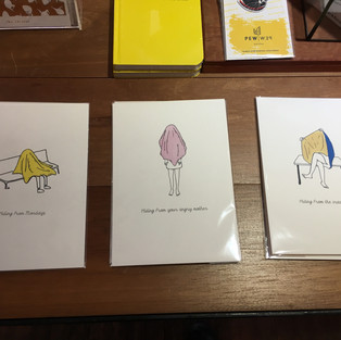
I went straight into brainstorming and sketching thumbnails for this event. and non-surprisingly I had quite a few ideas.

I consulted with my boyfriend, mother and sister about the designs and what I should develop further and I decided to develop these 3 -


I scanned it on high res of 300 dpi, and developed it on illustrator.


I knew I need to add a splash of colour and from the research I did before it was obvious to use pink, but I wanted to give it another color that would give it a bit of contrast. I did some experimenting and found this blue colour that I really liked. both together symbolise a little bit of harmony between female and male (which is usually represented by blue), It is also that the yin and yang feminine and masculine are meeting as one in the point of orgasm according to ancient traditions.
I transferred the files into photoshop to colour it by brushes, I’m very new to illustrator and so I proffered to do it on photoshop because I knew better what I was doing there. of course exported it by 300 dpi again.


Then I was ready to move on to indesign in order to prepare it for print.

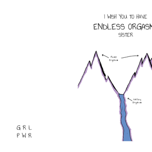


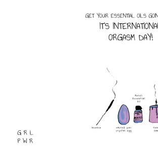
I gave all of them the same message inside and the same "Branding" - "GRL PWR" at the back. I wanted to make it as a small series that is obviously coming together.

Back to Envelope Design-
I decided to keep the minimalist style of design but add a little colour into the envelope as well. I used "mini" envelopes since they are sweet and elegant, the upper part (the triangle that is folding forward) would be light faded blue, and the envelope body would be light faded pink. I added the letters “GRL PWR” as I did at the back of each design, which means “girls power” and it creates a oneness feeling of all designs together as they were branded.


Comments