
3.4 Exercise: Understanding colour
- Amber Houbara

- Dec 15, 2018
- 3 min read
Updated: Jan 5, 2021
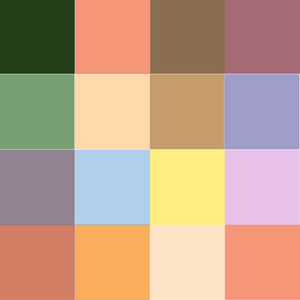
On this exercise I was asked to create 2 color grids - one with colours I like and one with colours I dislike.
The usual result as according to Johannes Itten - which is an artist and the creator of this exercise, is that the pallet that will look better is the one we disliked.
Even tho, I have to say, I like colours that are more gentle to the eyes and not so bright, and therefore I must say I think the grid of colours I liked looks better together.
LEFT - COLORS THAT I LIKE RIGHT - COLORS THAT I DISLIKE


Then I had to create a match of 2 colours just as Itten did, to describe different emotions.
I started as researching about colours psychology to know which emotion or word mentioned can be related to which color.
I found this useful guide and I summarise here the insights.
http://www.color-wheel-pro.com/color-meaning.html
Red
very emotional and intense color, very energetic.
Light red represents joy, sexuality, passion, sensitivity, and love.
Pink signifies romance, love, and friendship. It denotes feminine qualities and passiveness.
Dark red is associated with vigor, willpower, rage, anger, leadership, courage, longing, malice, and wrath.
Brown suggests stability and denotes masculine qualities.
Reddish-brown is associated with harvest and fall.
Orange
combines the energy of red with the happiness of yellow.
Dark orange can mean deceit and distrust.
Red-orange corresponds to desire, sexual passion, pleasure, domination, aggression, and thirst for action.
Gold evokes the feeling of prestige. The meaning of gold is illumination, wisdom, and wealth. Gold often symbolizes high quality.
Yellow
The color of the sunshine, therfore stands out for happiness joy and good energy.
Dull (dingy) yellow represents caution, decay, sickness, and jealousy.
Light yellow is associated with intellect, freshness, and joy.
Green
The color of nature, stands out for nature, harmony, growth, fresh and fertility.
Dark green is associated with ambition, greed, and jealousy.
Yellow-green can indicate sickness, cowardice, discord, and jealousy.
Aqua is associated with emotional healing and protection.
Olive green is the traditional color of peace.
Blue
The color of the sea and the sky, therefore resemble with depth, stability, trust, wisdom and intelligence, heaven
Light blue is associated with health, healing, tranquility, understanding, and softness.
Dark blue represents knowledge, power, integrity, and seriousness.
Purple
combine the energy of red and the stability of blue. resemble with royalty . creativity, mystery, intelligence.
Light purple evokes romantic and nostalgic feelings.
Dark purple evokes gloom and sad feelings. It can cause frustration.
White
resemble with pureness, light, innocence.
"White is associated with hospitals, doctors, and sterility, so you can use white to suggest safety when promoting medical products. White is often associated with low weight, low-fat food, and dairy products."
Black
"Is known for power, elegance, formal, death, danger, and mystery"

FINAL DESGINS
1. Angry - dark red (anger, rage) and black (danger - bold)

2. Hopeful - blue (faith) and white (faith)

3. Open - orange (sunshine, joy) and green (growth, fresh)

4. Vital - light blue (healing) and white (purity)

5. Brave - black and dark green (ambition)

6. Creative - purple (creativity) and green (fresh)

7. Independent - purple (power) and blue (confidence)

8. Dangerous - black and yellow (known in nature)

9. Jumpy - blue and dark red (vigor)

10. Kinetic - red (passion, energy) purple (energy)

11. Energetic - purple and red 2 energetic colors

12. Familiar - black and white (basic)

13. Gregarious - pink (love, friendship) green (harmony)

14. Luxurious - purple and Gold (luxury)

15. Masculine - brown (masculine) and black (power)

16. New - green (fresh) and white (pure, vergin)

17. Precious - purple (luxury) and olive green (peace)

18. Quiet - white (pure) and aqua (tranquility)

19. Wonderful - green (fresh) yellow (sunshine)

20. Extra special - orange and purple - both combining 2 colors energies

21. Youthful - white (innocence) and green (fresh)

22. Zany - yellow green (sickness) orange (tropical)

23. Reasonable - dark blue (seriousness, knowledge) brown (stability)

24. Sociable - pink (friendship) dark blue (seriousness, knowledge)

25. Tasteful - white and black - balanced

26. Unhappy - yellow green (sickness) and dark purple (frustration)

REFLECTION
I have learned, in this exercise, so much more about color. The psycology behind it, how to combine colors and how can it affect my design and my visual language and communications.
I really like working with colors, and it can be very interesting how can I use this knolege in future desigs. It was definatly an eye-opening regarding to which color or combination of colors can communicate different things.


Comments