
3.7.2 ASSIGNMENT 3 - COLOUR ME PART 2
- Amber Houbara

- May 31, 2019
- 5 min read
Updated: Jan 12, 2021
I started developing the first Idea, the Japanese craziness about the colour pink really won my heart, especially since I just got back from Japan the second time in 2 months and fell in love with the tradition, culture, food, views and pretty much everything else about this country and people.
I liked the fact they consider pink as masculine and more then that, pink resembles the fall of a warrior, while in his fall he is blooming in life.
- It's like taking all of western ideas about sex, power, competition and class and twisting it up side down.
So I decided to celebrate the figure of a Samurai, and combine it with the Cherry Blossom which is so beautiful, soft, bloomy, romantic, and pretty much everything most people and society agrees the colour pink stands for.
I found 2 inspiration for Samurai figures that I liked on pinterest.


and inspiration of Cherry Blossom trees on pinterest as well -


The amazing link between the Samurai and the Cherry Blossom kept amazing me, so I kept reading and researching a little bit more and found this interesting article, talking about the meaning of cherry blossom as life death and renewal.
https://notwithoutmypassport.com/cherry-blossom-meaning-in-japan/
"In Japanese culture, sakura as the embodiment of beauty and mortality can be traced back centuries. No one in history personified this metaphor more than the samurai, the warriors of feudal Japan who lived by bushido (“the way of the warrior”) — a strict moral code of respect, honour and discipline. It was their duty to not only exemplify and preserve these virtues in life, but to appreciate the inevitability of death without fearing it — in battle, it came all too soon for the samurai. A fallen cherry blossom or petal, it’s believed, symbolized the end of their short lives."
COLOURS
I found these websites that are specifying in colour schemes for Cherry Blossom and complimentary colours, an as I thought turquoise and light blue are a good complimentary colours.
http://www.99colors.net/name/cherry-blossom-pink
https://www.colorhexa.com/ffb7c5
https://encycolorpedia.com/ffb7c5
https://colorpalettes.net/tag/shades-of-cherry-blossom/
Then I also kept reading more about Shades, Tints, Tones and Hues on these articles
https://www.mybluprint.com/article/hues-tints-tones-shades-all-those-color-terms-are-about-to-get-way-less-confusing
https://www.canva.com/learn/tints-and-shades/
on the second article I have found an amazing tool for finding shades and tints complimantry colours etc - Paletton
http://paletton.com/
And I picked 2 main colours as my base colour and checked their colour palettes.


Then I also checked their complimentary colours

and picked these colours for my design -

SKETCHING


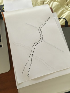


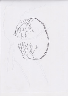
It took me quite some time to figure out how to sketch the cherry blossom tree.
I scanned my drawings and took them into Illustrator to create vectors from them -


Then added the flowers with brushes on photoshop


I opened a new file 297mm x 420mm
and placed my vectors.
I added text that I thought represented the idea and the colour -
"in his fall he blooms in life"


But something didn't work for me, so I started playing around with placing colours, shades/ tints, sizes and fonts..
as well as looking at some more Japanese posters inspiration on pinterest -
I've noticed that the japanese art uses circles quite often so I researched about the japanese circle, which called "Enso", according to Wikipedia -
https://en.wikipedia.org/wiki/Ensō
"The ensō symbolizes absolute enlightenment, strength, elegance, the universe, and mu (the void). It is characterised by a minimalism born of Japanese aesthetics."
So I chose to play around with circles in the background, also to enhance the whole of the samurai and the bloom.
I also tried to change the text for a more minimalist one since Japanese aesthetics are usually very minimalist, and also the colour pink is considered as calm.


My design options


MY FINAL DESIGN

Eventually, I wanted to celebrate the colour pink and its meaning.
In the west, the colour pink was unknown until about the 1700, when first got a noun name on the english language. It has been attached to female and women since the 90's and relates to everything sweet, calm, romantic, happy, girly, playful, cute, charming, and tenderness, friendship, affection, harmony, inner peace, and approachability.
Over east, in Japan, the colour Pink has been known for generations, especially since every spring there are thousands of cherry blossom trees that are blooming and filling the view in light peachy pink. The Cherry Blossom has been gaining a deeper meaning of life, death and renewal. While blooming season is glorious and powerful, it is sadly short and after its 2 weeks time of bloom -the flowers start falling and the petals fall looks like a beautiful rain, representing the fall of the glorious Samurai. As "when he falls, he blooms in life". The colour pink in Japan represents masculinity and at the same time, softness and calmness, and even sometimes mournful.
I wanted to show the balance between east and west, show the masculinity blooms in calm beautiful romantic tender and heroic way at the same time.
I chose to draw the figure of a heroic Samurai, which fell in battle but looks like he's still strong and not giving up, he blooms in life, while the competition doesn't stop him or let him down.
The Cherry Blossom tree framing him and blooming around him, showing he's beautiful charming fall. The cherry blossom represents in this design, the softness and the calmness, the harmony and peaceful of a glorious bloom.
I wanted to enhanced his inner peace and zen, with the circle, "enso" that wraps the Samurai and the Cherry Blossom tree together, in the circle of life. While represents enlightenment, strength and elegance at the same time.
The text, in a simple, thin, hand drawn font, represents the calmness of the colour pink as well. Having no capital letters or dots to represents the cycle of life, having no beginning and no end.
Font is centred to create a shape of triangle facing down to complete the geometric harmony of the circle above.
Initially, I decided to leave the turquoise blue out of this design, as I thought it didn't look good.
After receiving my tutor's feedback, when she said it could have been better to use this complimentary color anyways, I decided to use one of the designs I already made, with the turquoise blue circle around the main pink one, but this time I just added some transparency to it. I feel actually that it looks a lot better, almost like a shining moon in the sky.
REFLECTION
In this assignment, I really enjoyed the whole process. Firt of all the research was fascinating and I really learned so many things and I feel that it led me to refine my design. I really enjoyed playing with colors and to work manually and draw. It is very new to me to really draw my own vectors and I surprise myself with the way I manage to use my hands. I enjoyed as well to take it into the illustrator which as well I feel like I'm learning better how to use, and to actually change the colors and scale up and down and move it around later on photoshop as layers.
I really see how my work is improving and I really enjoy it.
I was happy to recive my tutor's advice and to not give up on the turquoise blue color in this design.
I feel like it gave it a whole new life and aspect now.


Comments