
4.2.2 Exercise: Playing with words
- Amber Houbara

- Apr 4, 2020
- 5 min read
Updated: Apr 16, 2020
Exercise: Playing with words
Using the following words create typographical representations that present both the word and a suggestion of its meaning.
Sad Safe Sardonic Saucy Scholarly Serious Sinking Skimpy Shadow Sleek Speed Swagger Shattered Snowy Squeeze Shy Sodden Stiff Short Silly Soothing Smart Squat Sweet Sordid Sophisticated Stodgy Stoned Style Supine
Start this exercise by working on A4 sheets of paper.
Set the words in 48pt Helvetica Bold, print and cut out the words and then arrange them and stick them to a sheet of paper trying to capture the meaning of the word visually.
Think about the composition, using the white space of the page to help you construct your meanings.
Then work digitally using any of the software you have available.
Explore how you can set text at a slant, at different sizes, in different colours and fonts.
Try using filters in your software for other effects.
Make notes as you work explaining your choice of representations and which ones you feel that you were most successful with.
Sad
I have started with SAD
I looked for a sad color scheme to get some inspiration.

I have used the blue as a background anf black as my font colour.
Then I chose "Bush Market" font since I thought it gives a sad feeling, as also it made the "sad" word be in an angle of almost a sad face. So I added a sad mouth to it as an underline.

Safe
Safe for me is a feeling of comfort, knowing I am safe from all sides and protected, this is why same as I did with the printed letters, I have arranged the letters in space from each other, "protecting all angels". I also felt like "going safe" with capital letters, black font on white background. I used "alice" font since it is a very neat font that gives a safe feeling.

Sardonic
I was looking for colours that represent cynical, and found this article
is says -
"BLACK: AUTHORITY
Black is the perennial colour of fashion and sophistication in the modern world. It is strong, without illusions. It flirts with cynicism. It is the least naive, the least childish of colours. We need black when we want to keep our cool; we’ve seen too much already to get carried away now. It is a reminder of the appeal of being a little bit harsh, a little bit demanding and decisive. Black is lean."
So I chose to have black as my background, placing the first part of the word below the other so it looks like the second part (which has letters that face away from the first part) is 'higher and better' than the first.
I also chose to have the first part in gray and the second in white - so the white part is like cynical and sarcastic towards the other -its brighter.
The font "Perfetto" felt to me like playful and matching a Sardonic feeling.

Saucy
According to this dictionary, Saucy means -
"You can use saucy to describe someone who likes to cause trouble, but usually in a playful and funny way. Saucy is also a good word for a person who really likes to flirt."
I wanted to give this feeling along with 'saucy' which is derived from Sauce.
I was inspired by vintage sauce posters.


They all had the same color scheme and same kind of fonts.
Red is a color that can make people hungry and yellow is playful and calm.
I wanted to give a playful and funny feeling to it so used the tomato behind and put the letter C in an angle.
The tomato represents a saucy and juicy feeling, and the font "Arial Black" is full and thick like both meanings of the word.

I decided to add another red circle layer with only 35% opacity and filter the letters that sit on top of the tomato, other than the 'C', to give it even more of a playful feel. It also creates a slight shade for the tomato.

Scholarly
I was thinking about the notebook we always had in school, with lines, and the font "American Typewriter" which is so connected to school and writings. I chose the lines to be light blue like the classic notebooks and the font to be dark gray.

Serious
I chose black, gray and white since they are very serious colors. I chose the font "Copperplate" which is a very serious font. I gave the word a shade to make it look even more serious.

Shadow
I decided to make the shadow typeface look like an actual shadow, so I chose the font "Fredericka the Great" which has a sketched look. I started playing with light and darkness on my software and that was my first intention.

I still didn't quite like it and decided to place the letters as a shadow of dark gray cubes under a light.

Shattered
I was thinking blue can represent the word shuttered and I chose the font "Barrio" since it is an unmatched font, giving it a sense of being shattered.
I placed the letters as they are being shuttered from the top down.

I wanted to play around with the typeface filters, so I grouped the letters layers and filtered with 3D to give it more depth, then I played with some brushes and brushed the edges of the "falling letters".

Shy
I wanted to show the shy as hiding in a little bubble. I chose "Alex Brush" as my font since it has an angle and it looks like the font is bending forwards (as almost kind of hiding). I've placed the small bubble in the bottom in front of a big one, to show the difference between being shy and being confident. I also made the font slightly smaller and also picked the color gray as its almost blending into the dark blue.

Short
I chose "Amatic SC" font since it's a very thin font, size 60 pt I placed the letters one on top of each other and reduced the space between the lines into 40 pt. So the letters can "sit" on each other.
I have placed the word in the bottom so it looks "short" and tilted the slant so it's all almost hanging on top of each other.

Silly
I wanted to create something silly, so I used the font "Dazey" which is very playful.
I played with the sizes, placing and the pastel colors of each letter.

Then, I used a filter of "Pinch" to create a silly and illusionary shape.

Sinking
I really wanted to play around with this one, and create the motion of sinking.
So I first made the background with brushes. an ocean with light torqouise water and then deep blue and I gave them a filter of "blur surface" to emphasise depth.
So I first made the background with brushes. an ocean with light turquoise water and then deep blue and once the letters crossed the turquoise w to emphasize depth. to them, to emphasize heaviness.
Then I have added some bubbles. and then I gave the typeface and the bubbles a filter of motion blur.

Skimpy
Skimpy is usually familiar with women and with short and revealing clothing, so I chose the font "Aladin" which is very stylish, and gave the "PY" a large size, so it will look like legs. Then placed "SKIM" on top of the top parts of the "PY", The top of the letters "PY" has wide elements and I wanted to make it look like hips. So the "SKIM" part of the word is like a "skimpy" skirt.
Then I have drawn a woman's body silhouette. I have made 2 versions, one with a hollow silhouette and one with a filled one.
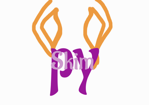


I decided I like more the hollow one.

Sleek
Sleek is like retouched or polished, so I chose the font "Ultravog" which looks very polished. I gave it a big size and colored it with a golden color to make it look more polished and expensive.
I added a star to make it look shiny.

Smart
S - Yellow: hope - size 250 pt
M - Light Blue: Clarity - size 150 pt
A - Dark Blue: Discipline - 150 pt
R - Dark Red: Power - 600 pt + slant
T - Light Green: Sanity - 300 pt + slant + 70% opacity
Font - The Girl Next Door
I wanted to create something wise, placing the letters in a smart way and playing around with colors, placements, sizes, and slants.


Comments