
4.4.3 - Exercise: If the face fits
- Amber Houbara

- Apr 16, 2020
- 5 min read
Updated: Jan 6, 2021
Part 2
Now identify which fonts you might use in each of the following commissions:
• A poster to advertise an after-school club for boys aged 13 – 14.
The poster will be A3 size and the copy reads:
“Bored? Feeling got at? Nowhere to go? Then why not come and join us on Tuesdays and Wednesdays after school in the Old Gym. We’ve got football, ping pong, table soccer, computers, Karate, cooking and lots more. All free just come along.”
• Your friends’ engagement party.
They want a flyer A5 size to send to their friends as if advertising a club night. The copy reads: “Mandy and Josh are finally going to do it...well almost!!!!! Come and join them on Friday 24 March from 8pm at the Golden Calf to celebrate their long awaited engagement... and yes lots of presents would be gratefully received particularly if we can drink them!!!!!"
Then have a go at mocking up each of these.
Try different fonts to see how each changes the feel of the text
and make notes in your learning log about which works best and why.
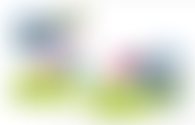
A poster to advertise an after-school club
• A poster to advertise an after-school club for boys aged 13 – 14.
The poster will be A3 size and the copy reads:
“Bored? Feeling got at? Nowhere to go? Then why not come and join us on Tuesdays and Wednesdays after school in the Old Gym. We’ve got football, ping pong, table soccer, computers, Karate, cooking and lots more. All free just come along.”
Research for websites of sport afternoon activities for youth


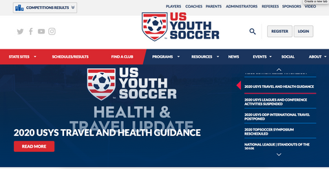
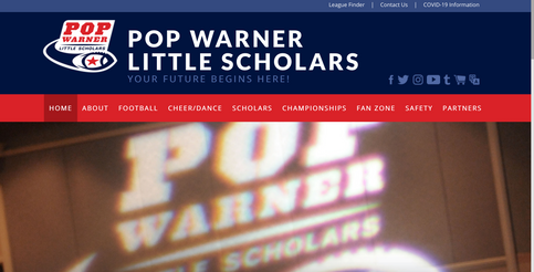

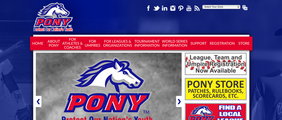
Insights -
1. Mostly sans serif, some headlines have a "sporty"-looking serif font (like "Pop Warner" logo.
2. colours are clearly red blue and white
3. Design is very "Sporty" looking,
More research for adds


Insights -
1. Big headlines with decorative sans serif, text with bigs simple Sans serif
2. Very simple and epmowering design
3. Green field background
4. Combining blue red and white with the green background
Fonts that can match in my eyes
Headline -
Stencil Std - I have noticed in all adds the main call has a catchy title and a decorative font that is very bold and powerful - I think this font is definatly representing power and definatly catching the eye
Bebas Neue - It is good but I don't think it will give the powerful feel I'm looking for, maybe too boring and regular
Chalkduster - this is a great font, decorative and cool, but I think it brings more of a "back to school" feel rather then "after school activity"
Impact - I think this font is pretty good, It's bold and the "?" typeface of it brings a cool twist to it.
Triester Sans - This font I wanted to see as a headline and as a text font, since I can relate it to sporty looking, but for the headline or latge size I think it is less what I'm looking for.
Text -
DIN Alternate - I thought it can work but I think it misses the point and for this poster it's too boring and standart.
Impact - another font I have decided to check as a headline as well as a text, I think it is bold and great for a small chunck of text that needs to bring a message.
Triester Sans - I really think this font fits sport, So it will probably be a desicion between Impact and Triester Sans, the difference between them will be the thickness of the font.

Then I made the design playing around with 3 fonts
Stencil Std 72 pt
Impact 48 pt with a white red stroke around
and Triester Sans 48 pt space between letters 130% blue and red with a white stroke around
Background image source "Canva" stock
I liked the typeface but my design was a bit boring in my eyes, for 13-14 teenagers I needed to make a bit more "noise".

So I added some more images (source "Canva" stock) and changed the angles of the text.
Final Design - Afterschool Activity

Engagement Party
• Your friends’ engagement party.
They want a flyer A5 size to send to their friends as if advertising a club night. The copy reads: “Mandy and Josh are finally going to do it...well almost!!!!! Come and join them on Friday 24 March from 8pm at the Golden Calf to celebrate their long awaited engagement... and yes lots of presents would be gratefully received particularly if we can drink them!!!!!"
I started by gathering inspiration.
The first thing that came to my mind was an artist I rembember since I was a teenage and was working in night life in Tel Aviv.
I got into night life from a very young age, even tho I was underage I got good work in it and made connections and money. One of my jobs was to walk around the city and visit every single cool bar or party and hand out flayers.
I always loved the design of them and there was one artist that have been doing "The Block" (one of the leading underground nightclubs in Tel Aviv) designs for years. His artist name is "Prop4g4nd4".
from his website-


I remember waiting to see what is going to be his next artwork and find it on the city's walls.
(Back then, there was facebook but not really instagram, so the only way to really get into people's eyes was the city; the walls, the bars, the people.. Flyers Posters etc)
Looking at his designs I can tell the typefaces are so various but they are all very decorative.
I kept looking into other more mainstream ideas on Pinterest
the other adds that I have found had a lot in common
1. Neon looking sign typefaces combining handwritten / script and sans serif either very thin and narrow or thick and bold.
2. Neon colours, purple-pink blue. black background and white elements.
3. Design very geometric and sometimes psycodelic.
Fonts I think can match


left to right -
First mood - Triester family cool and bold
Triester Sans Outline
Triester
Triester Sans
There is somthing really special in this family of fonts, I really feel like thry are the perfect ones for this brief. I can really see it in glowing lights which is what I want to create here. They sit perfectly together and this is the magic of family of fonts that have few different fonts that communicate.
Second mood - Mix of fonts Sophisticated
Phosphate
Poiret One
Poplar Std
This is an interesting one that I came up with, It's a mix of fonts, and they are well communicated.
I feel like in nightlife the fonts are mainly "modern" looking and here is a play with one font that is bold and has a thin hollow line inside it (Phosphate), and the pair that I have found for it is a very thin line (Poiret One) which is almost like it is the inside line that is missing of the first font (Phosphate).
The rest of the text is a very nice modern font that is great for a longer and smaller text.
I feel like it's giving a sophisticated mood.
Third mood - least favorite, mainstream mood
Poiret One
Wildwest
Euphemia UCAS
I feel like this pair that I have came up with is a very mainstream look. I mean very "mainstream parties". So I didn't like it so much. For me, as someone who has grown up living and working in the "underground nightlife scene" - I always chase creativity and outside of the box thinking.
My choice to go further was the first mood.
I have found this cool tutorial that is explaining how to make a neon light effect -
So I started working on the text, and I chose to use purple (for creativity and third eye opening feeling) yellow (as optimistic and happy) and together they give a happy and fun feeling.
I have found a galaxy background image on "Canva" images stock.
I gave also a very light outer glow to the body text too.

REFLECTION
This task was again a good fun, I really like working with fonts and it was really good to learn how to fit typefaces together. I also really like layouts and working and learning about that further was interesting.
I'm very happy to see how my skills and design eye are getting better and sharper.


Comments