
4.5.1 - Exercise: Hierarchy/ interview
- Amber Houbara

- Jun 6, 2020
- 7 min read
Using about 500 words of Lorum Ipsum (or other dummy text)
you are going to design three different pages:
• an interview with a TV actor in a listings magazine entitled: Will Sheila tell the naked truth? • a review of a new piece of hardware or software in a specialist computer magazine
• a book review in a newspaper’s weekend edition.
Research these types of publications and identify three different combinations of typefaces appropriate for each publication.
Now you need to invent headings and subheadings for your articles. Set these combinations so that your header is above 12pt in size, your body text is 12pt or below and subheadings sit in between in your hierarchy.
You will need to create some text to allow you to show your combinations in action.
Use your text to:
- describe your decision making process,
- why you think the combination works
- and what your intentions were.
Listing Magazines Research
Google source images

I have found this analysis of listing magazines article
I've learned from it:
There's mostly the logo of the magazine on the cover story usually on the top left
The main image is big and spread onto 2 pages of the spread
There are captions underneath or near every person - All captions are kept consistent, with the same font and color, and in this case, a box around each caption.
Article heading is big
There's a drop cap
There are one or more quotes, they are highlighted as a subtitle
There are questions and answers on the interviews
There are other smaller images
There's a 'by-line' for the writer of the article -The by-line is usually in a different font or has an effect on the font to stand out from the rest of the text.
TV TIMES issue source

TV GUIDE issues source

May issue source

March issue source
TV Times


insights -
There's mostly a logo of the magazine on the cover story, usually on the top left or right
The main image is big and spread onto 2 pages of the spread
There are captions underneath or near almost every person - All captions are kept consistent, with the same font and color.
Article heading is big
There's a drop cap - sometimes
There are one or more quotes, they are highlighted as a subtitle
There are questions and answers on the interviews - on TV guide it's presented as more of a story of quotes.
There are other smaller images
There's a 'by-line' for the writer of the article -The by-line is usually in a different font or has an effect on the font to stand out from the rest of the text.
Fonts Titles are usually sans serif unless it is special as the example of TV times when it's a serif which is italic. It's usually shiny or has some sort of a filling to the letters. Titles are big and bold and take quite a large size of the pages. They could be on an angle too.
There could be a special background and then the text will be boxed, either with transparency or framed.
The subtitle is sans serif and text is sans serif on questions or boxed text and serif or sans serif with the larger amount of text.
Font Pairing
Example 1
I have noticed that this genre of publication uses very bold and heavy weight fonts for the title, especially to be able to perhaps fill them with color or graphic. So I was looking for a font that is really think and bold and I know Phosphate well, for using it in the past, and I knew it could fit well. I have tried in the beginning to match it with Assistant which is a great font but I wanted to explore more fonts that I have. I have found Seravek and chose Extra light weight. I have chose 'Lato' as the text font and gave it a thin weight, I think it is a fine and nice font that can compliment for the other two.
Example 2
Montserrant is a great font for titles, I really like it. so I chose it as a title, and tried to experiment with matching a font called 'Montharo (otf)' to it, I liked the typeface they have created together, I wasn't sure if it will fit this genre and my purpose but I wanted to have it as an option. I have chosen 'Apple SD Gothic New' as the txt font with light weight, it is a very classic and easy to read font.
Example 3 and 4
While 'Montserrat' is a wider, shorter, and heavy font, 'Impact' and 'Popular' are tall and narrow. I wanted to create 2 similar but different typeface, one is lighter and one is heavier. Example 3 is a lighter version, using 'Impact' Regular (title), 'Assistant' Light (subtitle) and 'Sukhumvit Set' light (text). they are all a lighter version of Example 4 - 'Poplar Std' black (title), 'Sathu' Regular (subtitle), 'Geneva' Regular (text). It was interesting to see the different effect they give, I would say, Example 3 is cleaner while example 4 is more dramatic.
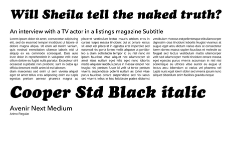
Example 5
As I saw on my references, the genre usually uses sans serif for titles and subtitles, but somethimes using serif with italic bold weight as a 'special'. So I wanted to experiment with that. I have chosen 'Cooper Std' Black italic for the title, 'Avenir Next' Medium for the subtitle (- in order to give it a solid quite bold subtitle), and 'Arimo' Regular for the text. I really liked this typeface they are creating together.


Inventing subtitle and trying my fonts -
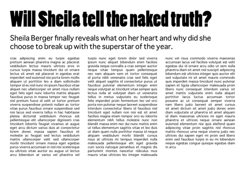
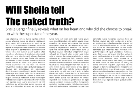
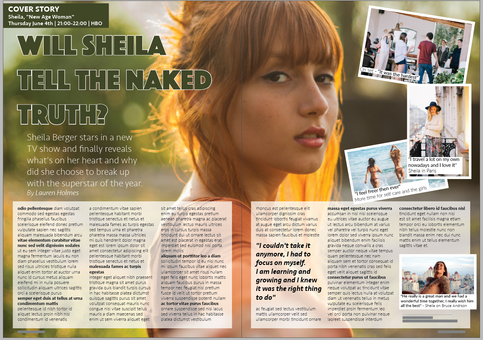
Title (given) - Will Sheila tell the naked truth?
Subtitle - "Sheila Berger stars in a new TV show and finally reveals what's on her heart and why did she choose to break up with the superstar of the year."
I was still a bit unsure of which pairing I like the most so I decided to try them all with the subtitle I have invented and then decide.


3 Font pairing -
Those were my favorite matching, they have a different mood and they are all appropriate to the publication.
Impact, Assistant and Sukhumvit Set as the cleaner version of a tall typeface
Phosphate, Seravek and Lato as a classic typeface
And Cooper std, Avenir next and Arimo as a special/ glamorous typeface.
In the process -
I have started by placing the text on an A4 spread with 500 Lorem Ipsum words.
I have picked the pairing of -
Title -Phosphate Solid 72 pt
Subtitle - Seravek ExtraLight 24 pt
Text - Lato Thin 11 pt
This font pairing that I have found is very minimalistic but still classy. I think that a lot of those magazines in this genre have less great style and they just aim for simplicity, but simplicity can look good too.
I was trying an image that I have found and I was stretching it for tha whole top half of the spread. I didn't quite like the way the text was falling on the background so I was looking for a different image. I have found this ginger hair woman and I actaully liked the blured background of that image so I could play with the title and subtitle on it. I started by placing it on my spread and the image was so big it was initially covering the whole spread, I was cutting it so it's only stretched on the whole top half of the page but it actually looked better before hand when it was stretched on the whole spread top to bottom, right to left. So I kept it like that and gave the main text a white box with 70% opacity at the start and then raised it to 80%.
I was using 3 columns on each page, and added a quote (font 'Seravek' Medium Italic 18 pt) so my text will reach more space on the page.
I also added a byline "by" Seravek ExtraLight Italic 18 pt, name of writer - Seravek Light Italic 18 pt
I've added 3 small images on the top right and another image on the bottom left, all with white frames (6 pt) and small captions using 'Lato' regular for the quotes and 'Lato' thin for descriptions.
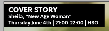
I have created a box for the "cover story" using 'Seravek' bold 20 pt for the title "cover story" and medium 14 pt for the description time and channel.
I have marked lines as questions with 'Lato' heavy weight.
I've added the numbers of pages with the name of the magazine on the bottom using 'Lato' heavy 8 pt
Then I added the credits for the photoshoot. I was not sure where to place it so I've tried few places. I have found it was the best to move the bottom image up and place the credits on the bottom of the whole article - within the white box. I've eventually used 'Lato' thin 7 pt.


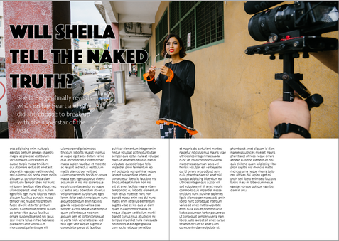


Now when I feel I have completed everything that I wanted to build in the page, I can play around with the title. I want to experiment with how I can fill the bold text, and perhaps change the colors of the theme of the whole article.
I was thinking to play with the colours green and orange since they are the ruling colors of the main image. and also, I think it represents freedom and fresh start, which the article is about.
I've started with checking just plain green color and white frame for the title, I wanted to see how it looks, but it wasn't what I was aiming for.


Then I wanted to see how it will look to fill the title text with images, I was thinking about something like nature green and orange images, and that it won't look so obvious of what the image is, just some kind of color shades.
I have found this video tutorial on how to place images inside the text in InDesign.
I have found nice nature images on 'Canva' stock images


I have decided to highlight the word 'naked' because usually in that kind of articles people want to read something revealing about the 'stars' they are watching on the TV. I have highlighted it by using the orange images, which also sits nicely on the background of the woman's ginger hair. and filled the rest of the words with the green grass image.

Now I've collected all the text from above about my decision making, and why I thought this typeface works best (- 746 words)
My intention was to create a spread for an article that will attract the people's eyes and that they will want to read it - and to promote the TV show the actress is showing on (which is the aim of this kind of an interview).
I've used this text in order to place it in the article's lorem ipsum and see my combination in action.
(811 words)
I had to use only 649 words since my text was too long, or alternatively I could have made the text smaller... but I was happy to use less text.


Comments