
4.5.2 Exercise: Hierarchy/ Hardware or Software Review
- Amber Houbara

- Jun 6, 2020
- 6 min read
Using about 500 words of Lorum Ipsum (or other dummy text)
you are going to design three different pages:
• an interview with a TV actor in a listings magazine entitled: Will Sheila tell the naked truth?
• a review of a new piece of hardware or software in a specialist computer magazine
• a book review in a newspaper’s weekend edition.
Research these types of publications and identify three different combinations of typefaces appropriate for each publication.
Now you need to invent headings and subheadings for your articles. Set these combinations so that your header is above 12pt in size, your body text is 12pt or below and subheadings sit in between in your hierarchy.
You will need to create some text to allow you to show your combinations in action.
Use your text to:
- describe your decision making process,
- why you think the combination works
- and what your intentions were.
TechLife magazine source


APC Magazine source


PC Powerplay magazine source


DIYODE magazine source


Insights -
Big images, can be spread to 2 pages.
big product images as vectors
some small images for extra
image of the writer - byline with the writer's title have a different background color
1-3 columns in a page + wrap around to images
quotes, either big (as subtitles) + wrap-around, or same as the text but have a different color/ bold/ italic
image caption - same as the text, maybe have bold weight
fonts are modern - title and subtitle are sans serif (title can be bold or not, they are usually the same font but with different weights), the text is mostly serif and can be 'Monospace' or classic
the design is very fresh and modern
The title, subtitle, and text is set ragged aligned to left
drop cap as a design add on (not always)
red and blue colors
vertical dividers between columns
star rating with some comments
Font Pairing / process
This was actually quite hard for me, I have found myself getting lost in finding the right fonts since it is less my taste. I have realized I like serif fonts better than sans serif, and that I also have less sans serif on my laptop.
Example 1 -
I have started with 'Assistant light' for the title and 'Assistant extra light' for the subtitle, and 'Alef' for the text. I actually really liked the simplicity of it and the matching between the fonts, so I have chosen it as one of my 3 matching options.
Example 2 -
I have used 'Apple symbols regular' for the title, 'Euphemia UCAS regular' for the subtitle and 'Alice' for the text. It looked ok but not quite what I was after, also I have tried it with different text and it didn't look as good together (see example 3)
Example 4 -
I actually really like the font 'Euphemia UCAS' so I decided to use it instead of the 'Apple symbols' title.
I've used 'Euphemia UCAS' as the title (bold) and the subtitle (regular), and 'Apple SD Gothic Neo light' for the text. I've used the previous design that I didn't like in order to create a better version, and therefore I have chosen it for one of my 3 matching options.
Example 5 -
I have found this really nice font 'Sinkin Sans' and decided to try it for my title (300 light) and subtitle (100 thin). I have added another nice font I came across called 'clockwise' (regular) for the text.
I really liked the typeface they have created together, very modern and clean. I know the text is sans serif as well, which is a little bit odd for this genre but I think it was still appropriate. The main idea of having serif as main text is that it would be easy to read a large chunk of text, but I think 'Clockwise' font is very clear even in a smaller size.
Example 6 & 7 -
Here I kind of got lost. I have found this confusing font called 'Calmer', at first glance it looked pretty classic, but when I have used combinations as 'L' and 'i' it was going in different hights - which is not appropriate for this genre. I did give it a chance by trying 2 different combinations, but it didn't work in my eyes. I also tried to combine a monospaced fonts, since the ones on my references look pretty 'tech' kind of fonts, but I couldn't find fonts which would mimic the same effect.


Final chosen fonts -


Title and Subtitle
Now you need to invent headings and subheadings for your articles.
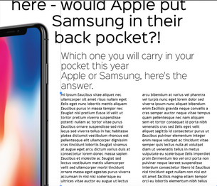
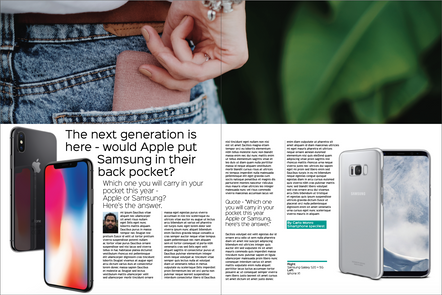
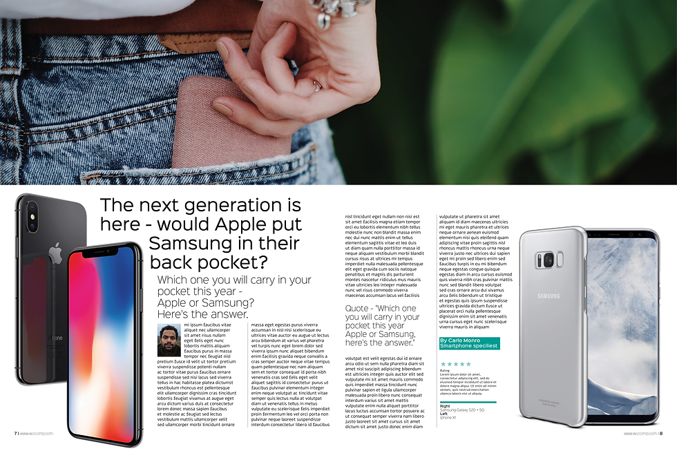
The next generation is here - would Apple put Samsung in their back pocket?
Which one you will carry in your pocket this year, Apple or Samsung? here's the answer.


In the process -
Iphone and Samsung Image sources from this website
I started by placing the pairing of 'Sinkin sans' and 'Clockwise' along with the titles, lorem ipsum of 500 words and the 2 images of phones I have found on the net.
I created a wrap around the phone images, as appropriate for this genre.
I was wondering how it would look if I actually use 'Alef' font instead of 'Clockwise', both are fonts which I liked for the text, but I didn't try to combine 'Alef with Sinkin Sans'. I actually really liked this combination and therefore kept it that way.

I saw 500 words are actually small for a spread (which is typical for a review like that in this genre) So I was checking if I could add another image of a phone in the back pocket of a man/ woman - to match the title I came up with. I have found the perfect image on 'Canva' stock images and placed it on the top of the spread to spread on both pages.
Now I could place the title, subtitle, and text below and create a great space for them to fit in.
I have created 4 columns, so I have 2 on each page, and let the title wrap around the image of the iphone on the left.
I aligned the text to be set ragged and changed the title size to 40 pt, the subtitle size to 24 pt and the text to 11 pt.


I have added dividers in gray color and 60% opacity to be just 3 mm to the left of each column.
I've added a quote to get more space taken off the main text (since I have only 500 words and it wouldn't fill the whole space). I've used 'Sinkin sans' size 18 pt and 200 X light weight.
I've added a photo of the writer and a byline with a light blue frame, I've used 'Sinkin sans' size 11 pt with 600 Semibold weight for the name and 500 medium for the writer's title.
I've added a light blue divider for the photo credits and the text with 'Sinkin Sans' 8 size pt and 200 X Light for the text and 500 Medium weight for the title - 'right' / 'left'.
Then I've added some rateing stars. I have used a vector from 'Canva' stock. I've used 'Alef' regular size 8 pt.
I have added the page numbering and website (as I saw on my references that is appropiate for the genre). I've used 'Sinkin Sans' size 8 pt 100 thin weight for the website and 500 medium for the numbering.
I tried to use dividers on the edges of the page too, as I've seen on one of my references, but I didn't like it so much.


Creating Text
You will need to create some text to allow you to show your combinations in action.
Use your text to:
- describe your decision making process,
- why you think the combination works
- and what your intentions were.
As I have described before, it was actually more challenging then I have expected. This is a very different genre from what I usually read or like so it was a good challenge. I was trying to keep modern and simple and loyal to the publications I have researched.
I am very happy with the result and very proud of myself with how I analyzed it all and managed to find a great typeface that worked, even though it was a long and hard decision-making process.
I really think this combination of fonts work well together on this genre, since they both have something quite digital, technological, and fresh to them. they are simple and round but yet a bit squary shaped. Especially 'Alef is great since it is almost hard to tell if it's a serif or sans serif - it is not 100% monospace but there is something special that make it look like it is.
(all text from above which I have chosen to use in order to see my combination in action - 615 words)

again it was interesting to see how 500 Lorem Ipsum words were almost comparable to 615 real words. So, once again it was a good part of the process to exercise this change.


Comments