
4.5.2 - Exercise - Lorem Ipsum
- Amber Houbara

- May 20, 2020
- 3 min read
Updated: Jan 6, 2021
Lorem Ipsum is dummy text with more-or-less normal distribution of letters that makes it look like readable English. It has been used for many years and some desktop publishing packages now use it as their default model text. If you don’t have it already, go to www.lipsum.com and generate as much as you need.
Now select one of the designs from your research that you like and think works.
Using the dummy text, try and copy the layout and design as closely as possible.
You will need to measure the margins and column widths.
If you don’t have the exact typeface get as near as you can.
If you are copying a page that includes photographs just leave 10% tinted boxes to indicate their position. Is the type serif or sans serif?
Is the text set ragged or justified?
Are there spaces after paragraphs or are new paragraphs indented?
How many columns are there to a page? What happens when you alter the fonts, change the alignment, adjust the leading or tracking?
Now try another, different publication from your collection.

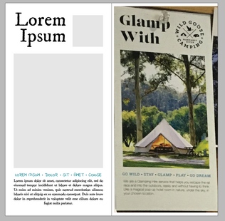
I chose to try one of the brochures I have taken photos of in the cafe near my house.
Something that was a bit more challenging since I didnt have a perfect picture of it and I had to measure it by measuring 2 points on the same angle.

I started checking the fonts
I know the title is Serif, The subtitle is serif too and the text is sans serif.
I checked on my laptop what fonts can match, and went online to check some other fonts.
The closest that I have found to the title was 'CaslonTwoBlackSSK' - 'regular' (free download from this website)
The closest to the subtitle was 'American Typewriter' - 'semi bold'.
The closest that I've found to the text was 'Avenir' -'book'.
The title was aligned to left, and I have noticed by meassuring it had a smaller leading then the automatic leading. So I have adjusted it accordingly.

The subtitle was aligned to center and was justified. The kerning and leading seemed normal.
The text was aligned to the left, and also was justified, and the kerning was more condensed than the normal font automatic spacing. So I have adjusted it accordingly.


There were no more than 1 paragraph and 1 column.

What happens when you alter the fonts, change the alignment, adjust the leading or tracking?


Example 1
I have tried to change to a script font on the title but it didn't seem to work the same for me
Example 2
Again a script font, it was really pretty in my eyes but definitely not eye catching or readable
Example 3
I tried to change the title to a more decorative font, it wasn't really working
Example 4
A different kind of serif it wasn't as neat and classy as the original design in my eyes.
Example 5
Some more decorative sans serif, looked too naive and not really attractive.
Example 6
Here I have created a more 'village' mood. Using this decorative serif title font 'Fredericka the Great', a sans serif subtitle 'Architects Daughter' which is more naive and cute, and a serif font for the text 'Marion'.


Example 1
I have changed the title for a semi decorative serif 'IM FELL DW Pica', which somehow reminds me of an old type machine. It is a bolder font than 'Fredericka the Great' and I have aligned it to the center in order to experiment. The subtitle is in a different sans serif - semi script 'Indie Flower' which I had adjusted the kerning to 100 so it is stretched and justified, even tho there are not enough words to reach the edges of the column. The text font is 'Marion' which I have aligned to center this time.
Example 2
I tried to align the title to the right, it was interesting, it wasn't so bad as I thought it would.
Example 3
I have aligned the title back to center, and experimented with bringing the subtitle to be on top of the image on the bottom and lifting the text up, also increased the size of the text so it's bigger and easier to read.

In conclusion
I actually liked to experiment and change the typeface here since it is not a complicated design, I think lifting up the subtitle which is the 'Highlights' of the ad looks good and sophisticated.


Comments