
4.5.3 - Exercise: Hierarchy/ Book Review
- Amber Houbara

- Jun 6, 2020
- 6 min read
Updated: Jan 7, 2021
Using about 500 words of Lorum Ipsum (or other dummy text)
you are going to design three different pages:
• an interview with a TV actor in a listings magazine entitled: Will Sheila tell the naked truth?
• a review of a new piece of hardware or software in a specialist computer magazine
• a book review in a newspaper’s weekend edition.
Research these types of publications and identify three different combinations of typefaces appropriate for each publication.
Now you need to invent headings and subheadings for your articles.
Set these combinations so that your header is above 12pt in size, your body text is 12pt or below and subheadings sit in between in your hierarchy.
You will need to create some text to allow you to show your combinations in action.
Use your text to:
- describe your decision making process,
- why you think the combination works
- and what your intentions were.
Research


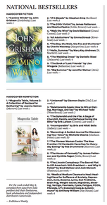
I knew the way this newspaper presents the book review wasn't really what I was asked to do, but it was still good to add it to the research.


The Wall Street Journal Weekend – May 9/10, 2020 source


Insights:
5-6 columns
small font for text.
Title - mostly serif
subtitle - mostly sans serif/ serif
text - mostly serif
The fonts here don't seem to be too different between title, (subtitle if serif), and text-only the size or bold makes the difference.
photo of the book or other related image
one main image to a page, others are small.
text is wrapping around the image mostly in a square shape.
drop cap
It seems like the page is divided to each book review, either in a complete square or as a continuous review to the previous one.
Identify three different combinations of typefaces


I started by checking a serif for the title and sans serif for the subtitle, along with serif for main text.
I then moved onto checking some all serifs pairings.
After doing 3 examples, I actually decided to mix a few of the pairing and use the title font of the first pairing, and the subtitle and text fonts from the third.
I think the final one will be great to have as the book review fonts for my design.
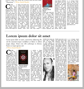
inventing title and subtitle for my design -
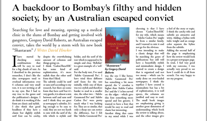
"A backdoor to Bombay's filthy and hidden society, by an Australian escaped convict"
Searching for love and meaning, opening up a medical clinic in the slums of Bombay and getting involved with gangsters, Gregory David Roberts, an Australian escaped convict, takes the world by a storm with his new book "Shantaram".
Trying to place the titles with the fonts I've chosen... For the test I've used sizes :
Title - 36 pt
Subtitle - 18 pt
Text - 11 pt


In the process
I have genarated 500 lorem ipsum words and added them to my body text
I have started with adding more columns, the examples I collected have about 5 columns on each page, I started by 4 columns and worked my way up to 6.
I added the subtitle to stretch over 2 columns and then 3 when I added more columns.
I added the image of the book I saw this on the WSJ newspaper and really liked it, its adds to the organization of the page and to the hierarchy of the images.
I added the byline on the subtitle, using the same font as the text 'Adobe Garamond Pro' but with italic and a different color.
added drop cap too.
I've added an image of the writer of the book, but I felt it wasn't strong enough for the book review.
I decided to use a big image to sit at the top. I've noticed that most book sections have a main article - main book review and the rest are smaller. So I wanted to show the book I've chosen as the main one. I have searched online for some images that would be related to the book, and have found this guide to Mumbai that is following the plot's locations. I really liked this image of Dhobi Ghat and added it to the top of the review.
I've added dividers, and also created the top section of the "book" title, the date and the name of the newspaper. I tried to use the same font of the text -'Adobe Garamond Pro' with Italic but it didn't look as good as I expected. I have changed and used the title font 'CaslonThreeSSK' all capitals.
Then, I have had my complete review article, but half the page was still empty, so I decided to fill it up with another book review. I have used again 500 word of lorem ipsum and the second book of the same author. I have arranged the second review to match the first one and used also dummy text for the title and subtitle.
Images source:


Creating Text
You will need to create some text to allow you to show your combinations in action.
Use your text to:
- describe your decision making process,
- why you think the combination works
- and what your intentions were.
I have started by checking some combinations that will be easy to read for a big chunk of text. As I described in the previous researches, I don't like the idea newspapers tend to overload information over 6 columns and very small text, it is not inviting at all in my eyes. But I had to stay true to the genre and the publication's designs. I do think it is working if the fonts are classic and stylish.
I also think that good headlines if they have a classic but slightly stylish serif font can be catchy, despite the overwhelming amount of columns and things going on.
I think 'CaslonThreeSSK' has some kind of sophistication, it's more stylish than the other serif fonts that I liked.
The subtitle could be serif or sans serif according to my research, but there are some fonts that have serif but it's very gentle, it is almost a mix between serif and sans serif and I think they are great as newspaper's subtitles. It's big enough to be easy to read, they are not too harsh to mix with the serif of the title which is stylish and bolder, and the serif of the text which is supposed to be simple and clear. 'Bellefair' is a great example of a 'soft' serif.
For the body text, I've used 'Adobe Garamond Pro'. I have tried three different serif fonts for the text initially, while one of them was too stylish and therefore harder to read in a smaller size, the other two - 'Adobe Garamond Pro' and 'Adobe Caslon Pro' were pretty much what I was looking for. They are so similar, that only a sharp eye can notice the difference, but I felt like 'Adobe Garamond Pro' was the one I like better. 'Adobe Garamond Pro' has something a bit more special, the 'e' crossbar is higher than 'Adobe Caslon Pro' and the 's' is less curved on the edges - which gave this font something more special and less generic. I wanted to have a font that would be easy to read and classic but interesting.
Another thing that came in my mind while I was choosing is that I have chosen 'CaslonThreeSSK' for my title, which means - 'Adobe Caslon Pro' might be from a similar family. and I wanted to mix it and not go for the obvious.
I was intending to make a classic design that will be matching the genre of publications but still will have a beautifully stylish and minimalistic design. I wanted to create a design that is organized and not too messy - which can be easily done on over-loaded newspapers. I think the typeface I have created is minimalistic but has a bit of sophistication, it is well spaces, the columns are justified and easy to read. The small book images are emphasizing giving is another great dimension of understanding which book the review is talking about, and the other images give a feel of the story or topic. I think the catchy title and subtitle are attractive and witty. Adding a byline with italic weight and an orange color separate the byline from the subtitle.
Adding the second half of the page is emphasizing how the review would look in a proper newspaper page.
In total, I feel very good with my outcome, I was actually very proud to see how I could do it all from scratch. I'm very happy to see my progress.
(578 words)
Show my combinations in action


I was surprised to see that 500 words on lorem ipsum wouldn't compare to 578 real words! so it was actually an interesting stage of the process.
I decided to add a quote from the text and highlight it with italic weight, 14 pt size, and use the same color I've been using for the byline. it looks better that way, otherwise, I would have used another image, but I saw on the example I have from WSJ they also have used a quote, so I knew it is appropriate for this genre. I have decided to add a line divider underneath as well.

REFLECTION
Again, this exercise was a lot of fun for me, I really deveLop a special love for book and magazine design, I knew I would apply to book design after this course but it's only making my decision stronger regarding to it. I really enjoyed learning and exploring the different styles of magazines and newspaper layouts and learning how to do it myself. Also how to work with a lot of columns and images.
I also feel I'm getting better and better on Indesign.


Comments