
4.6.3 Assignment 4 - Show me... | Article Design
- Amber Houbara

- Jun 30, 2020
- 5 min read
Updated: Jan 8, 2021
Context
Typographers and type foundries (the companies that commission and produce typefaces) have always had to promote their latest designs to printers and designers to show off a particular typeface, its different fonts in a variety of sizes and contexts, and the unique features of it. Once Specimen Sheets were the main way of doing this. Nowadays most of that marketing takes place online – research type foundries on the internet.
Brief
Design the font for use on the cover of a magazine called type
and write a short article for the magazine using a range of typefaces, with typographic illustrations, drawing on all that you have learned in this section.
The article should include sections on:
• what makes a typeface interesting
• how a typeface is constructed
• question marks.
Requirements
Do a mock up of the magazine cover to show where and how your title font will appear along with other cover elements.
Produce a magazine article that is attractive and interesting enough for someone to want to pick it up to read, and which shows off what that you have learnt so far about typography.
Add illustrations, photographs and colours as you want.
ARTICLE
Research
I have done those 2 courses on skillshare before doing this part of the assignment to learn more about typography that works and layouts
Typography That Works: Typographic Composition and Fonts by Ellen Lupton, Curator, Cooper Hewitt, Smithsonian Design Museum
I started by gathering information and inspiration from my initial research, and added more ideas regarding to articles layout from this website, through this article


Sketching
I started by sketching some ideas for the layout of the article.

I have written my text -


Typography Illustration
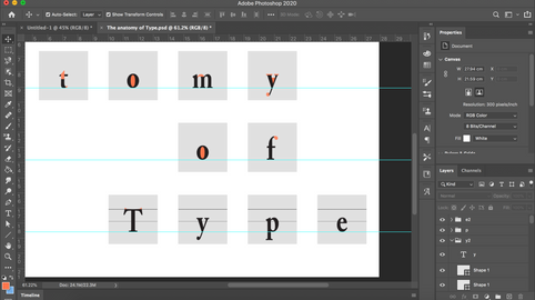
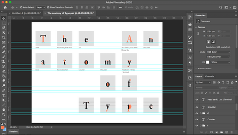
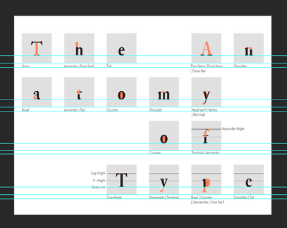
I have noticed magazines present fonts in small squares, exampling the anatomy of the font with coloring parts of the letters, so I decided I want to make an image describing the anatomy of the typeface.
I was using 'Adobe Caslon Pro' bold 60 pt for my letters, and 'Avenir Next' regular 12 pt for the description.
I was using this tutorial to learn how to color my letters.


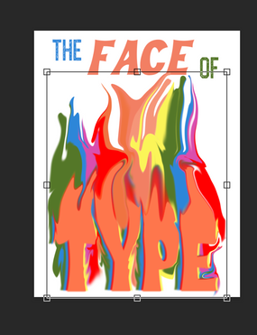
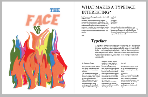
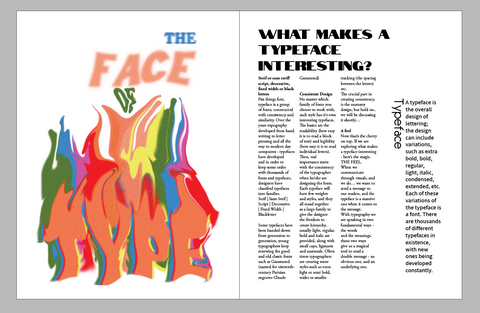
The cover of the article
Most editorial articles have a special article cover, a page or spread which comes before the article and have a special message or image regarding to the article which will attract the readers and make them want to pick it up and read.
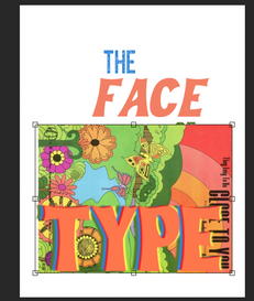
I was working on a psychedelic poster inspired design, I wanted to make something which is psychedelic but still minimalistic.
All images sourced on pinterest.


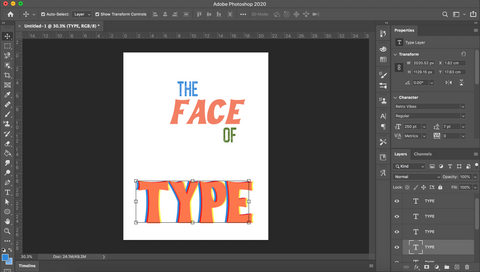
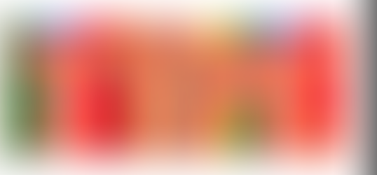
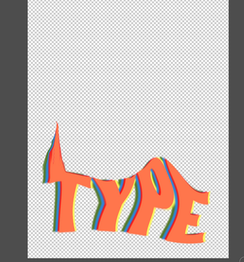
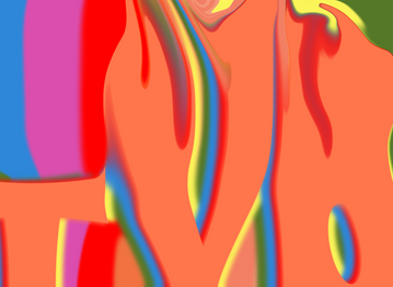
So I was looking for some editorials to learn how to "melt" and play around with text. I decided to name the article "The Face of Type" and used this tutorial to learn how to liqufy my text.
I have used this tutorial, and this one too
I also used gossian blur (TYPE, OF), motion blur (THE) and box blur (FACE), as well nois to all the parts of the sentence, I have used 'Retro Vibes' font in bold (TYPE) and italian bold (FACE) and used cooper std black (THE, OF).
I have made a rainbow of rectangles and liquified them. I made another rainbow layers of the word "TYPE" (apart of the first layer which I kept as it is) and made them filtered with gossian blur. Then I could merge the rainbow layer which I have liquified and the rainbow text which has the blur - so I can liquify them all together. I have also decided to liquify the word 'OF' so it gives another motion for my text. I have added the other blurs to the other text, I had to double layer 'OF' and 'TYPE' so I could keep them readable and only give them the background blur touch. Finalized with noise to all so it gives it a little vintage feel.


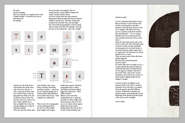
LAYOUT
Now that I have my typography illustration, the anatomy of typography demonstration and my text I can start laying out my article, I have found few vintage images of question marks which I want to use in the last section.


question marks images sources -
I have placed first my cover image and placed my text, I have placed the anatomy of design image too, and started playing with the question marks images.
It was a long play with the layouts, the text had volume so I was trying to find the best ways to keep it looking good.
I have used grids and columns to create good separation of the space. I have used set ragged and not justified because it looked better, and gave it a better flow on the page.
Hierarchy - I chose 'Adobe Garamond Pro' regular 12 pt as my body font. I decided to use the same font with bold italic mainly with all caps for main highlights in the text, I didn't use any subtitles in the main text so I decided to use my "subtitle" size in the hierarchy in order to make the qoute of 'Typeface' bold and noticeable - I've used felix007 36 pt for the title of the quote and 'Assistant' 16 pt for the middle size hierarchy. Finally, the title was something I was thinking about a lot, I wanted to create a slab title which was created from more than one font. I ended up finding 'Notable' and 'Blackoak Std' both regular and 36 pt to be a great combination, it gave it a great vintage feel which was going well with my article cover. On the second spread, I've used for titles - 'Allora' and 'Notable' 36 pt and 'Didot' 36 pt. I have ended it up with a small punch line using 'Notable' again with 20 pt, and a by line using 'Adobe Garamond Pro' italic bold 12 pt . I have also added a page line with the magazine name and issue number 'using Adobe Caslon Pro' semi bold italic 9 pt
I have used a drop cap and I liked the fact it was pretty closed to the text, so I left it that way.
I have added brackets for the quote, using 'IM FELL English SC' 72 pt gray color and 30% opacity


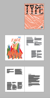


MOCKUP


REFLECTION
This assignment is by far my favorite. I enjoyed learning so much and developing so many new skills in photoshop and InDesign. I enjoy solving problems on youtube search for tutorials, and I surprised myself with my creative abilities. I really see how with every project I do I get better and better and it's pushing me to get out of my comfort zone, learn more, and develop a creative design process.
I also was so impressed I could create my own typeface! I never thought I could! it makes me feel very empowered with my design process and work.


Mình có lần lướt đọc mấy trao đổi trên mạng thì thấy nhắc tới bongdaso.org trong lúc mọi người đang bàn luận về kết quả các trận đấu, nên cũng mở ra xem thử cho biết. Mình không tìm hiểu sâu, chỉ xem qua trong thời gian ngắn để nhìn cách bố trí thông tin, tỷ số và các mục liên quan. Cảm giác là trình bày khá gọn, các phần rõ ràng nên đọc lướt cũng không bị rối, với mình như vậy là đủ để nắm thông tin cơ bản rồi trên bongdaso.org.