5.1 - Exercise: Magazine pages
- Amber Houbara

- Jul 4, 2020
- 7 min read
Updated: Jan 8, 2021
Choose a magazine, newspaper or journal and work out the grid or grids they have used.
You will probably need to look at least four pages to get a feel of the layout.
Measure the size of the pages, the margins, the text columns and the gaps in between them. How many columns do they use? Is it the same on every page?
Can you identify the fonts they use? Do you have it or one with similar properties?
How do they use photographs and illustrations?
How much ‘white space’ on the pages is there?
Draw up a two page spread using the same grid as the magazine. Indicate text using Lorum Ipsum and indicate images by either filling a picture box with a 10% tint or using a picture from your collection.
When you have done this see if you can develop the grid further.
Select a title and images and see how many variations you can come up with.
What happens when you alter the body font or headline font?
Do different kinds of images change the ‘feel’ of the publication?
Do you think the readership for each of your variations would be the same?
Does the image you choose suggest a different design?
Which ones work best and why?
Make notes in your learning log.
Before starting to work, I have done this course on skillshare
in order to learn more about layouts.
Choose a magazine, newspaper or journal and work out the grid or grids they have used.
You will probably need to look at least four pages to get a feel of the layout.
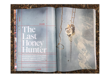
I have chosen National Geographic Magazine.
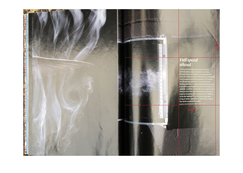
Here are the pages I have checked.
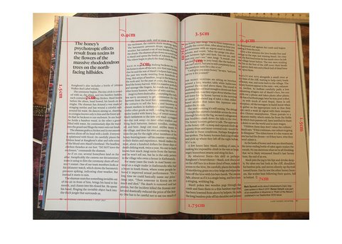
(I have measured on the actual magazine and wrote it on the computer so I don't write on the actual magazine, I didn't want to destroy it)
Measure the size of the pages, the margins, the text columns and the gaps in between them. How many columns do they use? Is it the same on every page?
pages - 25 x 17.5 cm
margins - 1.5 cm outside, 1.25 inside, 3.5 top, 1.75 bottom
text columns - normal body text 7 cm, image caption between 5-6.5 cm, article covers - 10 cm
gutter - 0.4 cm
The number of columns on a page / is it on every page? - 1-2 on most full article pages, 1 on images pages.
Can you identify the fonts they use?
Do you have it or one with similar properties?
How do they use photographs and illustrations?
How much ‘white space’ on the pages is there?
Fonts - I couldn't find the exact fonts they are using, I have used identifont but it came out as Times New Roman, and when I was working with my eye and going through possible fonts I know from the last part, I could see it is probably the closest to the Caslon family. I could see the big titles are similar to a font from this typeface which I have 'CaslonTwoSSK', and the subtitles and body text are similar to 'Adobe Caslon Pro'. They are also using some small caps font of this family, the closest one I have is 'CaslonProSSK'.
Then I have had a deeper look and seemed to me like the body text is more similar to 'NCT Granite'
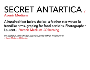
I have also checked the caption and photo credit fonts (and in this cover case, the cover title too) which are a sans serif, it seemed to me that it was the closest to Avenier Medium, I had to redius the kerning to -30 for it to seem similar.
I have used some of the text from the pages above in order to find better the matching fonts.
some interesting articles I have found regarding to National Geographic's fonts
Photographs/ images vs. 'white space' - There is a lot of white space on the article pages, which gives air and calmness. There are a lot of pages which are a double spread of full images but this is because Nat Geo is a magazine featuring a lot of photography and it is one of the main specialties of it. There are very rarely some illustrations, such as on two of my example pages, mostly illustrations of the globe or maps, or in the bees article case - some animals, but there is barely any use of illustration in this magazine.
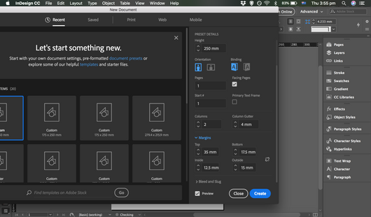
Draw up a two page spread using the same grid as the magazine.
Indicate text using Lorum Ipsum and indicate images by either filling a picture box with a 10% tint or using a picture from your collection.
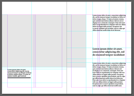
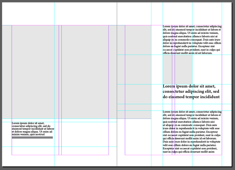
I have chosen to use 2 double page spreads, since National Geuographer has no titles within an article spread, and I know on the next stage I will need to come up with some titles subtitles and develop different feels and articles, so I wanted to have enough verity to play with.
I was really measuring the distances on lines as well so I could have a better idea of leading, font sizes and and measuring the hight and width of each 'text box' so I can be as close as possible to the source.
I have used tinted boxes, to begin with, because I know I will have the opportunity to play later on.
When you have done this see if you can develop the grid further.
Select a title and images and see how many variations you can come up with.
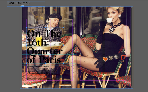
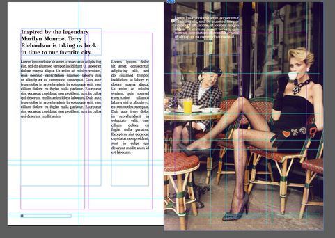
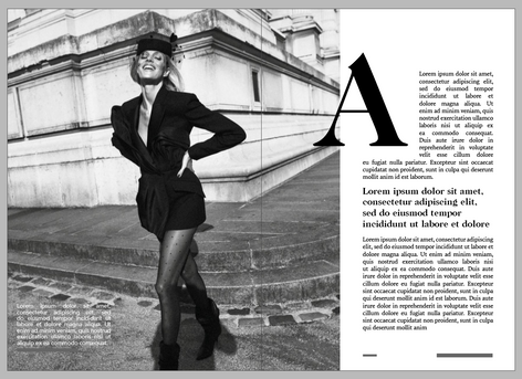
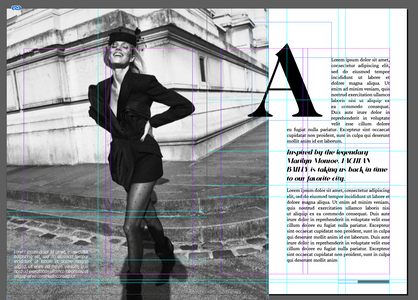
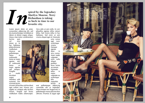
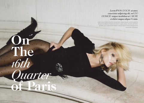
I wanted to make it a fashion magazine editorial, and I called it "On the 16th Quarter of Paris", so I was looking for cool editorial photography from the streets of Paris.
I have found pretty quickly this really stunning editorial photoshoot by Terry Richardson.
and I have found this illustration of Marilyn Monroe through pinterest on flicker I wanted to fit it where the globe illustration was, on my reference.
I have found another good editorial article with great photos so I wanted to change it and see if it will be better to work with the background colors.
Research
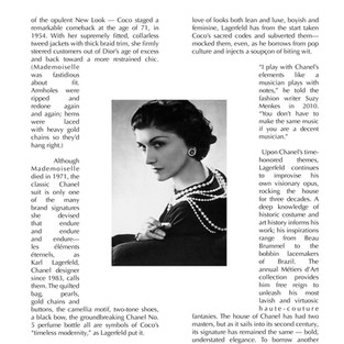
mini research of how fashion editorial magazines use layouts
another image is from google search
In The Process
Golden Spiral Measuring
I have created a golden spiral vector that I'll be able to use on all my future designs, I have colored it as well with different colors so it will be easier to use on top of content and still see the measuring.

Since I have been working on mainly fashion imagery I wanted to play as well with different images to see how it would look to change the images and therefore would it change the publication/ feel/ readership.
FINAL DEIGNS
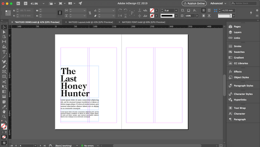
The first demo, the original layout.
The first versions only changing images + title
The second version changing the fonts
The third version changing the layout
The fourth version changing the images, layout, fonts
What happens when you alter the body font or headline font?
Fonts are a great way to communicate different approaches, as I have already learned in the previous part. Therefore changing the fonts change the feel straight away. The first version feels more flat, very simple and clean, the second one feels more chic and stylish, the third one a bit more vintage-looking and the last one more classy.
Do different kinds of images change the ‘feel’ of the publication?
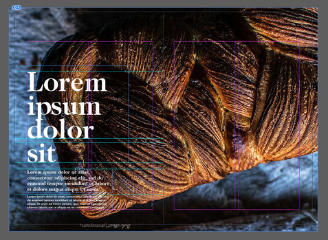
Yes, of course, another communication channel is imagery, images change everything straight away. When I have used the fashion images it was obvious it is a fashion or photography article. When I have used the same original layout with bread images it is straight away changing the topic to a bread article or a recipe or a cookbook. I also used dark and rustic images of bread, while if I would have used light and dreamy imagery of bread, it will change the feel to a lighter and sweet feel even though it is still a bread article. When I was using fashion images, there is a different feel between them as well, One editorial photoshoot is more vintage while the other one is more classy and 'haute couture'.
Do you think the readership for each of your variations would be the same?
No, The first version, when I was using the same grid with fashion images, would look more like a photography magazine or design magazine. The layout is more minimalistic and suites design magazines, while the other versions of the fashion images suggest an editorial fashion magazine design, and therefore the readership would be people who are interested in fashion.
On the second design I did with only images (the bread design), it is obvious the readers would be more into bread, baking or cooking.
Does the image you choose suggest a different design?
Yes, different images always demand the designer to be flexible with the positions of text over images, simply because we need the text to be readable, so even if I used the same layout firstly I needed to change some placements. Also, every publication and readership is different so when we are using different images from different spectrums of subjects, we will have to adjust the layout to the appropriate publication.
Which ones work best and why?
I really love all of them, to be honest, I think I was working correctly and I see how my design skills are growing. If I have to choose one it would be the last one, I think I have designed something fine, classy, and attractive which is following the appropriate guideline of an editorial fashion magazine and brings enough play and creativity. I think it is very attractive and appealing.
REFLECTION
Once again, I've enjoyed learning more about magazine design. I also really liked expanding my knowledge through skillshare, and I decided I will take more courses on skillshare on this part even if it means it will take me longer to finish it.
It was very interesting to see how I took one layout from one magazine and turned it into something completely else from a different genre of magazines.



























































Comments