
5.2.1 Exercise - Judging a book by its cover | part 1
- Amber Houbara

- Jul 10, 2020
- 7 min read
Updated: Jan 8, 2021
Choose a book by an author you are familiar with.
You are going to design two different covers for it,
one using illustrations or photography and the other using just type.
Design the whole cover including the spine and back page.
Include:
the title of the book,
the author’s name,
a brief description of the story
and any other information you think is necessary.
As you are working remember that your design is intended to help a reader know what the experience of reading the book will be.
Is it a serious text book or an off-beat funny novel?
Are the readers expected to be young women or older men and does this matter?
Is it an ‘easy read’ or ‘literary’?
Does the publisher have a house style you need to be part of?
When you have finished critique your work –
which of your two designs do you feel works the most successfully and why?
Make notes in your learning log.
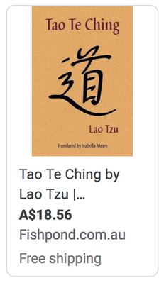
I have chosen the book 'Tao Te Ching' by Lao Tzu it's an old Chinese wisdom book and has been published in multiple versions and languages.
Research
As a part of this exercise, I did this course on Skillshare, "Introduction to Book Cover Design: Making Stories Visual" by Chip Kidd, Graphic Designer at Alfred A. Knopf.
It was very inspiring and I have learned a lot about book design, I was also following his steps of book design in my process here.
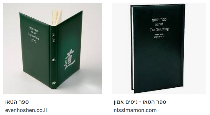
I was looking for the history book design of Tao Te Ching, including the Hebrew version I have next to my bed which has a padded book cover with leather.
I have to say I was quite intimidated by the number of book covers which have already been made and some ideas I had in my mind have already manifested. But I decided not to give up and go on with the challenge.


Tao Te Ching is a book of wisdom, it constructed by short moral stories, each is one-page stories and holds sacred different meanings each time you approach them. It is a very interesting and life-changing book. I have read parts of it several times, it is not a book you necessarily finish, ever.
It is a book that I picked up when I was about 19 and passed it on to my sister who wes younger at the time. It is a book one can read at any age or gender and any occasion, so I had to match my designing to everyone - probably except kids, since it's very less likely they would read it, but it could be a male at 91 or a female at 19 (and vice-versa).
- There is actually a book inspired by it for kids, which is called The 'Tao of Pooh' (Winnie the Pooh).
I wanted to research a bit more about it since I have listened before to great philosophers such as Alan Watts.
I have found this interesting video speaking and quoting of the Tao Te Ching.
The speaker was saying that every sacred text acts like a half-silvered mirror, and it made me think. Spirituality is about understanding everything is within you, and you are a part of the great universe, no separations. So I was thinking to make the cover of just text have a background of a mirror.
Another thing he quoted on this video was "know the white but keep the black" which is quoted on another version as "When one knows the white that is splendor, yet holds on to the black that is humble and lowly." it is speaking of knowing the balance between all elements between feminine and masculine, between heaven and earth, yin and yang - this is when you find enlightenment. So another idea I have had was to use yin and yang but not in a conventional way as the background.


I have made a board of inspiration for book design, especially Japanese book design since I was thinking the esthetics of Japanese minimalism can flatter my designs.
I have listened to another interesting talk of Alan Watts about Tao Te Ching (or Dao De Ching - different pronunciation). which gave me some inspiration. I like listening to him since he is very wise and sharing his wisdom in such an inspiring way.
I read this article about "How to bring Japanese design into your creative work"
Then I was looking for some Japanese symbolism.
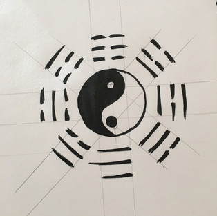
Initially, I wanted to use the Enso which is the Japanese circle a symbol and concept strongly associated with Zen, but as I said before some of my initial ideas were already manifested.
So in the search of Japanese symbols, I came across this article, and there was the 'DIVINATION', which I already have seen on the first video, and other then the yin and yang symbol in the middle I didn't know this symbol.


Another symbol I have found on this link was this one - Kanji dictionary: 禅 (Zen)
meaning - Zen, silent meditation

As Chip Kidd was saying on the course I did, I read some parts of the book again, looking for interesting words or information which can be interesting to work with.
As Alan Watts was saying this book can be 3 things -
"you can take it as a guide to mystical understanding of the universe, you may take it as a dissertation on the principles of nature (a handbook of natural law), or you may also take it as a political book - a book of wisdom for governers (and the principle which it advocates, basically, is the virtue of governing by not ruling)"
This book is definitely using the laws of nature and nature in general as it's metaphors, so nature images or illustrations can be good, images of parts or all elements of the 5 elements - focusing on water, air, wood, and earth (metal is harder to find in nature).
I was thinking of some images I took on my travels on film.
Acording to the only type version, I was looking into placements of the type that I had in my mind and sketched them, and wanted to go further on inDesign or photoshop.
(I have also quoted a few of my favorite quotes on my sketchbook and above)


I have taken the info of this book from this website of Poetry in Translation
"The Tao Te Ching (or Daodejing, in pinyin) is a classic Chinese Taoist text dating from at least the fourth century BC. According to tradition it has its origins even earlier, around the sixth century BC. The title may be translated as Instruction regarding the Way of Virtue. Consisting of eighty-one short sections in a poetic style, the text ranges widely in content, from practical advice to universal wisdom, embracing politics, society and the personal. The emphasis is on the right view and understanding of existence, the Way of the cosmos, and the text sets out to transmit an informed awareness of being that leads to personal harmony. The Taoist inclination to refer to the natural background to human existence when considering the human is widely in evidence. The literary style is terse and often cryptic, so that multiple interpretations of the individual sections are often possible, but the essence of the work is clear, in communicating an approach to life which is in accord with the natural, and so conducive to spiritual tranquillity and resilience."
*Tao Te Ching has been published by an endless number of publishing houses, so I don't feel a special need to match it to a specific publishing house style.
Developing Ideas
So I have already had enough ideas to play around with, I wanted to start manifesting them and see where my work will take me.
As I have seen on this interesting talk interviewing famous book designers, it is many times the mistake you make in the process that makes a good book cover.
I know the English version of Tao Te Ching is smaller than the Hebrew version and I have measured it - 13 x 1.2 x 19.9 cm
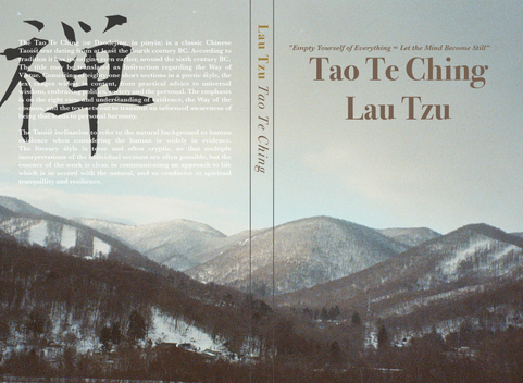
Cover Design using Photography
I have gathered a few images I took on my travels on the East, mostly in Japan. I took them all on my analog Fuji camera and developed and scanned it on high resolution.
I started experimenting with the right fonts and replacements, as well as colors.
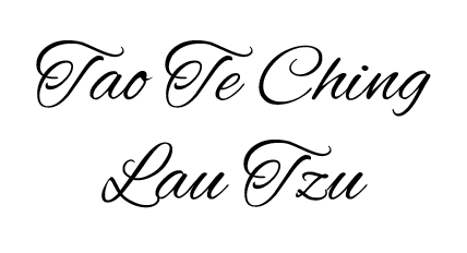
I started with 'Allura' font and matching it with 'Baskerville', Then I decided to go with 'Baskerville' as the title and text, only changing placements, colors and sizes.
Baskerville is a very classic old font, it gives an ancient feeling and wisdom in my eyes.
I have added the illustration I liked of Kanji dictionary and placed it on the back with opacity.
I was playing with colors -
Blue - calming, clarity, wisdom, water and air elements
Golden - royal, mystic
orange - energy, and vitality
brown -realistic hope, mature, nature, wood element, earthy, grounded
I took a quote of the book that I liked and thought was describing the book really well, and added it to the front page.
Elements I was using -
Title of the book
Author name
A brief description of the book
And a quote.
I thought that was the best amount of information to use for keeping minimalistic and 'to the point'.
The placements I did were more by my eyes and to create a flowing similar feeling depending on the images I was using.
While working on it, it reminded me of a book I have picked one time at a book shop in an airport - literally by it's cover. I actually didn't like tha book and ended up not reading it past the first part, but I remembered what Chip Kidd said about Homage, and I was inspired by it on this design.
This bookcover design gave me a calming feeling, a hope it will take me on a journey to China after the contemporary Chinese Hermits and teach me about inner peace and joy.


Final Designs with photographs


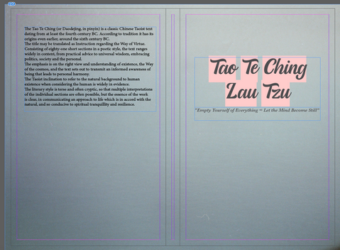
Cover Design Using Illustration
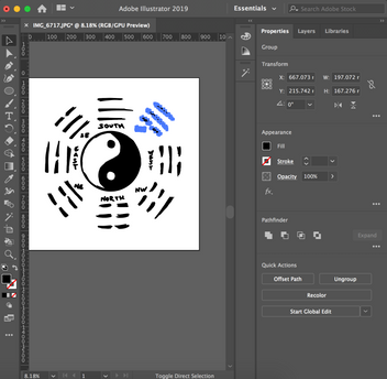
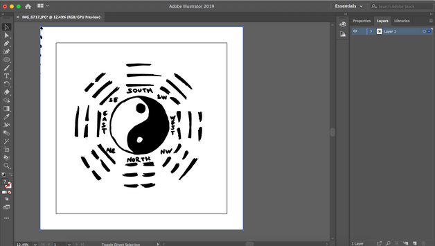
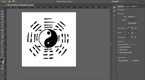
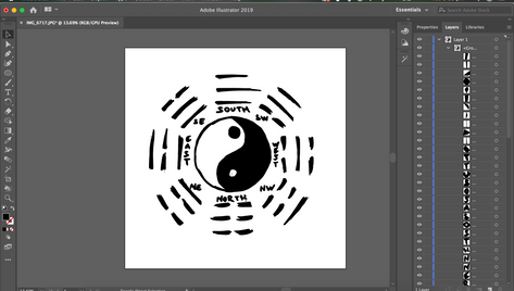
My second idea was using the 'DIVINATION' (Onmyodo) symbol. I wanted to sketch it and bring it into the computer and work on it to


Then I took it into the computer using Adobe Illustratior
I have traced it using image trace, I have worked on it but I wanted to keep the 'sketchy' feel, like it was illustrated by hand maybe many years ago - to give it a mysterious feel.
While working on it, and my eyes were already catching every book design near me, I have spent a couple of days at my partner's parents house, and I picked up a beautiful book that have caught my eyes on the living room table -
I really liked the colors and the mysterious design, and it inspired me to play with offwhite, black and a faded kind of red.

So I decided to change the colors on the outside to mystic faded red.


Then I took it to indesign and worked on the design of the layout.
I was looking for the right font 'Trattatello' was really cool and also had a Glymph of CH which gave it a circle feeling (the Japanese Enso I wanted to add in the beggining).
I made the quote big and with opacity on the top left back, and kept the illustration I liked of Kanji dictionary at the back, but shifted it down to the center, and added a small one to the bottom of the spine too.
I wanted to give it a tinted background, something offwhite-beige color. I have found the right color and gave it 40% opacity.
I chose Bodoni 72 for my backgrouns and spine text font.


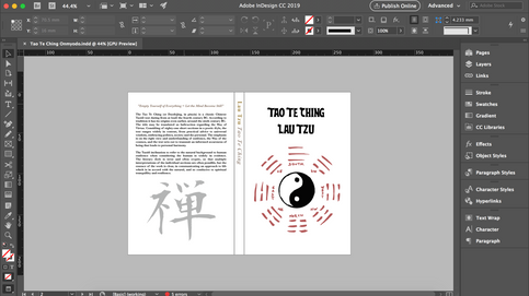


Final design with illustrations

Continues on next >>


Comments