
5.2.2 - Exercise: Judging a book by its cover | part 2
- Amber Houbara

- Jul 17, 2020
- 5 min read
Updated: Jan 8, 2021
Choose a book by an author you are familiar with.
You are going to design two different covers for it,
one using illustrations or photography and the other using just type.
Design the whole cover including the spine and back page.
Include:
the title of the book,
the author’s name,
a brief description of the story
and any other information you think is necessary.
As you are working remember that your design is intended to help a reader know what the experience of reading the book will be.
Is it a serious text book or an off-beat funny novel?
Are the readers expected to be young women or older men and does this matter?
Is it an ‘easy read’ or ‘literary’?
Does the publisher have a house style you need to be part of?
When you have finished critique your work –
which of your two designs do you feel works the most successfully and why?
Make notes in your learning log.
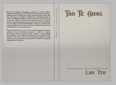
After I have got my options for the book cover with illustrations or photographs, I continued to work on the cover with type only.
I had this idea as I have mentioned before, to create a type for print on a mirror paper.
I have looked online and asked around to know more about mirror paper

I have found that there is such a paper, also on links like this one
I also went to the arts and crafts store and got a mirror paper to print on. Unfortunately, my simple printer couldn't print on the gloss coating, so I have contacted a couple of printing houses to see if it possible and maybe get my design printed.
I have received 2 options but they were about 100$ to print only one design, so I decided to not print it, but I know it is possible for mass production and I can keep my concept and go on and work on it.
I actually was already thinking of how to solve this problem and maybe create a book jacket which would be on 3/4 of the actual book while it's possible to see the title and author's name and the rest would be covered by the mirror. - But I have received the approval it is possible.

I have used a tentative image of a mirror from Canva stock while I was designing, I wanted to try and take a picture of the mirror paper I have but it would reflect everything I was placing it against, for instance the sky (which I thought could have been another cool concept but not for this book).
*I was thinking to scan it, but needed to wait for a printer so was working on the tentative image in the meantime.
I know for print I would only need to design the type and layout and the paper would be the mirror one, but I wanted to show it here of how the final product would look.


My idea was to show the face of the person who's reading, so he can see a reflection of himself/ herself and feel the experience of truly diving deep into his own soul, 'look himself in the eye' kind of experience.
I also wanted to create a dynamic feel of infinity, so I designed the front and back text to be top left and bottom right, so kind of completion, infinity, yin and yang.
The silver paper also gives it a sense of glowing truth and expensive knowledge.
I have found the font 'Caravan 01' for the title and author name, and have used 'Charm' for the quote and spine. For the back, I wanted to see how a sans serif would look like, and I picked 'Avenir Next'.
The quote and author's name is like leading the reader to go into the book.


I've scanned the mirror paper but since there was no light inside the scanner it didn't come up as shiny as I wanted, I was trying few times to lift it up while scanning but still I didn't get what I wanted.


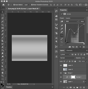
I decided to take the first scan, and add a chrome gloss to it on photoshop.
I was using these tutorials to learn how to create a chrome effect to my background, and I was basically using both of them in 2 different layers, one was gray gradient and the other a brightened version of my scan, I have used the blur tool and filter to soften the scratches and fingerprints which were on the innitial scan, and then used the gradient layer as a screen and 70% opacity to the main layer.


Then I took it back to my initial design, and I decided to see how would it be to make it embossed or cut out from tha mirror paper, since I was talking on the phone with another printing house that said it is possible too.
I was using this tutorial to learn how to make a paper cut and from that I have figured out the ebmoss.
I was playing around with it until I was satisfied.
I have added the subtitle "a self-reflective text" so people would understand better why do they see themselves through this mirror.


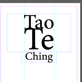
Final Design Only Type with Mirror

Just in case the first design idea wasn't going to succeed, I wanted to challenge myself with another design.
I wanted to play with type only and create something interesting.
I wanted initially all the words separatly other than the author's name and that they all would fit the same width and therefore would have to be in different sizes, but then I decided to push myself further and use multiple fonts and sizes.
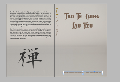
I have decided to use an orange background because orange is a very spiritual identified color and it gives us a sense of eastern wisdom and calmness.
I have a book I really like in Hebrew called 'The Eastern Wisdom' and it is orange and when I read from it I feel really calmed and philosophical. It actually has a really nice fabric on its hardcover and a nice emboss.

I have used 'The Baghotta Script' for "Tao"
'Walpurgis Night' for "Te"
'Luminari' for "Ching"
and 'Gabrielly Script 2' for "Lau Tzu"
I have used the back text with 'Baskerville' again and the spine and quote at the back with 'Walpurgis Night'.
I think it all together gives it a sense of mystic wisdom and ancient knowledge but still with a modern touch and relevance.


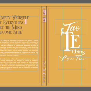
Final Design Only Type

It was a very hard decision, I really liked the images, illustration and type. I think the design I like less than all is actually the mirror one, maybe if I have had a bigger budget of a publishing company to try and see how it would actually look to make raised or cut out lettering on a mirror paper, on the cover or even as a cover jacket.
I think out of all of them the orange type design looks the most proffesional.
So I have chosen this one as my final design.


REFLECTION
This task was a little bit challenging for me as I had an idea and didn't manage to manifest it as I wanted to. I was confused as well as many images I was using fitted my idea of the photography book cover design and didn't know which one to chose. I also enjoyed drawing the Chinese symbol and working on it in illustrator and developing my skills again.
It was also really hard to chose one design out of all of them, but eventually, I'm happy with my final design.


Comments