
5.4.1 - Exercise: Birthday list
- Amber Houbara

- Jul 18, 2020
- 4 min read
Updated: Jan 8, 2021
Brief
For this exercise, you are going to make up a poster list for yourself.
It is intended that you keep it pinned to a noticeboard or wall to remind you of the dates and as it will be there a long time, it needs to look good.
Start by collecting all the birthdays of your friends and family.
You’ll need their name and birth date,
to decide whether or not you buy them presents or just send a card, text message or email. When you have all this design a page to include all this information for example:

Now you design your own ordering the information that best suits you
and including as much additional information as you would find useful.
Research
I have started by collecting all my big family data (I wanted to collect as many family members from all sides to have a big family board so I never forget any birthday + I could ,later on, divide it into families and share between them!)
In the meantime I was looking for some birthday list designs, and forms, tables and lists designs in general. I have created this board on Pinterest to collect some ideas.
Then I was actually pretty disappointed and uninspired from the designs of birthday lists available on the web (google search didn't come up with anything more inspiring)... So I was thinking about what can inspire me in this project.
I was looking into bullet journals since I really like the designs of them, they are naive and so cute - and their organizing way of data and lists and forms design is really cool in my eye.


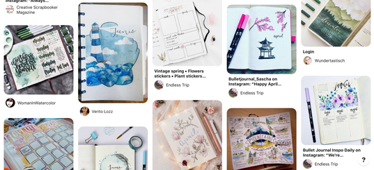
Then another design style that I was looking at was this minimalistic color boxes and type style of design, There are a lot of them in a cool platform I like called Creative Market.
Here are few examples I have collected
(Sources within the gallery)


Even just from looking at the presentations, the cards on top of this block of mute kind of color background, the shadow behind the cards, the shadows of plants on everything, the textures of the background this style of design and layout was inspiring for me.
So I started sketching.
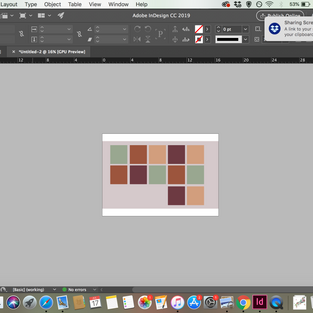
Sketching
I started by a very convensional way of organizing the months on a grid. It felt too boring to me so I was thinking way not having all boxes in different colors and in different hightseven overlapping each other a bit. I wanted to illustrate the small vectors for "email" "present" "phone call" and "postcard" and then have small boxes to tick.


Developing Idea
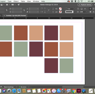
I was looking for some muted colors, something like autumn colors, to use in my design.

I have opened 2 documents of A3 for a poster on InDesign, one horizontal and one vertical. I wanted to explore and see which I will prefer as my design.
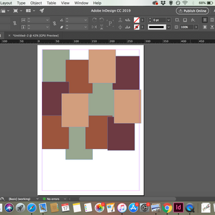
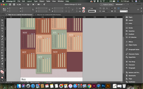
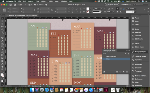
I started exploring my space, I created 12 boxes on each of the documents and used a background on almost the whole document - I wanted to have some white background on the edges. I put my title and started exploring with layouts. The vertical one I have made the boxes longer and overlapping each other while with the horizontal I was using square boxes and a very organized grid.
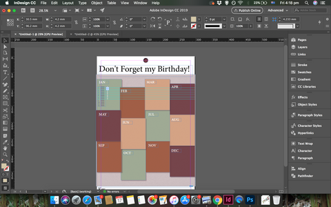
I have added another important element, the round shape at the top is a space for people to pin it to the wall. I have seen already on my previous exercises when I went to the cafes around and took photos of brochures, which were pinned, that some designers knew to leave space there for the pinning tool and some didn't consider it into their design and therefore the pinning tool have disturbed the title - which is really not a good idea!


Background texture
I wanted to have the background as a paper texture so I went to photoshop and created a paper texture using this tutorial -How to make paper texture on inDesign


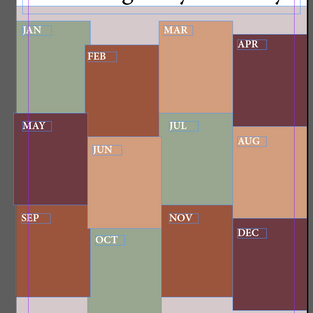
Keep developing my ideas I preferred my vertical grid so I kept developing it. I was creating the month's titles and creating drop shadow for the boxes so they have a floating feel.
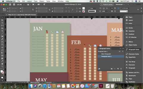
I have added the space for numbers of the month and names, and also the boxes.
I have also chosen a font - 'Gabrielly Script 2' regular for the titles, 'Alice' regular for the months and 'La Belle Aurore' regular for the names and numbers.


Illustrations on illustrator
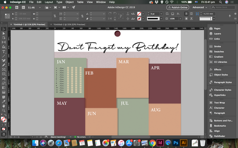
I opened a document on illustrator and created quick and cute vectors for my design, I wanted them to look naive and cute, so I made them mainly by one stroke- without lifting my hand from the pad (only used another stke for elements I had to).
I've used very light colors to fill them.


Keep developing the design on illustrator
I have placed the vectors on my InDesign document and copied the month arrangement with all the numbers, names, vectors, and boxes.
I have arranged a key to make sure to not be confused by the vectors - and also because I have promised my family I will give them all a copy - so I didn't want them to be confused.
and I have added some lines using paragraph style to have empty spaces for each person to add more down the track.
At last, I have added all my data - dates and names.
I also decided to give the white background a very light shade of pink so it is not too white.


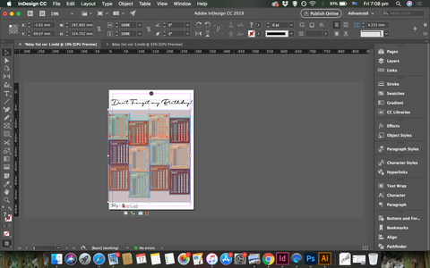


FINAL DESIGN

Mock-Ups


REFLECTION
Another great exercise to be creative and work with multiple softwares. I enjoyed preparing the little vectors and really think through how to make this design attractive, contrary to the designs I have found in my research.


Comments