
5.5.2 - Exercise: Poster and flyer | Part 2
- Amber Houbara

- Jul 24, 2020
- 5 min read
Updated: Jan 8, 2021
The Brief
This exercise is about how you deal with two different spaces to work in. You have been asked to design an
A3 poster
and an accompanying double sided A6 flyer
to promote a singing course run by an organisation called SingOut (all one word).
They have very little money so want to print these posters on their black and white photocopier.
You can use a colour paper if you want.
You may want to include an image such as a drawing or photograph,
but be very careful with photos as they tend not to reproduce well on a photocopier particularly if they are colour photos.
You will need to check by printing off your design and/or photocopying it.
The information they want to give is:
Do you love to sing?
Join us for an exciting opportunity during the day with a professional vocal coach.
Learn to sing different types of music, vocal techniques, meet new people and have fun!
10.30 to 12.00 every Tuesday from 11 March
The Community Centre, Charlotte Church Road
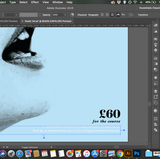
£60 for the course
No experience needed/no requirement to read music
For more information call 011779 8765432 www.singout.com
The first thing you need to do is work out if you have all the information you need to fulfill the brief. If not what is missing?
Work out the hierarchy of the information.
How will you divide your information up to fit on both sides of your flyer?
How will you link the design for the poster with that of the flyer?
How can you make the poster eyecatching and effective with such a limited palette?
Which typeface or faces will you use and why have you made that decision?
When you have finished pin your poster up and critique your work.
What do you think?
Keep notes and sketches in your learning log.
Work out the hierarchy of the information.
My hierarchy was -
First
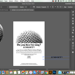
Do you love to sing?
Join us
Singout
Second
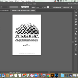
When and Where
Third
Everything else
New Design process

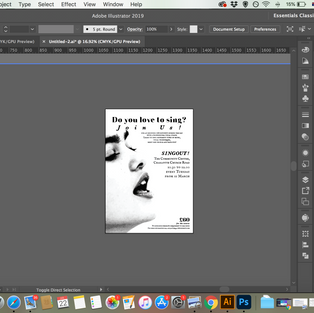
I have found a microphone image on Canva stock, and I could modify it by filters to black and while, I was experimenting with photoshop filters too, but the effect I have got on canva was really cool, it created some liquified black and white stripes and I wanted to experiment with it.
I took it to illustrator this time and started fresh. I wanted to create a spiral like look of the big letter singout in the background transperent, but it didnt work so well in my eyes on the "digital sketching level" so I tried something else.


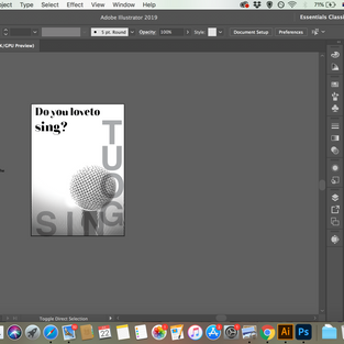


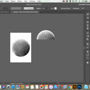
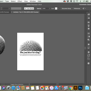
Another idea I had was to create a half-round shape from the microphone and make the text wrap like the other half, creating a round shape together.
It actually finally worked as I wanted, so I kept developing this idea.
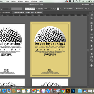
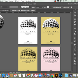
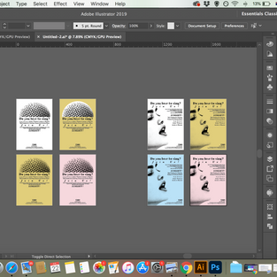
I have also tried different background as color paper to see how it looks.


I still didn't want to give up my initial idea using the black and white singing girl and decided to come to it with a fresh mind on illustrator.
I basically took my type arrangments from the previous design and decided to give it a shot and play around on the canvas.
I actually really liked my results!
When I have shown my designs to my family to get feedback, my mother has pointed out that if she didn't see the fact that if you don't have the previous experience you can still come, she would think it is not for her and walk away, so she has recommended me to make it bigger or bolder.
I have to say that was probably one of my challenges in this project, to find what's important because there was quite a bit of information. I have tried to make it bold, with a box, making the text slightly bigger and changing the font, but I didn't want to mess with my hierarchy too much.


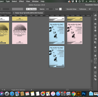


Mock-Ups and Decision Making
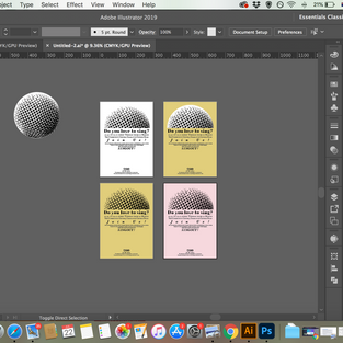
I have mocked my favorites up and was trying to do some decision making.
My family all said they prefer the blue paper and the singer girl so I decided to go with it, I didn't like so much the box I have created to highlight the details in the bottom, and as not everyone (including myself) have agreed with my mother's opinion, I decided to keep the cleaner version, which was without the box.


Flyer
How will you divide your information up to fit on both sides of your flyer?
I think the idea of a flyer is firstly the front page to attract you in, then the second/ rest of the pages provide all the other information.
I wanted to challenge myself and create a 2-3 folded flyer but there was not enough information in my eyes to fill all those pages and space(with still keeping loyal to my poster design).
So I decided to do a simple double-sided flyer and fit the first inviting information on the front "Do you love to sing?" "Join Us" "Singout", while it's enough to interest the reader to go in, also, my "singout" title is giving a dynamic feel of going in/further to reed more.
On the other side, I have provided all the rest of the information, being loyal to my poster design.
How will you link the design for the poster with that of the flyer?
Using the same elements - image, fonts, relative sizes, and on the front page the same placements.
I gave the back page transparency of 5% for the image and the title "do you like to sing"
How can you make the poster eyecatching and effective with such a limited palette?
I don't think that eye-catching is about the color palette, I actually did like very much working with black and white, and some esthetics when they are done right and well are far better and more eye-catching on black and white. I think that the image was a good element to use in order to catch the eye, and using big titles with interesting fonts in the right layout too.
Which typeface or faces will you use and why have you made that decision?
I have made a decision by experimenting.
I wanted some type that will associate with Jazz and high contrast between strokes is a good one, as well as ink-based faces in my eyes.
I have used 3 main fonts - 'Kenarock by undercoster', 'Galley', 'IM FELL English SC'
I think they are communicating well together, and I like the total feel they are giving.
To summerise, I think the use of ink like image and ink like fonts can only get better with a cheap photocopy print, because it is rustic and cool, rather than fine.
My Process
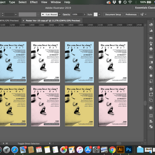
Flyer Mock-Ups


Finals & Printing
poster


Flyer


When you have finished pin your poster up and critique your work.
What do you think?
Keep notes and sketches in your learning log.
I am actually SO HAPPY to see it printed it looks so good, so clear and I really like how the shades of grey are printed so nicely even in a cheap photocopy print

REFLECTION
Another very challenging exercise, it was really challenging for me to find the most important information and work on hierarchy, adding the right fonts and sizes, and then using elements that will all look good in black and white. I think I usually love color so much that black and white can be out of my comfort zone and it was really empowering to overcome this discomfort.


Comments