
5.6.1 Exercise - Chance Housing Association | Part 1
- Amber Houbara

- Aug 3, 2020
- 5 min read
Updated: Aug 4, 2020
The Brief
The Chance Housing Association has been set up to try and help first time buyers (audience) get
onto the housing ladder (aim)
and they want you to develop a brand image for their stationery.
It is important to them that the Association is seen as being different from the other local housing associations – more modern, more helpful and definitely welcoming to young people wanting to buy a house.
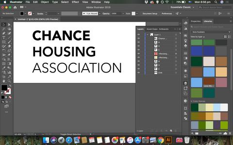
They want to use their logo on their letterheads and office stationery and it will also be used somewhere on the sheets that hold the property details. It also needs to be reproducible in the local newspaper and professional trade magazines. (mockup)
What to do
• Research other housing associations’ and estate agents’ styles.
Look at other publications designed for a similar audience.
This information should help you identify as much what you don’t want to do as what you do.
• If this was a real job you would need to visit the housing association’s offices and website, if it has one, to see how many decisions they have already made – for example they may have painted their sign silver and dark blue and used a particular font.
As the designer you may want to continue with and develop those decisions or change them.
• Using just typography sketch up some designs.
You want to come up with at least three initial ideas to show the client.
In this instance you can decide which one you think works best to further develop.
• Mock up a letterhead and business card using the logo and house brand.
Look in you local newspaper and mock up an advertisement to fit in the paper.
Measure the space carefully remembering to leave sufficient margins so your text isn’t cramped. Photocopy in black and white onto cheap paper – does your logo still work?
Have any fine lines got lost?
Are the differences between colours still discernable?
• Show your designs to your friends and family. What is their feedback?
• If you need to, go back and adjust your artwork.
If all is well make up a presentation pack to show the client – in this instance your tutor.
Keep all your work and record the process in your learning log.
Research
First of all I wanted to be clear and know what is the aim of a housing association.
By Wikipedia - Housing association
"In Ireland and the United Kingdom, housing associations are private, non-profit making organisations that provide low-cost "social housing" for people in need of a home. Any budget surplus is used to maintain existing housing and to help finance new homes and it cannot be used for personal benefit of directors or shareholders.[1] Although independent, they are regulated by the state and commonly receive public funding. They are now the United Kingdom's major providers of new housing for rent, while many also run shared ownership schemes to help those who cannot afford to buy a home outright.[2]"
I have done a couple of interesting courses on skillshare for this task -
Logo Design with Draplin: Secrets of Shape, Type and Color by Aaron Draplin, Designer and Founder, Draplin Design Company
Visual Research
• Research other housing associations’ and estate agents’ styles.
Look at other publications designed for a similar audience.
This information should help you identify as much what you don’t want to do as what you do.


A very interesting project "BRANDING AND GRAPHICS FOR HOUSING.COM, INDIA'S NUMERO UNO REAL ESTATE PORTAL." by Animal on Behance


This is an un believable series I have found on my research and I just loved it! I think it is so sophisticated yet so simple and so witty!
I really got inspired from it, it is really different from everything else I have seen and I think it can be a great gateway to get away from all the super old imagery of house associations and real estates.


Sketching and brainstorming
• If this was a real job you would need to visit the housing association’s offices and website, if it has one, to see how many decisions they have already made – for example they may have painted their sign silver and dark blue and used a particular font.
As the designer you may want to continue with and develop those decisions or change them.
Since it is not a real job, and unfortunately I can't receive information from the actual "brand" or company, I will have to do complete this spared in my own way / work.
• Using just typography sketch up some designs.
You want to come up with at least three initial ideas to show the client.
In this instance you can decide which one you think works best to further develop.
I have started sketching and brainstorming.
I wanted to create 3 initial ideas which were -
first one extreme
second moderate
and third one very conservative and simple
I saw the house/ roof/ door elements are very repetitive, in one way it is a bit too "chewed" on another it shows me it works. shapes like rectangle and triangle work well in this genre of housing and real estate.


Digital sketching


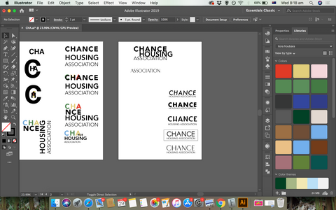
3 initial sketches ideas
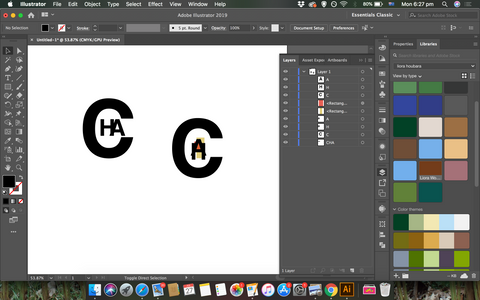
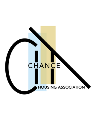
I have come with 3 ideas, one is very conservative, only type.
one is a bit more sophisticated, have the house shape using the H letter while it also has an arrow shape going up.
The third one was more sophisticated, I was using the letters CHA of the "chance housing association" to create a house like shape, but it was more modern and sophisticated rather then the second one which was a bit more simple and straight to the point.
I was consulting with my family, and one half have said the middle one was better because it was more simple and straight to the point, but the other half said the more extream version is better for the audience and the task. I have felt like my heart was more with the third option since the second one have felt to me not so interesting and that it has already have been done in the past in one way or another.


Developing
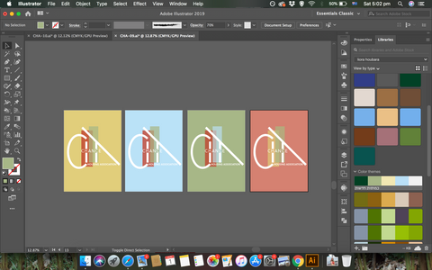
I wanted to create something that will be good in black and white but will get more depth in multiple colours and arrangements.
I wanted to use shapes such as triangles or rectangles as I have described before, and I have worked that two long rectangles almost overlapping each other are giving a great feel of growth and youth, while the actual shape of the lettering is giving an almost scaffolding / house shape,
I was thinking from the beginning about 4 colours - red (power, excitement) blue (trustworthy, strong), Green (fresh, peaceful, growth), yellow (young, hope, optimism). But I didn't know how to combine them together. then by trying different things I have realised the logo I have created is so dynamic I can have it as a concept and it can work with all my colours in different combinations.


Comments