
Assignment five - Promotional design - Abigail's Party | Part 1
- Amber Houbara

- Aug 30, 2020
- 6 min read
Updated: Jan 12, 2021
Brief
A youth theatre club is performing a production of Abigail’s Party.
Mike Leigh’s tale of suburban taste is set in the 1970s and explores middle class aspirations and preoccupations.
You will need to acquaint yourself with the play if you don’t know it already,
as they are particularly keen for it to have a 70s feel.
The play will be touring local theatres for a month,
performing every Friday night and Saturday matinee.
Produce
a poster (A3 portrait),
a flyer (A5 landscape, double-sided)
and newspaper advert (A6) to promote this event.
In addition they would like their A5 programme cover to continue the design theme.
For the purposes of this brief you need to invent
dates,
times,
places,
names
and any other information you think will be required.
Use Lorun ipsum text for areas of body text.
RESERACH
To start with, I have watched the movie on youtube -
plus read on Wikipedia and a couple others articles, to learn a bit about the meaning of this play.
As a theatre student in high school and a theatre enthusiast, I was growing up reading plays instead of books, checking and watching most plays on the local theatres on a regular basis and later on also learning about the history psychology and everything else about the theatre's world.
It is known that plays, just as movies have a great agenda behind them and this time it was a big one.
Courses on Skillshare
Articles read
Truly Radical: The Electrifying Graphics of 60s and 70s Club Culture
A Look at Graphic Trends That Define the 70s (Retro Fonts, Text Effects, and More!)
https://thenextweb.com/dd/2012/01/27/design-flashback-13-delicious-posters-from-the-1970s/
Kiss the sky: psychedelic posters of the 60s and 70s – in pictures
Mike Leigh on Abigail’s Party at 40: 'I was sure it would sink without trace
Visual research
Google Search for Abigail's Party previous posters, 70's patterns and designs.


Theatre Posters
Retro Poster Designs
60-70's psychodelic era
Graphic Design - 70's Patterns

Sketching Ideas and brainstorming
Color research
Eventually I have found a great colour palette I really liked, and focused on all colours I wanted to use for a 70's look. I was concentrating on the red-orange colour to represent passion (which is a big deal in this play), the faded turquoise is almost a 70's associate, and the combinations of them together is such a 70's mood. The rest of the colours are more complimentary.
*During my work, I was really inspired by letterpress printing, and therefore I ended up almost sticking to 3 main colours - the orange-red, the turquoise, and the dark blue. since in letterpress printing it is common and more economical to use 3 colours, and using overlapping of them to create other colours. (I have mentioned almost, since on the pain logo of the event which is a typeface logo, I have used the yellow shades too to create contrasts).
TYPOGRAPHY RESEARCH
As mentioned above, I have done this course on skillshare - Branding Culture: Making Your Event Stand Out from the Crowd by Tom Muller, Owner, Creative Director at helloMuller
Since I knew I want to create the element separately for this task, I had a feeling this is not only about making a design which will be consecutive, there is some sort of branding here. When I came across this course I was really interested to know there is such thing as event branding! and it made me want to delve deeper into it.
I have learnt the first thing to do is the event logo, so I knew I wanted to create an event logo which will be typography based. The typography in the 70's is so inspiring artistic and creative!
you can see on the boards and articles I have read above most of my research about typography in the 70's.
So I wanted to know how to create my own lettering inspired by the 70's, and then I did this inspiring course on skillshare - 70s Lettering by Liz Kohler Brown, artist | designer | teacher | author.
(It actually made me interested to work in the future with tablet and procreate)
I started sketching, and the element that I really got inspired by was the groovy, edgy rolled and spikey at the ends style.


Sketching Ideas and brainstorming
While learning the course about event branding, watching the movie and a lot of researching, I have sketched some ideas and wrote some notes.
I wanted to find visual elements to complete my logo as I have learnt, and wanted to have a really cool idea to bring this play to the visual realm. I was really inspired by the artwork above by Aleksandra Kingo and really loved how she took important elements from the play and put them together into a very identifying and 'expressionism' inspired way.
Something in me wanted to stick to the kitchen tiles, to represent the suburbia's 'dream' - the big house, the best car etc. I was planning to maybe use the 70's kitchen tiles pattern as the background, but I felt like every design that I have seen of Abigail's Party - had this cool 70's pattern in the background and it wouldn't really be any different.
I was thinking what was it that really recognised throughout the show - the cigarettes and the gin and tonic were great elements. I was thinking to maybe create an old Gin commercial inspired poster.
Another idea i had was to use the cigarette as 'put down' like the evening was going down, or lemon squeezed on a gin and tonic - as it's sour - and the evening was going bad.


Tutorials
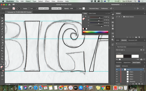
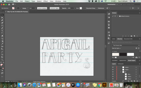
Developing the Lettering
I was using some tentative patters to see how my design can fit a 70's pattern / colors mood.


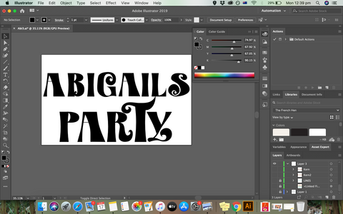


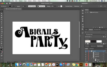


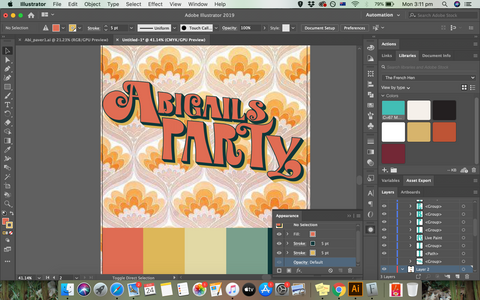


I have decided to match the font "Calderock" as my matching typeface for sub titles and body. it has few versions as stamp, hollow, inky and edgy. all create such a fun 70's letterpress mood.

*I have to say, that I felt a bit stuck at some point because of too many ideas. taking a break of few days let my mind and eyes be more clear about my design process.
Trying different ideas
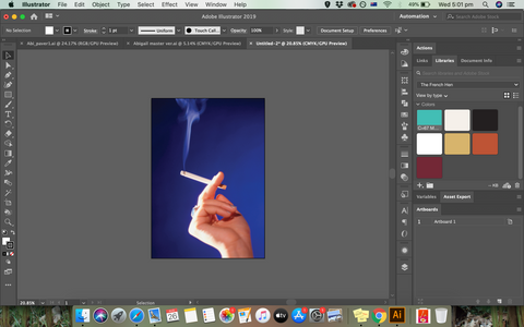
I wanted to try and create a solid color illustration of a woman's hand with a cigarette, or pictures to create a picture based design.
I was really inspired by letterpress printing as I have mentioned before so I wanted to create something illustration/ photo based.
I was looking on Canva stock images for some images.


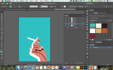
Working with illustrations


Working with images


I really liked the illustration, but the image design attracted me a lot more, it was just like a letterpress design from the 70's and I was also very inspired by Paula Scher's work for the Public Theatre.
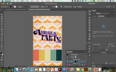
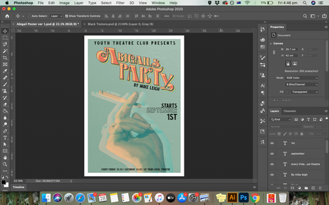
So i decided to keep working with the images, I think the effect of the triple printing of the image, not only gives it a vintage look, but also makes a 'dazed' feeling, since during the night everyone are getting more and more drunk.
The cigarette lifting up is more representing the 'suburbia dream', the pretentious living - everything is 'cool' and good. while the leg putting down the cigarette is more representing the end of the night and that 'things went wrong'.
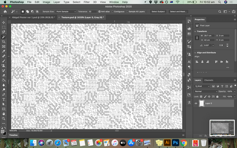
I have used a texture I took of my kitchen wall, grayscaled and bitmaped it and divided the white and the black. as I have learnt on this inspiring course on skillshare - Poster Design: Textures and Halftones for Screen Printing by DKNG Studios, Design + Illustration. those guys really inspire me with their work too. they are doing event music posters and I have done their first course a couple of exercises ago.
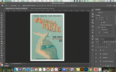
from here I was creating the flyer, the advert in the local newspaper and the programme.
While working on them I actually changed my poster design, so I will add all the final ones at the end, in the next post.


Comments