
CBD | P2 | AS2: Form and function Part I
- Amber Houbara

- Feb 13, 2022
- 8 min read
Brief
Design the book format and cover artwork for two different versions of Daniel Defoe’s classic 1719 novel Robinson Crusoe.
The publishers, Viking Press, have decided to re-release this title as a new pocket edition
for readers on the move
that reflects the adventurous nature of the story within a contemporary setting.
This paperback version should have a modern visual feel that can compete with new titles in the bookshop.
They also want a deluxe edition
for armchair readers and classic book collectors
that references the historical nature of the story and its associations.
Produce book design ideas and cover artwork to reflect the content of the story across both formats and contexts.
Be creative and inventive with both the look and format of these books.
As a side project to accompany the re-release of Robinson Crusoe,
Viking Press has also asked you to design a new book called Washed ashore: The ultimate guide to surviving on a desert island by Rik Bennett.
This is a ‘how to’ guide
that should reflect not only the practical advice it offers, but something of the adventure of being a castaway.
The scale, stock and binding of these publications are up to you.
The pocket edition needs to celebrate the functionality of the book as a lightweight, transportable object, and to connect to the story’s travel or survival themes in a contemporary way.
The deluxe edition can present the content in a larger, finer, more luxurious, considered or expanded way, that perhaps makes reference to the history of the book itself.
Your designs need to be seen as part of a series across both versions, so think about how you adapt your designs to fit each format.
The shipwreck guide needs to be seen as a separate genre, piggy-backing on the success of Robinson Crusoe.
Develop visual ideas that can distinguish the survival guide from your Robinson Crusoe designs, while at the same time making some thematic connection between them.
Your design should include the front, back, spine and flaps of your covers - if you opt for a traditional book binding.
You can also come up with alternative ways of binding, and therefore designing your books if you want to.
Generate your own illustrations, photography or artwork for the covers, source copyright free images, or treat the covers purely typographically.
This is an opportunity to be creative with both your design thinking and outcomes, so experiment, and test out a range of visual and physical options.
You may want to extend your project by also designing a number of sample pages from the inside of the book. When creating sample pages, try to make a link between the cover design and the design of the inside pages.
Present your ideas by mocking up each of the books and their covers, and by presenting the overall spec of your designs (what paper stock you are using, etc.).
Work through the design process, documenting it in your learning log as you go. Use rough drawings, notes, diagrams, mock-ups of your books, photographs of what you’re working on, and by saving different stages of any digital work to show your process. Talk about your creative process through notes and reflections.
Early notes
I like usually to read my assignment well in advance, so I can plant some seeds in my creative mind.
I have read my assignment brief and I'm writing myself some ideas and notes.
For the pocket book, I'm thinking about using a photograph of a jungle, to enhance the mystery and draw people into the book and the story.
For the survival book, using a photo of myself when I was camping by myself on a remote island, or using leather and sewing on it, as a feeling of a lost knowledge book, or a treasure box. using a 'fancy-old fashioned' binding and a thick old paper.
Scale & Sizing
Pocket Book
I have started with exploring what is considered to be a pocket book and how should I scale the pocket book.
Here are some articles I have read -
I think A6 will be good for the job.
Binding wise, as it is not going to be a thin book with little amount of pages I think perfect binding will be good to hold it together.
Soft cover will be great, and I am thinking about a slightly thicker paper for the cover (almost like a passport), but that might be a bad idea in case of travel as the book should be able to bend and be soft in the bag / pocket. around 300 gsm
Paper will be around 80-90 gsm
Deluxe edition
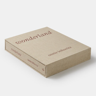
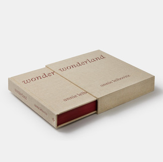
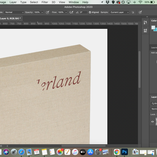
I have few ideas in mind, as luxury editions can be more pricey I thought straight away on 'Phaidon' books from my research on designers. I have seen their very new book of Annie Leibovitz - Wonderland as I would love to have the book in slipcase. In addition, as I am obsessed with cloth covers, I think it will be brilliant to use the cloth on the cover and then I realised the cover and slipcase of Annie Leibovitz's book is cloth!
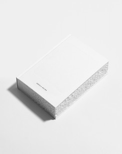
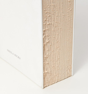
The final detail which can make it epic in my eyes is another thing which came from my desginer research - Irma Boom's book about American textile designer Sheila Hicks, the edges of the paper are torn and I think it will give it a castaway feel!
I have checked the measurements of Wonderland's book and it is 330 x 250 mm
As I'm designing quite a large cloth covered hard cover with a slipcase, I think it will be good to not have a jacket.
The paper here should be thicker, probably 110 gsm.
Binding can be stitched with a cloth here to give it a luxurious feeling.


Survival Guide
I have found a very sweet and beautiful guide book to Java I found in an op shop few months back. I love it so much as it really gives me the feel of a castaway island guide. Below are some snaps, the cover is clothed as well so I think maybe that would be my theme for all the books - can be pretty interesting and special!
I think A6 will be perfect for this guide (same like the guide I have)
I also love the fact it has a folded map at the end of the book! I defiantly have to have one of these in the guide I'm designing.
Paper will be around 90 gsm
and cover around 300-350 gsm.
Binding can be stitched or perfect - depending on the size of the guide.


Research
PLOT
I have read the Wikipedia summery of the plot to get familiar with the book
I have watched an Israeli version of the story when I was young so couldn't remember so much.
I have figured there are a lot of happening in the plot and it will be very interesting to work in an expressive approach to draw readers into the book.
VISUAL
There is a very beautiful instagram account and website by a great photographer 'Pier Rot' called Equator Journal, I really think it is one of my favourite archive of castaway photography of all times. Here is a Pinterest board I've made with few images I love over some time. More images on the website.
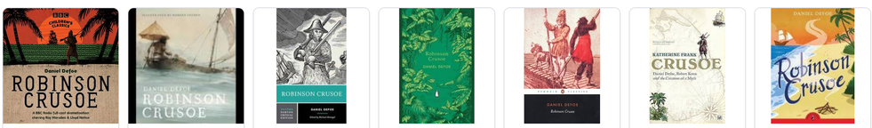
Here are some Robinson Crusoe book covers from over the years.
(Google Search)


Some more Robinson Crusoe ideas I've collected on Pinterest
(Including some cloth case slip ideas and edge paper ideas)
Some Film Photography I took on my travels


Non film photos I took while camping by myself on a remote island in Indonesia


Snaps from Robinson Crusoe Film on youtube


Survival Guides
(Google Search)


Extra Inspo


Brain Storming

Thumbnails

I had a lot of ideas, and I enjoyed letting my creative mind going so many different places.
I wanted to focus on trying very simple illustrations and or photography.
I have started with some illustrations ideas (above) and continue with some photography and text ideas (below).

I have started experimenting with some illustrations on Adobe illustrator but I didn't feel it was what I actually wanted. I felt a bit un inspired from illustrations.


Moreover, I felt like most of Robinson Crusoe's books are pretty much all illustrations - either older or newer. I had to break that pattern and in order to also bring some innovative and new feel (as the brief asks) I decided to work with my film photography.
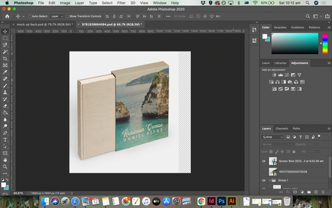
As I want to get all three designs printed on cloth and wrapped around the book and slip case, I wanted to keep minimal on the actual design so the pattern of the cloth will give it it's shine.
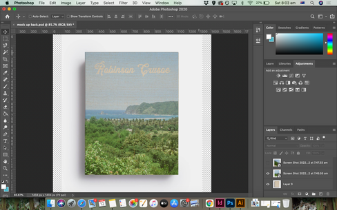
in order to keep checking how it can look when I place a photograph on the cloth, I started with creating a mockup of the clothed covered book and slipcase on Adobe Photoshop.
I wanted it to look exactly as I plan so I have added the 'torn paper' edges.
I run a test with one of my film photos and it looks so cool in my eyes. So I was very excited for how it's going to turn out.


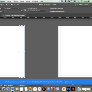
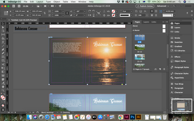
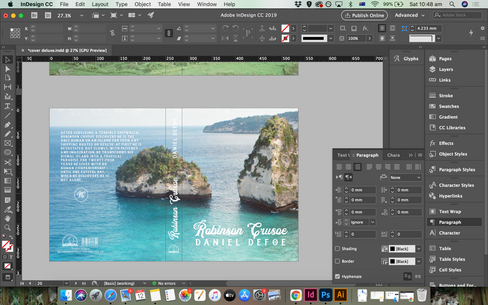
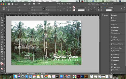
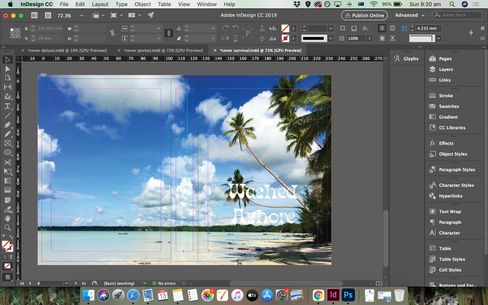
I started exploring with Adobe inDesign and work on a templet for the deluxe cover as it will be the bigger scale, and then scale it down for the pocket size.


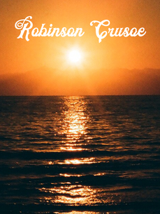
I was experimenting with some fonts, and found the one I really love.
'Raighton Font'
It is a family of few fonts and it was perfect for the adventurous and castaway feel of the story.


Then I really started to play around with photos and grids.
As I really loved how it looks (also checking on my mockup from time to time) I decided instead of exploring photography and illustration, I will design few editions of the Deluxe collection edit (- as collectors like to have all editions). and explore more into creating a different feel that keeps cohesive.


I have started to build the back cover and found a barcode vector which I turned white on illustrator. I also found the Viking Press vector and changed it's color to white on illustrator.


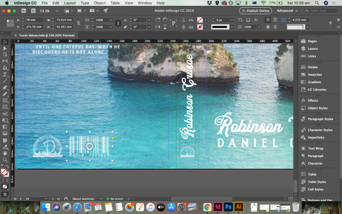


Then I thought it would be cool if I create a small branding for Robinson Crusoe's books and then also when I make the pocket version and the guide they will all have this cool logo.
So I went back into Illustrator and created the logo in few colors.


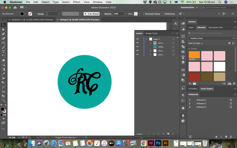


Here are the logos


Then I went back to inDesgin to keep working on the Deluxe versions. I came up with 4 versions which 3 of them will be the deluxe and the fourth will be the pocket guide.
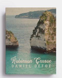
I had to think what I think will suit more the pocket one and I thought the jungle one will be perfect also as the other 3 are with on water.
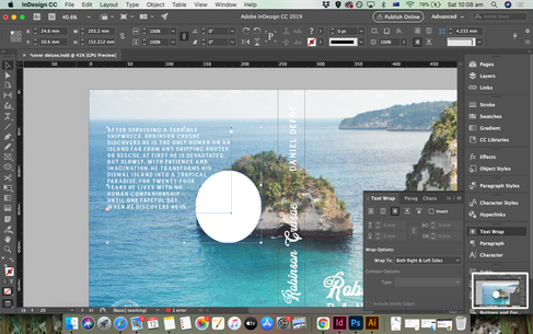
I was working with wrap around text and different positioning.


Working on scaling the jungle design down for the pocket guide, I also decided to reposition the back cover text and align to centre.
I kept checking how it will look with a transparent 'cloth' layer i have prepared.


Then I proceeded to work on the Survival Guide.
I wanted to keep working with a cohesive design approach, while keeping with the different genres.
I wanted to create something similar to my Java guide, while still working with cloth cover (same like the Java guide and my other books) and with photography.
Using a layout of A6, same like my pocket guide.
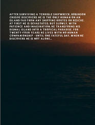
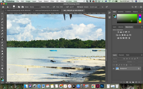
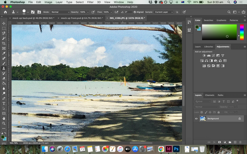
I decided to use one of the photos I took when I was traveling in remote islands (just before I went camping by myself in another island nearby).
I loved the shape of the coconut trees in this photo.


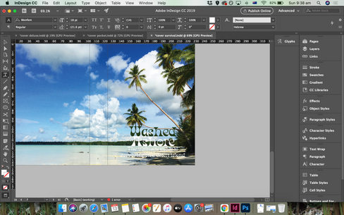
I remembered a cool psychedelic font I was trying when thinking about the Robinson Crusoe covers. I wanted to bring a cool element of far away places and old island posters to this guide.
Here are few ideas I've collected. I didn't want to make it an illustration and I wasn't intending to make it very much the same but just to bring this element into the design.


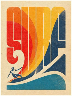


This font was just what I wanted to create this feel - 'Monfem' font.
Then I proceeded to develop the cover more, I realised that the subtitle in order to be in one line wouldn't be so legible if I use the same font, so I remembered another font I was intending to use on the main covers called 'Fontuna'. I really liked the feel and how it completed the total look with 'Monfem'.
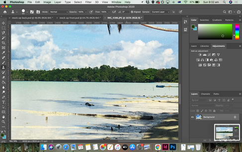
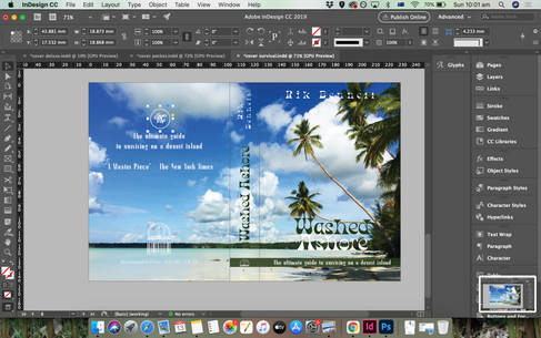
I also realised there are a couple of boats in there so in order to make it totally deserted island I decided to remove them on photoshop.


Then I developed more of the back cover and spine


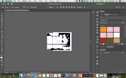
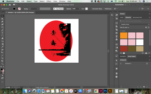
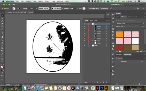
I decided to do the interiors of this book, so I opened a new document on inDesign and started creating it. I thought it would be so cool to take my photo to illustrator and image trace it so I get a really cool sketched version of the iconic palms to put on the first page.


Comments