
CBD | P2 | Ex 3: Book designers
- Amber Houbara

- Feb 2, 2022
- 11 min read
Updated: Feb 8, 2022
This exercise hopes to broaden your understanding of other book designers’ work by looking at their cover designs. Start to identify the kinds of book covers you are drawn to, and critically assess why you think these designs are successful.
1. Undertake a combination of library and internet research into the following designers, identifying a number of book cover designs for each. Reflect on their conceptual and/or expressive approaches to design. Write a very brief description of your selected cover designs and a brief overview of the designer - try to focus on keywords rather than long descriptions. Do this in note form, using the designer and the chosen example design to visually inform how the information appears in your learning log.
*All references and links are inside the gallery of photos.
Phil Baines


Phil is very creative and I love his work. I feel like he is using Typography like no other and really inviting you into the book. It feels enticing.
I have come across a lecture he gave and I liked the way he said "typography is binding the book" and I feel like that's exactly what he is doing. I do love the way he's using the type as creating illustrations. I also think his work is very clean and calming.
Coralie Bickford-Smith


I know Coralie's work, especially as it keeps drawing my attention every single time I'm going to one of my favourite book stores. Her work is so delicate and so beautiful. I love how the covers are using some kind of fabric, as I love fabric based covers. They give such a warm and prestigious feeling, as if it is an old mystical book. It also always looks so good on the shelf and for me a book is an important art piece in the home. Her designs are very expressive as they give the reader a feel with just simple symbols and colors.
Derek Birdsall


I was at first interested by his work as I liked the first spread on internal book design with the "ff". But then looking up his work further I was less impressed with his work. Yes, it is minimalistic, but I think it was almost 'boring' in my opinion. It is defiantly conceptual design.
Kelly Blair


I think her work is very beautiful and creative, sometimes conceptual and sometimes expressive. I find it intelligent, witty and cute - but her work is not my favourite or my style so much.
Irma Boom


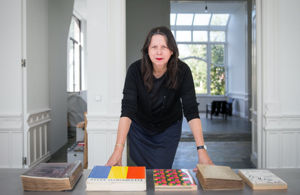


I am totally obsessed with Irma Boom. I love her approach, her sophisticated designs and her clean way of delivering such a special visual message.
In this link there is a lecture by her which goes for about 2 hours, so I'm keeping it to myself for further research for later.
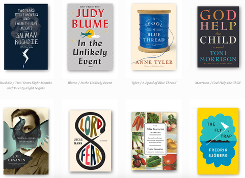
Suzanne Dean


I really like Suzanne's work. It is sophisticated, special for each and every project. She is very good at being cohesive and making great series design too. Very enticing.
Julia Hastings


I am totally in love with Julia Hastings. I think she is my new inspirational book designer. I am just mind blown from every single book and idea I can see on her website. I think she is a genius.
(I would have put all her artwork here if I could).
Linda Huang


I really like Linda's work. it is very expressional as it gives the feel of the book, but I feel like sometimes a book cover can also be conceptual when there is also a motive from the book which is communicated. Her work is beautiful and very intelligent. I love especially her Tao Te Ching book cover.
Jost Huchuli


Jost's work is definitely conceptual. It is very straight forward and showing a part of the book and its functions. His style is not my favourite for sure, but I don't find it as boring as Derek's work above.
Ellen Lupton


I really like Ellen's work, I have done a couple of courses of her's on Skillshare, and I really like her approach. I like how she brings such an expressional design and weave the feeling and ideas into the book as well. I think her book covers are art pieces.
Peter Mendelsund


I really like Peter's work. I think it is very witty and sophisticated. It is very conceptual in my eyes, but done so good, with beautiful aesthetics that draws the reader into the book.
Paul Rand


Paul's work is amazing and so classic. He managed to create such progressive designs in the 50's. I think his work can be partially expressional and partially conceptual. I really like his work and how his brain thinks and deliver the message which is not really always obvious what the book is going to be about.
Paula Scher


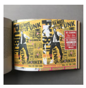
Paula is another designer I enjoyed learning from through Skillshare. She is bold and funny and such an inspiration. I really like the work she did for the Public Theatre and I love her approach to design, making it bold but still clean and organised (like an organised chaos almost).
*I couldn't find a lot of her own book cover design.
Jan Tschichold

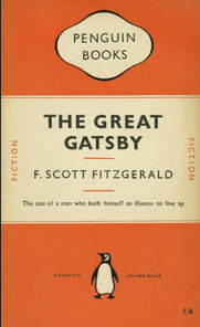


To be honest, and I will probably be a little bit rude here, but I am not a big fan of the 'plane' books of Penguin. Maybe it's because I am not English and wasn't born with so many of them as a normal thing... I think they are a good branding design work, but when it comes to book, I like to have something special about it and not just a different title. I think they have developed a different approach nowadays and this is why they have more interesting designs combined with their branding. So, I'll be honest that I am not impressed with his book cover designs (unless he was the first one to actually create them - but I couldn't find a source which prove that). Therefore I did ass some of his vintage film poster work to actually look at his designs. I think they are cute and probably very conceptual.
Wolfgang Weingart

I really like Wolfgang's approach, he is using type and color in a dynamic way which creates a feeling as if the letters are moving or if there is movement on the page.
I like his rebellious and bold approach and I think it is mostly expressional design.
Part 2
Compare and contrast some of the cover designs.
For example, how does the cover of Peter Mendelsund’s Kafka series compare with Coralie Bickford-Smith’s gothic horror series for Penguin?
Are these expressive or conceptual in nature?
Are they both conforming to genre expectations, or are they challenging them in some way?
Do Jan Tschichold and Ellen Lupton’s cover designs have anything in common?
Make a drawing, sketch or tracing of the covers you’re comparing to help give you a better understanding of the imagery, typography and arrangement within the design. Use your learning log to reflect on your comparisons, identifying which covers you think are the strongest and why.


Comparing the cover of Peter Mendelsund’s Kafka series with Coralie Bickford-Smith’s gothic horror series for Penguin.
Peter's cover series is very soft and relaxing, using pastel colors and very nice and relaxing simple drawings. The horror series of Coralie is obviously very hazarding - looking and using mainly black and yellow which are hazards colors in nature. The patterns or drawings are very 'spooky' and have an effect of blur. Obviously the differences are many and are here to reflect the topics of the series.
I think Peter's Kafka series is very expressive as he is constantly using the eye symbol but create a feel which draws the reader into the story without understanding exactly what the topic or main elements are. Coralie's Gothic Horror series uses an element from the story so I feel like this may be more constructive. Bringing an element from the story to reflect the important parts of the story.
When researching more on Kafka's books (to explore what is appropriate for the genre/ to Kafka in general) I came across this article, which explains how Peter's design for Kafka's series is very different and interesting.
"Unsurprisingly, recent reinterpretations of Kafka (at least the ones that have eschewed the non-design of an author photograph) have incorporated elements taken from Surrealist photography, modernist posters, and silent film."
"...The new covers, however, which focus on the humour in Kafka’s writing, move in a new direction and incorporate elements from the optimistic age of American mid-century modern design...."
(Quotes from the article "Peter Mendelsund and the Art of Metamorphosis")
When it comes to book design for horror books, it seems like photography and red color are both a big thing. Here we can see Coralie's design is defiantly working against what is common and usual and doing a really good job in my eyes to keep it 'scary' and mysterious without using photography (and I think it is way better!)

Jan Tschichold and Ellen Lupton’s cover designs
For this task I decided to look further into Jan's book design and see if I can find more designs as I couldn't find much more than the penguin series design. I found a couple more designs to have more of an idea.


I really like his designs here, and I can defiantly compare his designs with Ellen Lupton's. I think both of their designs are expressive and using beautiful minimal design approach, they both like to use patterns and type and combine them in a creative and fluent way.


Part 3
Now, select three or more designers from the list that you are particularly drawn to, either because you like their work or because you don’t understand their approach, and research their design careers in more depth. Think about how they’ve responded to very different design challenges, whether they have an underlying conceptual and/or expressive approach, and how their work has evolved over time. Continue to use your learning log to record their work visually, explore these covers through drawing, and your responses in note format. See this as a quick fire activity rather than a long essay.
Julia Hasting

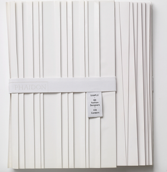


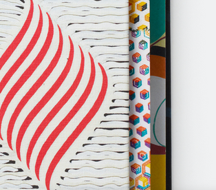


I loved Julia's designs so much and found them so extraordinary, so I decided to choose her for this task. I have read about her on her website and realised she won so many awards and is the creative director of Phaidon Press, I have already seen all her books were Phaidon's and therefore have checked their website and what they do - I fell in love with each and every book of theirs and I am not surprised she is the creative director. All Phaidon's books are too creative to be true, they use materials and take creative design to the next level. Here are few examples of her designs for Phaidon. It really inspire me to go out of the box and know book design have no limits.
I think her approach is mainly expressive, as she is picking up associative ideas which represent the feel of the book and bringing them into life in ways no body could have imagined is possible.
Irma Boom


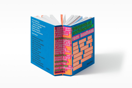


Irma inspires me, she is bold and breaking the ordinary thinking about design. I have read more about her on this article, and love learning more about her career.
‘I compare my work to architecture. I don’t build villas, I build social housing. The books are industrially made and they need to be made very well. I am all for industrial production. I hate one-offs. On one book you can do anything, but if you do a print run, that is a challenge. It’s never art. Never, never, never.’
“If I were to compare myself to an architect, I make social housing. Sometimes I’ll make a villa but that’s really rare.”
Her books are pieces of art in my eyes, always so clean, neat, and so structural (like architecture). She uses mainly expressive approach in my eyes as she gives you the feel of the book without using too much noise. If she uses 'noise' it is always organised and mainly expressed by colors or type,
I love her finishing on the page edges, it is never boring.
Linda Huang


Learning more about Linda's design I have found this interesting article.
I really liked reading her descriptions next to the book covers she designed and seeing the meaning for her art pieces or craft methods behind the scenes.
I have visited her website and realised she is currently an associate art director at Alfred A. Knopf. Formerly, she was an associate art director at Vintage & Anchor Books.
I think her work is very expressive, as the feel of the book is reflected in such a good way. I think sometimes as well her design can be constructive as one part of the book is shining it's light on the cover and inviting the reader to go in and explore more.
Part 4
Finally, identify at least three different book designers you find visually engaging. To do this you might want to visit a library, bookshop, or browse online.
Identify who designed these covers and find out more about them.
Try to work out why you are drawn to them.
Is it to do with genre or their approach to design?
What is it about the design that captures you?
What sort of imagery, if any, is used on the cover?
How does the text relate to the image?
What atmosphere or style does the cover evoke?
Summarise your thinking in your learning log - focusing on the kinds of book covers you are drawn to and why - and continue to document what these covers look like.
'A Wonder Book by Nathaniel Hawthorne'
I started with looking at a beautiful book, I have at my mother in law's home library.
"A Wonder Book by Nathaniel Hawthorne".
It has a cloth cover, which I am very attracted to. I think it is so beautiful and so prestigious and I just love the feeling of a cloth covered book.
I couldn't identify the book designer but it can be as this book is from 1955 (I was searching all through the book and online to try and find the book designer but only found the illustrator).
I think for that time the genre was probably a bit similar (even though I think this book is stunning and special) and I think it draws me so much as it looks so vintage and mystical. I love the illustrations and the design.
The cover, as I have already mentioned, is covered by cloth, and printed 2 beautiful illustrations which create a pattern; The Flying Pegasus and The Medusa (from the Greek Mythology). There is a a rectangular shape which doesn't have the pattern on and the name of the book and author is there. The type is a beautiful and mysterious Serif and gives such a beautiful aspect for the book.
'Plenty - Yotam Ottolenghi'
I love all Yotam's books, they always have such a cool theme and very attractive design to them. I am not sure if it is always the same designer but this book also drawn my eyes to it in my Mother in law's library. I have researched the designer and the brand is called Two Associates.
I really liked their designs I have found on their website and I think they have a good way of inviting the reader to know more and read. Sometimes with an expressive design approach and sometimes with constructive.
The design of the book is clean, even though the name is 'Plenty' it feels like less is more. Clean cuisine or clean eating almost. The background is white, and the cover is hard. There are illustrations of the outline of vegetables overlapping each other in different colors. The name of the book is in the bottom, big sans serif letters in gold, and the name of the author in smaller yet still large sans serif letters in gold as well at the top. Very sophisticated, minimalist and witty.
'Book of Longing - Leonard Cohen'
Once again, I couldn't find the designer.
I really like this cover as it is very naive and sweet, while maybe even a bit sad at the same time. The cover is soft and has an illustration (all illustrations are by Leonard Cohen) of a bird and also a couple of symbols. One is the star of David (as Leonard Cohen was a Jew, but it is shaped as 2 love hearts going the opposite direction. The other symbol I can't recognise. There is a feeling of hope but at the same time maybe something melancholic the reader would like to explore more in reading the book. The drawings are naive and using red blue and yellow colors mainly, while the title of the book and name of authur are both as well written by hand (by Leonard).
I really like this book cover design as it evoke very different emotions in me. I think most poetry books aspire to evoke emotions in the reader which are not always only happy and positive.


Comments