
CBD | P2 | Ex1- The function of books
- Amber Houbara

- Jan 21, 2022
- 7 min read
Identify a range of books that have fundamentally different functions in terms of how these books are engaged with - how they’re held, where they’re read, by whom, and for what purpose. Try to look at least six books, but you can extend this if you want to. The differences between these books might be determined by their genres. For example, you might look at a cookery book, a biography of a sports personality, a travel guide, a work of historical fiction, a teenage film tie-in like Twilight, this course guide – the choice is yours.
Think about how each book’s form reflects its function. The front cover is an obvious starting point (and the focus on your upcoming assignment) but try to look more broadly than this. Think about things like page extent, paper quality, typeface, the weight of the book, imagery and more. Is the book illustrated with photographs, reproduced images or drawings? Are these concentrated in one or two places or distributed throughout the book?
What about front matter and end matter? Historical novels like Hilary Mantel’s Wolf Hall may have family trees and/or a list of characters as part of the front matter. A scholarly biography will usually have many pages of end-notes and references.
Reflect on this in your learning log, with examples of some of the books you’ve selected. Identify how each book designer has reflected the genre and function of your chosen books in their final design.
Identifying a range of books that have fundamentally different functions


Book 1 - Parker's Astrology. A Guide Book.
How is it held, where is it read, by whom, for what purpose?
This is a very interesting book. It is a massive guide for astrology and has inside so much elaboration regarding to each star sign and planets. It is very heavy so need to be held down on a table or your lap while reading, and I would assume people would usually read it in their homes as self study. It is probably only for people who are fascinated by astrology and want to learn more.
Function
The cover is hard, as you wouldn't assume a big heavy book would have a soft cover, it has the stars signs wheel and a lot of stars and lines as if they were shooting stars in the night's sky. There is also a gloss over the illustration and typeface on the cover.
The paper is thick as it is helping the reader to have a stable read through a big book.
The illustrations are so beautiful, they are combining myth (which is an important role in western astrology) and have great imagery throughout the whole book.
There are also a lot of case study or teaching of how to read a birth chart so there are a lot of charts illustrations in the book.
The typefaces are suns serif as it is a modern version of this book and it gives a new and modern (and up to date) feel.
Front Matter - forward
End Matter - index
Designer's Reflection of Genre
I think the designer have done a really good job, as Astrology books could feel like a lot of information, but it is presented in a very helpful infographic and soothing way, and inviting to receive this amount of information.


Book 2 - Meridian Exercises. A Guide Book.
How is it held, where is it read, by whom, for what purpose?
This book is a guide book for Traditional Chinese Medicine Meridian exercises. It is usually read by therapist or other people who are interested by the idea of learning about the meridians and how to move them/ what is called Qi in TCM (means Energy) in the body. It is a thick book, and quite heavy (not as heavy as the previous book I have described). And I will guess it will be read by these practitioners either in their home or where they practice/ study - for professional / self study.
Function
The cover is soft, as it is a guide book for people who might also be practicing the ideas presented in the book. so it is important to keep it as light and easy as possible. The image on the cover is of the author and the guy who came up with these exercises Shizuto Masunaga, and a background illustration of the Yin and Yang symbol. The typeface is very simple and almost 'cheap' looking - maybe as it is mostly informative and the author is well known in this field, and not trying to 'sell'.
The paper is not too thick but thick enough to feel each page. it is very informative and a large book (A4) so need a matching thickness to it's pages.
The Photos & Illustrations are very informative and showing how to do these exercise, while adding some illustrations of 'dynamics' / 'directions' so the practitioner knows how to move.
Each photo of the author showing a pose, there is an extra illustration of a woman doing the same pose + the directions and movement.
The typefaces are simple and clear, titles with sans serif and body text with serif font for long reading and simplicity.
Front Matter - forward
End Matter - index
Designer's Reflection of Genre
I feel like the design match the genre of guide books. very plain and simple. The opposite from the previous book I was showing here, this time the guide book is very 'dry' and simple (the illustrations of the exercises are actually very sweet). But total look, the book is as almost as simple as it could be - which is good in a way when you are reading in order to receive the information.


Book 3 - The Simpsons / Flander's book of faith. A Funny (sort of comics) Book
How is it held, where is it read, by whom, for what purpose?
This is a very small and light book which can be held with one hand as reading by yourself in a moment of bordom or reading the jokes to your friends and family. As the Simpsons are - this book is a funny and a parody. It is read probably by people who want to have a laugh and it could be anywhere (where you can have a laugh).
Function
The cover is hard, and very colourful. it as the main character 'Flander' in the middle of a picture frame where all the other Simpsons are places next to word related to faith.
The paper is thick and glossy, very much like kids books where the pictures are the main thing. it has a lot of comics inside mostly very colourful.
The illustrations are big, and most pages are completely colourful.
The typefaces varies a lot and are very fun and groovy.
Designer's Reflection of Genre
I love this book design as it is so colourful and so much fun (and funny) and complement the genre of people who just want to have a break from life and have a laugh about society. I think the designer did a very good job to create a fun and funny 'comics' like book.

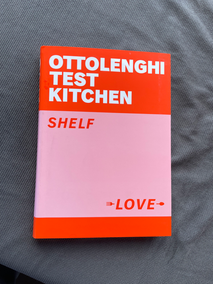


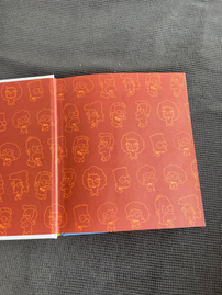
Book 4 - Shelf Love. A Cook Book.
How is it held, where is it read, by whom, for what purpose?
This is a cook book, so usually will be read in the kitchen and placed on the kitchen bench or a special holder while someone cooks or when they gather ideas for cooking.
Function
The cover is soft, but feels a bit different than any other soft cover I have held before. it has a use of pink red and white, and cool placements of the sans serif fonts.
The paper is glossy, and thick. it is needed for a cookbook to be strong enough to be in the kitchen while someone is cooking and it might get dirty. some of the paper in the beginning and the end is not glossy and as special folds to show the index and have some space at the end for your own notes or making your favourite dishes list with the same paper and folds.
The photography is amazing, showing the actual kitchen of Yotam Ottolenghi and Noor Murad (the authors) and some steps while making some of the dishes. It is a very beautiful photography production and the images are all through the book.
The typefaces are sans serifs giving a very modern feel.
Designer's Reflection of Genre
I think the designer have made a very profound and special design here. It is very reflecting the genre of cook books but taking it to a whole new level of coolness. I really enjoy flipping the pages and looking for recipes and the photos and enjoying the design and how each chapter is a different cool design to it as well.


Book 5 - Beyond. A Photography Book,
How is it held, where is it read, by whom, for what purpose?
This is a photography book, so it is held sometimes in the gallery space where it is presented or otherwise in a home as a coffee table book or in a cafe for the same purpose. It is light and easy to hold in the readers hands. It will be read by people who are interested in photography or the views of Westerns Australia/ nature. It is horizontal, and very light book.
Function
The cover is thin, so easy to flip the pages, and hold in the readers hands.
The paper is thick and glossy.
The Photography is stunning and the book design around the photography is very magazine like. I really like it. It gives all the space and respect to the images while the descriptions are small of each photo where is it from.
The typefaces are sans serif, giving it a chic and clean feel.
Designer's Reflection of Genre
I think the designer have done a really good job to reflect the photography book genre. It is usually nice to see different grids on a photography book (magazine style) and it gives the reader the drive to keep reading.

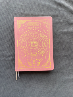


Book 6 - Magic of i. Diary/ Planner
How is it held, where is it read, by whom, for what purpose?
This is a yearly planner, it is used by people everywhere where they plan their schedule. This is also a planner guided by astrology so there are multiple areas to do some journaling and also a lot of information about astrology in many different aspects and connections (such as moon planting guide etc). It is read and used by people who are inspired by astrology and want to plan their schedule according to the moon, and other astrological aspects and planets. I would guess it is mainly read by women.
Function
The cover is a vegan leather (there are different colors to choose from, this specific one is a rose color). and has a beautiful drawing in gold.
The paper is quite thin, and has a round shape on the edges.
The illustrations are so beautiful, they are representing stars, planets, star signs, herbal remedies, tarot, and more. They are all through the book and especially on each month's first page.
The typefaces are all sans serif. As it is an up to date modern approach to astrology and also a very progressed holistic feel, the sans serifs make it easy to read and very convenient.
Designer's Reflection of Genre
I love this planner and book design and I think the designer did a very very good job to make a very special and unique planner design. It really invites you to use it all the time.


Comments