
CBD | P2 | Ex4: Designing a cover
- Amber Houbara

- Feb 10, 2022
- 3 min read
Following on from the discussion of George Orwell’s novel 1984, look at the covers for Margaret Atwood’s equally dystopian novel The Handmaid’s Tale (1985), in which a woman finds herself surviving inside a harsh American fundamentalist society, that sees women’s roles as subservient cooks, matrons, and mothers. Alternatively, you can pick a different book to respond to, but it needs to be one with more than one cover design, so avoid recently published books.
Are there key conceptual motifs being used over and over again within different cover treatments? Can you identify more expressive versions of the covers?
Check the date of each version and try to speculate about the historical, political or social context for each one. (Don’t spend long on this but it’s important to realise that creative design doesn’t happen in a vacuum.)

In general there are very similar colors and motifs repetativly coming back on many designs throughout the years.
Colors - Red White and Black (a little bit of yellow on older versions).
Motifs - White hat, red gown.
Newer editions using photography from the Netflix Series.
I can mostly find constructive designs, as they are all using the hand made / piece of her clothing- which are a part of the story - so less expressive approach here.
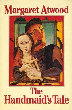
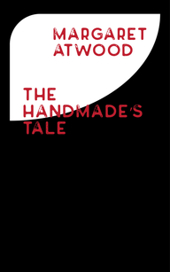
Very old school art piece, looking almost like mixed media or oil painting from the neo expressionism art movement (1980). Very old school font which is also serif - gives an old fhasioned feel.
An older, more traditional look, almost like an old art piece. The patterns behind the book's title. The serif fonts. All create a very vintage feel that match the time - 1998.

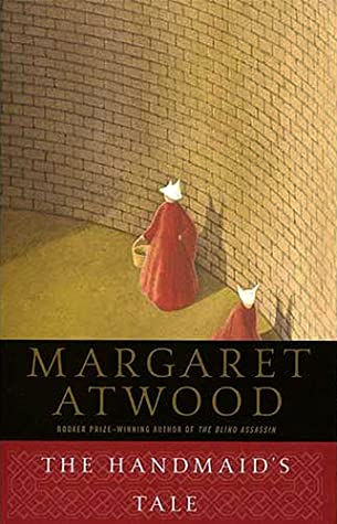
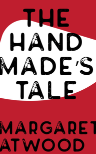
2010's design is looking like a graffiti stencil, it has a sans serif font which gives it a very modern look.

again using of sans serif - very modern. turning the usual drawing to a vector shaped (looks like an adobe illustrator job). Also I love the back side and the creation of a CCTV camera as if it's always watching the handmade. using the same colors and vector like shape - creating a very modern look and feel.
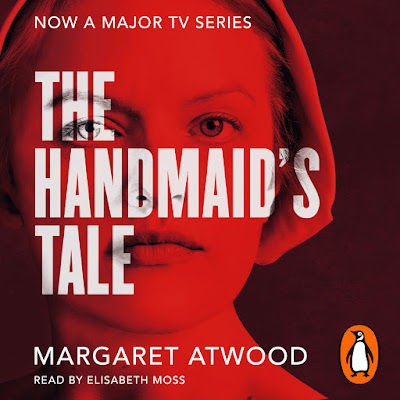
The audio book and the fact there was a very successful series made after this book gives a good opportunity to the designer to use photography from the series which most people are familiar with. Photography and sans serif are very appropriate for 2019.
Using one of the main motifs you have identified (such as the uniforms that feature the book), the title of the book, author’s name, and no more than three colours (including black and white), generate as many different layouts of the cover design as you can. Think about how you can dynamically layer, organise, frame, clash, or balance these elements.
Work quickly and come up with lots of different visual possibilities.
This is a similar exercise to the Lightbulb Project in Graphic Design 1, which aims to generate quick design possibilities by arranging your typography, motif and colours in as many, and as varied, ways as possible. Examples of students’ responses can be seen here: https://www.pinterest.co.uk/opencollegearts/the-light-bulb-project/
Use thumbnail drawings or DTP layouts to achieve at least ten fundamentally different layouts. This is a warm up exercise that will help you with your approach to designing a cover for assignment two.
---
To begin with i have found some standards book design measurements on this link
"Ideal dimensions for cover files are 2,560 x 1,600 pixels. 1.6:1 is a ratio you will see in paperback fiction"
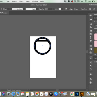
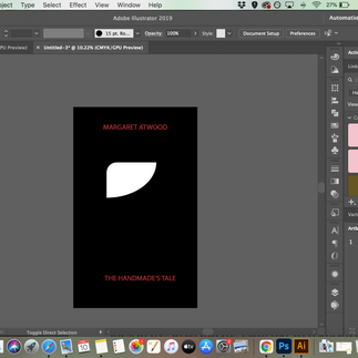
I decided illustrator will be the best to work with as I can open as many artboards as I like and use my elements quick for repositioning.
I have chosen 3 colors and elements -
Black, White, Red.
Hat.
I want to keep it mysterious and simple with one element to see how far can I stretch it. I know the hat is supposed to be white but maybe even playing with the color of the hat at some point.
I liked the vector like shape so I created my own vector on illustrator.
I was working as quickly as I can to let my creative mind flow. Generating ideas such as using the text to create some kind of shape like the body of the woman, Using different colors as text background and hat, scaling up down and duplicating, creating some scratches with brushes etc.


Comments