
CBD | P3 | As3: My Little Book of...
- Amber Houbara

- Apr 14, 2022
- 7 min read
The brief
Create two books explaining and exploring the typographic and layout principles you have researched in this section.
Book 1: My Little Book of…Good Typography
Using the reference material that you’ve gathered throughout the exercises and research tasks in Part Three, design a book which explores traditional ‘good practice’ in typography.
What is readability and, as a designer, how can you aid it?
Visually explain the typographic principles that we’ve touched on in Part Three, such as
- type size,
- leading
- and line length.
For example, you could demonstrate kerning by creating a page which looks at letter combinations applying this principle.
Equally, explore good layouts and use of grids to help support and frame your typography.
This is an opportunity to develop carefully considered design layouts that feel easy and engaging to read, and look at.
Be creative in how you do this, developing a range of options and possibilities.
Show off your good typography skills as well as talking about what makes good typography in your text.
To support this, find quotes and type rules by other typographers and designers - perhaps revisit your research into book designers from part two. Find examples of good typography within book design you can present and talk about.
Your booklet should be a celebration of good typography, whatever you think that is.
Book 2: My Little Book of…Bad Typography
The rules surrounding what constitutes ‘good’ typography are entrenched in tradition and convention, as you demonstrated in Book 1.
Having looked at ‘the rules’ surrounding readability and legibility, now is your opportunity to break them!
Be inventive and experimental in how you explore what might constitute ‘bad’ typography.
For example,
- negative leading,
- too-long line length
- and ‘inappropriate’ application of typographic principles may produce visually jarring and uncomfortable results.
What does ‘bad typography’ mean to you and how might it manifest itself?
Express your ideas in a visually imaginative way within your second book.
This is an opportunity to be playful and push your design layouts, typography and ideas to the limits - celebrate bad typography through your designs and content.
Again, find quotations you can work with or examples of bad typography to draw on.
Your books should each take the form of a simple eight-page booklet – folded, stapled or stitched. Design the cover and contents for each.
When creating your content for both books, be aware of your audience, and how you might want them to engage with your content.
While both these books are about typography, make sure you also include images within the text. These could be your own illustrations, photographs, or stand alone typography pieces that accompany your text.
Use a flatplan to organise your content
and indicate where important text and images occur, on a recto (right-hand) or verso (left-hand) page, or as a double-page spread. Suggest images by a crossed box, as in the example for ‘front cover’ in the diagram on the previous page.
These crossed rectangles indicate image boxes in desktop publishing (DTP) software, and are used in drafts and sketches to signify image material. There is no need to go into detailed drawing regarding text or image material at this stage. Text can be indicated by a series of thick horizontal lines, with main headings sketched in. Use the flatplan to familiarise yourself with the structure of a booklet. Note the blank pages and how they are organised to complement the preceding or following page. Note the extent (number of pages) in the book and whether it has been printed in signatures, or sections.
As with previous assignments, see this as an opportunity to undertake a creative project that is more circular in nature than linear. Visualise initial ideas, assess them and return to your starting point to develop new starting points. Be experimental with your typography and take creative risks along the way. Focus on how you can visually document your creative journey as well as your reflections on what you are producing.
Your notes should cover why you decided to portray what you did, what you included and what you omitted. Reflect on how do you feel about the two completed books. For example, are there comparisons you can make between them, has any interesting design issues emerged through the process of making them?
Research
To be honest, I started this project with not many ideas in my head, so I started off with a visual research on Pinterest to feed my mind.
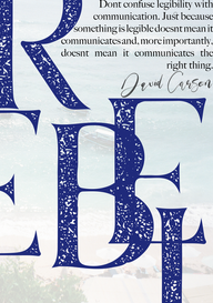
Then I went off by looking for inspiration, and something in the back of my head remember this Masterclass trailer I watched of a very inspiring designer (happened to be David Carson), I went into Masterclass's website to find out whom it was, and found David Carson which then sent me into the rabbit hole of researching the inspiring world of his work.
I think he is probably what I call best bad typography in the world. I adore his work and he is defiantly one of my favourite design-artists.
This is one of many videos I've watched, along with looking at many of his artworks.
Ideas
I wanted to create a 2 catalogs, which will look like they are from they same 'family'.
One catalog is for good typography and one for bad typography.
I wanted to create a list of 5 consensus rules for typography and show on each book the same rules in different eyes - one book respect the rules, one book breaks them.
*I defiantly want to create a homage to David Carson work on the bad typography book.
Typography Rules
I was searching few websites such as this one and this one to find some rules I would like to work with and break too. As well as rules I think are 'holy' in the design world. I wanted to create a short text to elaborate about these rules so I would have some text to work with when I design the catalogs.
I want to use the same texts but give them completely different lives and approaches.
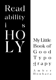
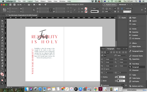
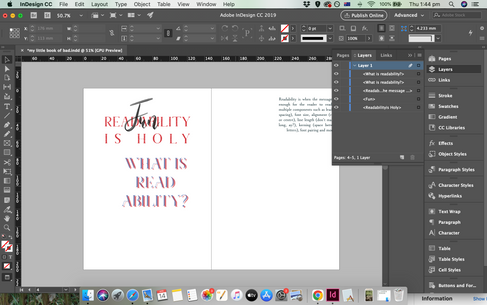
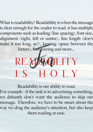
Readability is Holy
What is readability? Readability is when the message is clear enough for the reader to read. it has multiple components such as leading (line spacing), font size, alignment (right, left or centre), line length (don't make it too long, ay?), kerning (space between the letters), font pairing and more...
Readability is our ability to read.
For example - if the task is to advertising something, we defiantly don't want the audience to skip our message. Therefore, we have to be smart about the way we drag the audience's attention, but also keep them reading at ease.
Correct Alignment
The right alignment is very known for designers. Usually considered immature to align to centre, and very challenging to use justified. When aligned to centre, Ellen Lupton said it reminds her of grave yards and "maybe you are not dead yet" on a course I took on Skillshare - which was a different approach to designers claim "it is hard to read". Centre justified alignment can be hard as it can create 'bumps' in the text, which can be less pleasing to the eye, especially if the lines are too long.
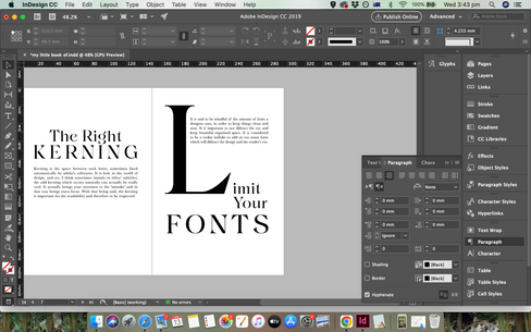
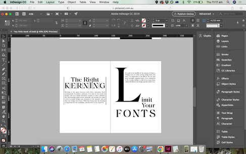
The Right Kerning
Kerning is the space between each letter, sometimes fixed automatically by adobe's softwares. It is holy in the world of design, and yet, I think sometimes (mainly in titles/ subtitles) the odd kerning which occurs naturally can actually be really cool. It actually brings your attention to the 'mistake' and in that way brings extra focus. With that being said, the kerning is important for the readability and therefore to be respected.
Limit Your Fonts
It is said to be mindful of the amount of fonts a designer uses, in order to keep things clean and neat. It is important to not distract the eye and keep beautiful organised space. It is considered to be a rookie mistake to add on too many fonts which will distract the design and the reader's eye.
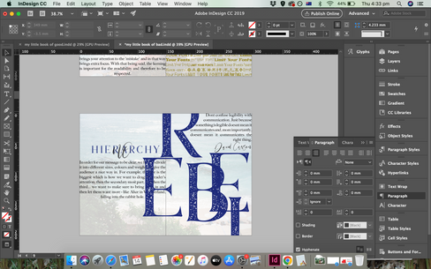
Hierarchy
In order for our message to be clear, we have to divide it into different sizes, colours and weights to give the audience a nice way in. For example, the title is the biggest which is how we want to drag the reader's attention, then the secondary most part, and then the third... we want to make sure to bring them in and then let them want more - like Alice in Wonderland, falling into the rabbit hole.
I wanted to draw a flatpan to orgenise the idea of how the books will flow, so there would be a theme but the visuals will be different. I wanted to also think about images on this flatpan, however I wanted to use massive letters and black boxes as my images and wasn't so inspired to draw it by hand. In these cases I feel like the accidents which are happens on the creative process digitally are usually the winners.
I satrted with the first drawing but while I was working on inDesign I felt like I needed to change it (therefore flatpan no.2)


I was inspired by most of the black and white designs on my Pinterest board (above). I always was in awe for this minimalistic sophisticated black and white Typography layouts. They don't use any images other than actual massive letters as images and layouts/ grids which made from the massive letters and small chucks of texts.
I decided to name the book 'Readability is Holy - My Little Book of Good Typography'
I was using Amaline font for titles and Baskerville for body text.


My little Book of Good Typography / Designs


My little Book of Bad Typography / Design Process
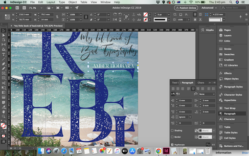
My aim here was to create a homage to the surf magazines and typography David Carson was doing over the years. I love his daring, rebellious, surfy edgy designs. I wasn't sure exactly what I'm going to do other than the idea to have texts overlapping and to have the page of "limit your fonts" repeating all through the page and with different fonts.
I started getting creative and saw where the process took me, I started with fonts and ended us using:
Marschel for titles (which has 3 options Printed, inline and stencil), Big Caslon medium for body text, and Maria Rose for scripts.
I was trying to work with angels and boxes of colour and saw it wasn't working for me. eventually I decided to stretch the text all through the pages as the readability here was not important at all.
Eventually the white background was disturbing me so I decided to use images I took in Bali, Indonesia by film


Last minute I realised I didn't add a quote in either of the designs!!
So I have found cool quotes by David Carson and Ellen Lupton to add to the last pages.


My little Book of Bad Typography / Designs


My little Book of Good Typography / Mockups


My little Book of Bad Typography / Mockups


Reflection
I actually really loved doing this assignment. I just love designing booked and magazines and getting inspired by some styles I like. I really loved as well researching more about David Carson.


Comments