
CBD | P3 | Ex1: Type samples
- Amber Houbara

- Apr 7, 2022
- 3 min read
Find as many examples of type as you can from a range of sources, including newspapers, magazines, flyers, leaflets, online, and printed ephemera. Broadly classify them into serif and sans-serif groups. Explore your computer to see whether you have any of the typefaces mentioned on the previous page. Find other examples on your computer that relate to these classifications. Print these off and begin to create a collection of type samples.
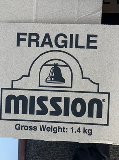
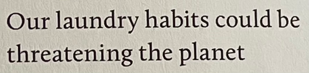
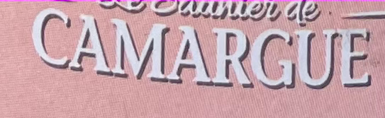
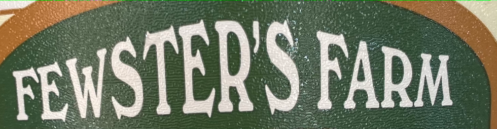
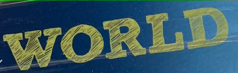
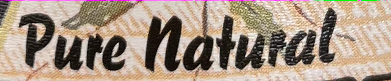
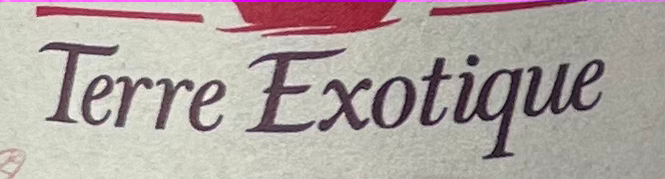
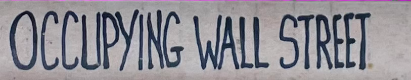
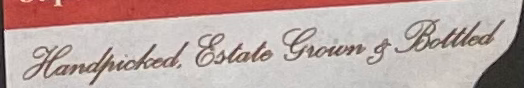
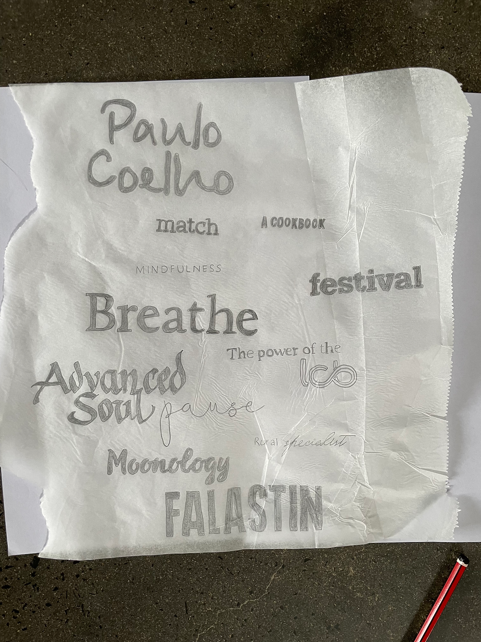
Here are different types I've found via magazines, newspaper, and even products.


I have cropped the different fonts into smaller images so I can classify all into groups.
Serifs


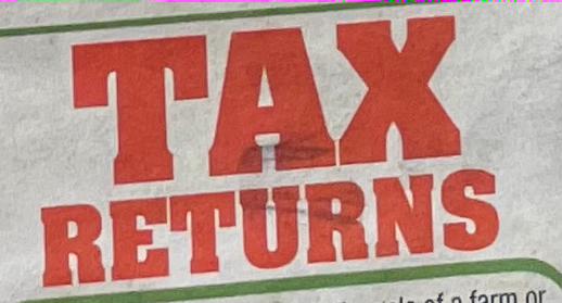


Sans Serifs


Decorative


Scripts


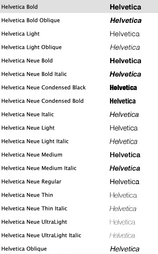
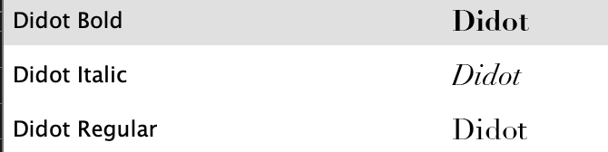
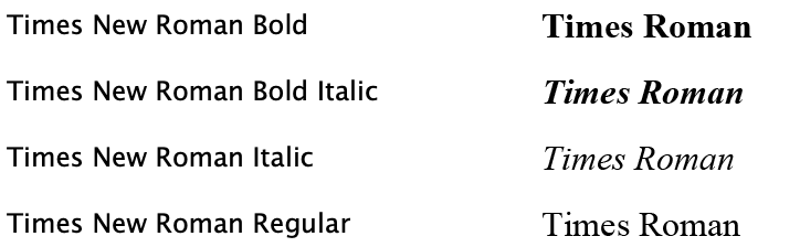
Finding fonts mentioned on my laptop
These are the only ones I could find on my laptop.


Classification of typefaces


Identify + Reflect
Choose five different typefaces from your classification collection and now look for examples of how they can be used for reading in different contexts. For example, which typeface would be appropriate for a magazine, a science book or newspaper? Have you collected a typeface that might be suitable for all these subjects?

I think from all fonts, the fonts which will match a newspaper are:
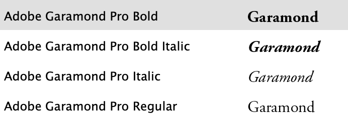
Caslon and Baskerville
The fonts which will match a science book are
Baskerville and Futura. Could potentially be also a match of Aladin for titles and Futura as body text
The fonts which will match a magazine are
Rollingstar as a title & futura as text. futura. Baskerville. Caslon as text.
One font which will possibly match all is Baskerville.
As a way of testing out which typefaces might be appropriate for a particular job, also consider them as inappropriately as you can - find contexts in which they don’t work, look ugly or feel ‘wrong’ in some way. Do this by experimenting visually with your typeface choices.
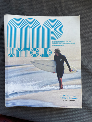
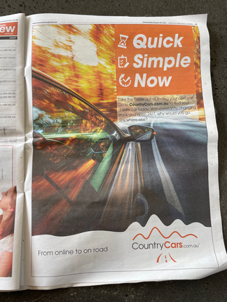
I took these examples for mockups, the first one is a wine book, a very cool and modern infographic style book. The second one is a surfer biography book, and the third a newspaper advertisement for car sale. I wanted to see how I can push it with the typefaces I've chosen and put the complete wrong fonts in the wrong context.
The originals :

The Mockups:
*I wanted to create fast mockups to get the idea so I didn't make them perfect.


In example 1, is a wine book, very fine and fancy, the original is a serif font, so I tried to use Aladin, The Rollingstar and Futura as I thought they would definitely not fit.
Aladin is soft, not fierce as this wine book appears to me, the Rollingstar is way too rebel and Futura is just too plain.
In example 2, is a surfer biography, this surfer was around the 70-80's and therefore the vintage look. I would assume in a typical category test, The Rollingstar would have fit, but as the original is very decorative and playful, and very 80's, the Rollingstar is not fitting. Also as it is very minimal with playing options. I knew Baskerville and Caslon wouldn't fit too, as they are too 'classy', and there need to be a more rebel and cool surfy and psychedelic style to match this book.
In example 3, is a newspaper advertisement for a car seller. I can already see the words 'quick, simple, now' as the title, so I know this typeface has to be modern, sans serif, fast looking, anf futuristic. I knew right away The Rollingstar, Baskerville and Aladin wouldn't fit. Rollingstar and Baskerville are both serif, which is very not 'modern' and 'fast', aladin is too soft, and not giving this sharp fast feeling, rather a more lazy and slow mood.
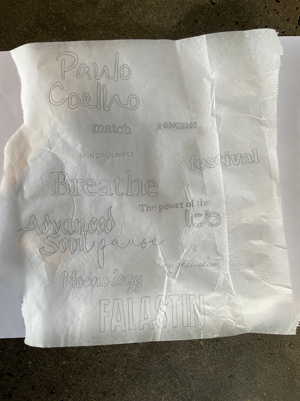
Consider and reflect on the nature of the type you are collecting. Examine and annotate printouts with your own impressions of the letterforms. Use descriptive words that express something of the form and character of the typeface. Follow the same process for your ‘wrong’ typefaces as well.
*I've added my reflection throughout the Identify part, as a prat of the process.
Develop
Trace some interesting, unusual and everyday letterforms onto clean paper. This will help you to understand the distribution of weight of line within a particular letterform. Draw over the tracing to enhance the line and fill in the letterform with an even dark grey tone – HB pencil is fine – to recreate the impression of print.
Document and present
The work you produce for this exercise will feed directly into your assignment, so collate your notes, printouts, traced letterforms and samples of type you have gathered. Consider how these could be inventively and visually integrated, and how your ideas could be creatively developed further for your assignment.
I think it could be interesting to use all the images and text I've presented here and create a small book or collages.
Reflection
To be honest, I have already learnt a lot about typefaces on my first course, so obviously it is always good to come back to beginner mind, but I felt like I am re doing something I already know. So I wasn't feeling this exercise is challenging to me, rather a redo of something I've already done.


Comments