
CBD | P3 | Ex2: Double-page spread
- Amber Houbara

- Apr 7, 2022
- 3 min read
Updated: Apr 16, 2022
This two part exercise aims to understand the relationship between typography, the grid, and the page in more depth by analysing existing layouts and creatively developing alternative ones. Both of these activities will feed into assignment three.
Understanding layouts
Research into book layouts that you find interesting. These could be art or design books, or others that have more complex layouts that balance images, typography and other content across multiple columns.
Here is a board I have created on Pinterest.
Graphic Design - Magazine design
Graphic Design - Layout
Tracing
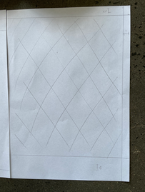
Trace the grid structure of your chosen double-page spread using tracing paper and a sharp pencil. Measure the margins, column width and depth, plus spaces between the columns. Transcribe the tracing onto a clean sheet of paper, drawing on the measurements.
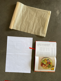
I have found a layout I like from a cook book I have 'OTK'.

I have traced the layout into a tracing paper.


Then I have drawn the same layout onto a clear paper.


Comparing
Compare your drawings to other double-page spreads within the same publication. Identify the similarities and differences - is there an underlying grid system and how does it adapt to deal with different content?


It is quite obvious, but as it is a cookbook, the recipes grids stay the same. The margins are very similar, though in some layouts the images stretched differently and sometimes to the edges.
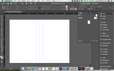
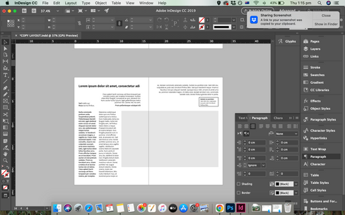
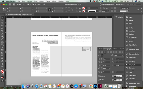
Now recreate the same double-page spread using DTP software. Use your traced drawing measurements as a guide. There is no need to copy out all the text – you can use ‘dummy’ text or ‘blurb’ such as lorem ipsum. Lorem ipsum is Latin text which has a distribution of letters that make it look like readable English. You can download some from www.lipsum.com and incorporate it into your layout. Similarly, there is no need to recreate the images – indicate images by a 10% shaded area, whether these are cut-out, full-bleed or within a box. Try to match the typeface as closely as possible. It doesn’t need to be exactly the same, but try to retain something of the original – for example, make sure you use a sans-serif font if the original is sans-serif.


Experimental layouts
Extend the project by thinking about how you might radically change these layouts - what creative decisions around the grid would you make to improve these designs? Develop layout ideas that ignore the grid structure, challenge it, or offer radical alternatives to the existing layouts. Develop a range of ideas through thumbnail drawings and DTP layouts, in a similar way to the first part of the exercise. Use this as an opportunity to take creative risks, and find radically different ways to layout the existing content. This process might challenge any preconceived rules about how a layout should normally work. Reflect on the process in your learning log.
For me, the best way to go crazy and break the rules in graphic design is not to plan ahead with thumbnails, rather just let my creativity flow and move things around on my software. I just let myself dare and go wild and ended up with some cool layouts which I wouldn't have come up with if I just drew on paper.
I really like it.


Reflection
Once again, this is a similar exercise to one I did on Graphic Design Core Concepts and I felt like I was repeating it, but I really enjoyed the last part of moving things around and taking risks without planing and seeing the cool outcomes.


Comments