
CBD | P3 | Ex3: Experimental typography
- Amber Houbara

- Apr 12, 2022
- 5 min read
Updated: Apr 16, 2022
Below is an extract from Jules Verne’s 20,000 Leagues Under the Sea. Using a single typeface of your choice, lay out the text in as inventive a way as possible. Experiment with the letters and words, using the typographic principles you researched in earlier exercises to significantly alter the arrangement of the text, its rhythm and readability.
Think about design group Tomato’s definition of typography – ‘Sound as form’ – and how this concept might apply to your own work. Use the content of the text to inspire visual ideas. How might you experiment with the type to communicate something of the essence of the descriptive content? Think about how the designers you researched in the previous section, e.g. David Carson and El Lissitsky, would approach the text – or artists like Marinetti and Schwitters.
It is important that you play with the text, with individual letters and words. How experimental can you be in making expressive typographic designs? Can you reveal something of the character and nature of the letterform by experimenting with scale and orientation, so a simple unassuming letter becomes a monumental, almost sculptural form?
Think about the sound of the words you are working with, how can your typographic decisions help to communicate these?
As a book designer, you might be more drawn to analog or digital ways of working. Whatever your preference, try to mix and match both approaches. Your work on paper might become a starting point for digital experimentation with this text, or print out your initial ideas, so that you can experiment with what happens when you start to cut, collage or physically alter your text in some way. This physical work can then be scanned to kick start a new digital stage.
Read the text through once before starting to manipulate the type. Make several designed versions of this passage, or parts of it, spanning several pages if need be. Feel free to focus on certain aspects of the text, or use the whole text within your designs. Use your learning log to reflect your creative decision making as well as sharing the various stages of your process.
20,000 Leagues Under the Sea, Jules Verne Chapter 1, A Shifting Reef
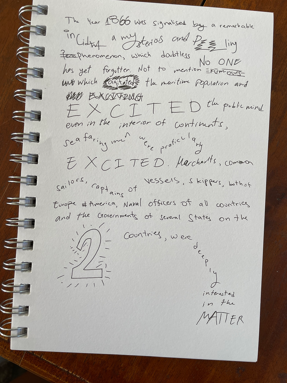
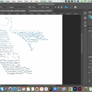
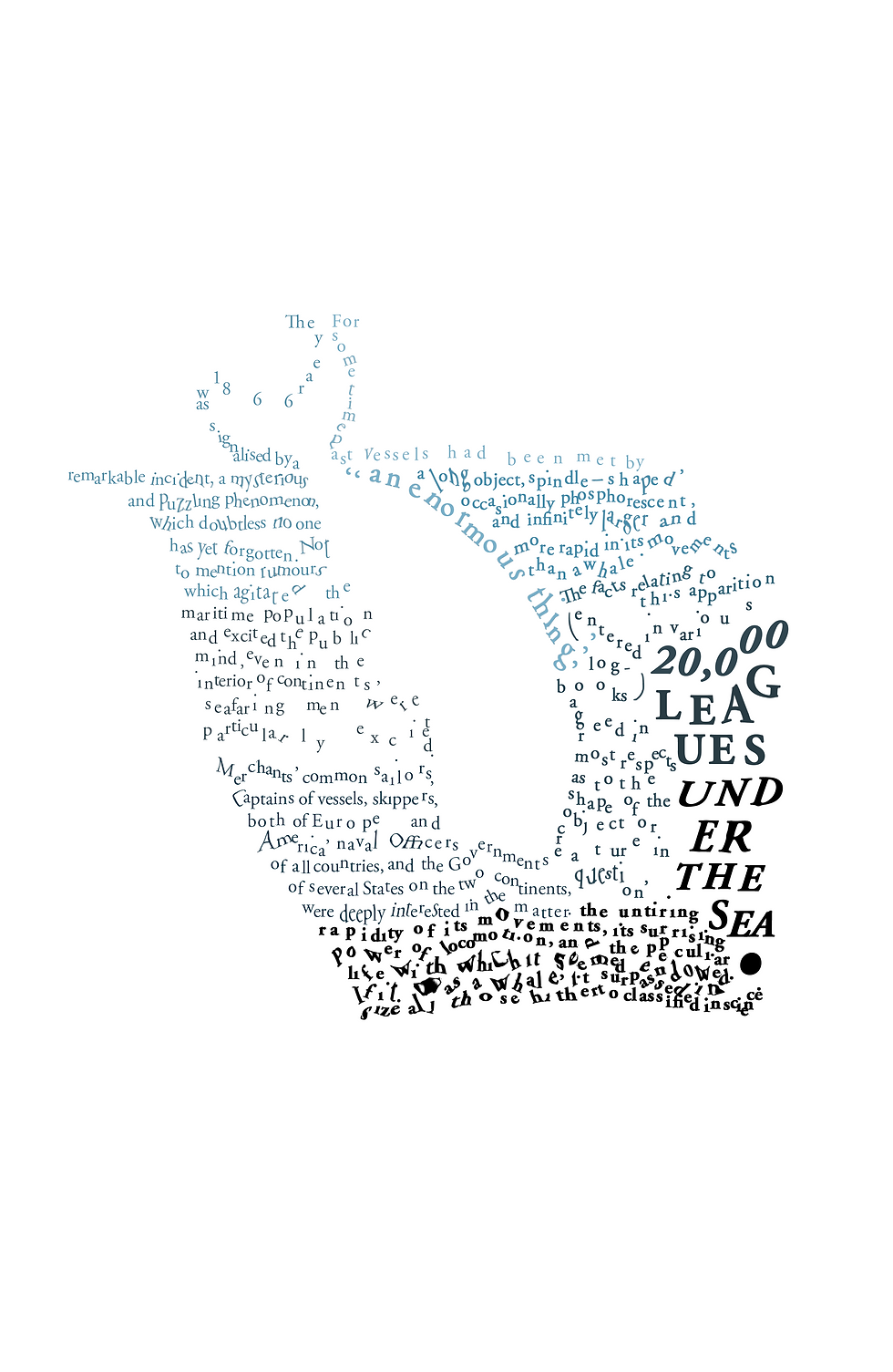
The year 1866 was signalised by a remarkable incident, a mysterious and puzzling phenomenon, which doubtless no one has yet forgotten. Not to mention rumours which agitated the maritime population and excited the public mind, even in the interior of continents, seafaring men were particularly excited. Merchants, common sailors, captains of vessels, skippers, both of Europe and America, naval officers of all countries, and the Governments of several States on the two continents, were deeply interested in the matter.
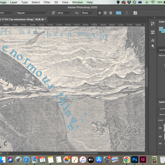
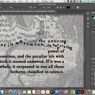
For some time past vessels had been met by “an enormous thing,” a long object, spindle-shaped, occasionally phosphorescent, and infinitely larger and more rapid in its movements than a whale. The facts relating to this apparition (entered in various log-books) agreed in most respects as to the shape of the object or creature in question, the untiring rapidity of its movements, its surprising power of locomotion, and the peculiar life with which it seemed endowed. If it was a whale, it surpassed in size all those hitherto classified in science.
Research
articles
TOMATO
I find Tomato's work fascinating, as when I started working on the thumbnails of the book design i did for my recent client, I have asked him "If your book was a music album what would it be?". Because of the time difference, and as he was asleep, I remembered he told me how he loved writing to the music of Leonard Cohen, and I added another classical music artist I thought was suitable, and as I was listening to the music I could create from these notes.
I think art and design are no different, they are intertwined, we can't just design, it goes into so many fields of knowledge such as art, or sometimes engineering, sometimes combining different medias of art such as music and sound, or even illustration etc.
20,000 Leagues Under the Sea Research
I read about the story on Wikipedia, as I know the name of it and I am obssesed with another story by Jules Verne (Around the world in 80 days) since I was a little girl (probably the reason why I have left traveling when I was 21 and didn't stop until Covid stopped the world.
I loved the illustraions I could find on the page, and I loved the typical adventurous story by Jules Verne.


From reading it and seeing the story I can develop some Ideas.
Ideas
Printing the text out and using markers and a pen to draw on top then going back into digital for further developing.
playing digitally with how I can make certain words mimic their meaning.
playing with text and negative space and the old book cover of 20,000 Leagues Under the Sea
make the words seems like they are '20,000 Leagues Under the Sea'
Manual Experimental Typography Exercise
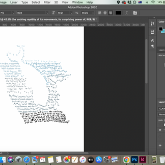
When I started reading the text it felt as if every word wanted a life of its own, so I wanted to explore with myself how it feels to just work manually and give each word its space and meaning with expressionism.
Digital experimanting
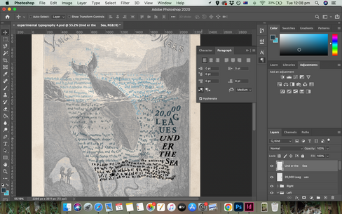
I was trying to work with the old cover of Jules Verne’s 20,000 Leagues Under the Sea, and the idea of the huge vessel being like a huge whale. I wanted to work with wrapping and changing the positioning of the text to create illustrations, either on their colours or with negative space.
I was trying a lot of different options, from photoshop and indesign, I wasn't sure which wrap around is better. I tried also using the lasso tool to create the shape of the wale and use the wrap around tool (which I realise then is only on indesign. When I took it to indesign the image was 'square' as it doesn't work like photoshop even if it is a png with transparent background).
I also tried the pen tool to create a text box and fill it in with text but it didn't work as good as I wanted it.


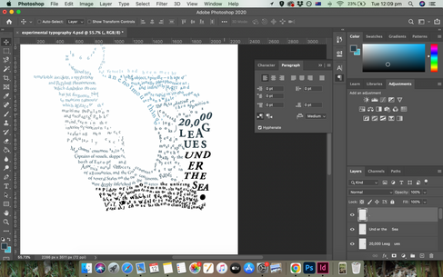
I worked back in photoshop, and as I did before just tried different things out of exploration, partly frustrated and partly excited and curious. when I finally found a tool I never worked with in text - the Puppet Wrap. I love this tool as I can really manipulate each letter and each word and really give them their meanings + work as creative a homage for the old cover and the wale. I wanted to make the words look like they float on the waves above, and really drown under the surface of the ocean.


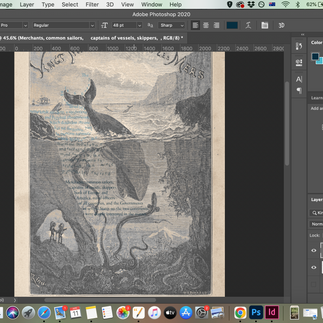

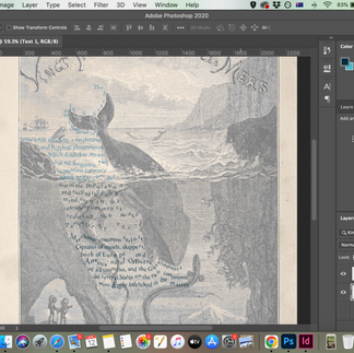


I was really satisfied with my work, but I felt like leaving the space of rock on the left felt weird without the context of the old cover. So I decided to add the title of the book.


Final Design
Reflection
I actually really enjoyed this exercise as I always wanted to create a layout of some kind of drawing with type, and i am very happy with my results!


Comments