
CBD | P4 | EX 3: Sequencing images
- Amber Houbara

- Jun 24, 2022
- 8 min read
Updated: Jul 6, 2022
In this exercise you’re going to create images which you’ll then print onto the papers you collected in the first exercise. You have been working with the poem Tango With Cows in the exercise ‘Concrete Poetry’, to create an experimental text. Using your interpretation of the poem as a starting point, develop a set of images that you can sequence into a narrative. You can choose to create these images yourself or use existing images.
Idea generation
Create a series of images which will build a narrative sequence over about 16 pages.
Use keywords from the poem as a starting point. Work with images you have created before, developing and changing their contents, or use fresh new ideas and imagery related to the poem. Remind yourself of the creative design process.
Explore the sequential narrative over the folds. Produce a folding document (2 sided) with the images you have created. Try one of the folding systems discussed in part two of the course, Form and Function: Paper folding.
Research and development
A visual narrative is a way of communicating some form of ‘story’. It may be that you interpret ‘narrative’ in a conventional way, using chronological images of how your identity has changed over time, with a beginning, middle and an end. Or perhaps you’ll work in a less obvious way, exploring how your images can be exploited through abstraction and print processes, using the term ‘narrative’ as a vehicle on which to hang your concept of the poem.
The purpose is to interpret the brief to create images that are meaningful to you, plus extend your understanding of image qualities. These images may be paintings, photographs, drawings, film stills – they can be at any scale, in any media and about whatever you want them to be, in the context of exploring the concept of the poem. This is your opportunity to explore some of the features of digital imaging software, such as Photoshop, to layer images, cut out images, experiment with opacity, filters, hue, brightness, contrast and halftone screens, among other things.
For example, can we approach text as image? What happens if you ‘rasterize’ text, then begin to manipulate it, in the same way as you would montage image material. Be creative! Explore!
Remember you have access to Bridgeman and Oxford art libraries online also, if you want to download images and work in this way, but originating your own images will make the project more personal to you.
To start with I wanted to explore some paper folding. Here is Paper folding part from Part 2 of the course.
Paper Folding
Folding paper in half and combining and binding a number of sheets together is a simple way to create a pamphlet. The same principle can be scaled up, so multiple pamphlets can be bound together to form a larger document. Other folding options such as accordion, gatefold, and rollover printing can offer alternative structures for small publications, create inserts in standard book formats, or offer book jacket options
I wanted to explore a fun and relatively easy way to fold my designs. I looked online on Youtube for tutorials and came across this video:
I wanted to created 16 designs, each as a spread, which will be A4, and then folded into 2 A5, I will glue the edges to create this fun long accordion looking book. and attach a simple cover at the end.
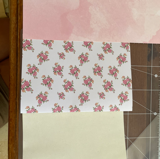
I have found this really nice recycled paper on the previous exercise and my mother had a full pack of it at home, so I am planning to use it as my paper. it feels like around 100-110 gsm and will be great for printing a lot of color on it.
To be focused I copied and pasted the poem again here so I can divine it into sections which I think can be fun to design photomontages from.
The fun part about photomontage is the things can also not make sense and this poem is a great example of sentences which don't really make so much sense together and especially apart.
Poem: Tango With Cows
1. Life is shorter than the squeal of a sparrow.
2. Like a dog, regardless, sailing
on an ice floe down the river in spring?
3. With tinned mirth
we look at our destiny.
4. We - the discoverers of countries
5. conquerors of the air
6. kings of orange groves
and cattle.
7. Perhaps we will drink
8. a glass of wine to the health of the comets,
9. expiring diamond blood.
10. Or better still – we’ll get a record player
11. Well, to hell with you!
12. hornless and ironed!
13. I want one - to dance one
16. tango with cows
15. and to build bridges
from the tears
of bovine jealousy
16. to the tears
of crimson girls.
Research
A mentioned above, I decided I want to take this opportunity to work on my photomontages, there is an artist I really love called '@Kaleiraher' on instagram, whom is doing beautiful photomontages with old school film images and I just love her work.
I thought I can use her as an inspiration for this project.
Her mood is always so romantic and mysterious and I think it can match the mood of the poem even though it won't be a very direct and obvious interpretation.
I also love the way she's using the text, very tame and relaxed and minimal, but still very attention dragging.


I feel like photomontages are not my strong side so I'm looking forwards to see how it will unfold for me and how challenging and hopefully fun it will be.
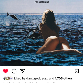
I created these mood-boards on Pinterest. One which I've used on the Robinson Crusoe project, as it has a similar style of photography, and one of which I found using text as well, some are with photomontage already and some I can see how I could use it for a photomontage.
Page 1
"Life is shorter than the squeal of a sparrow."
I wanted to create a romantic mysterious and mystical kind of mood here, not to put a very obvious sparrow and make it look like it squeals.
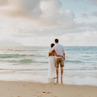
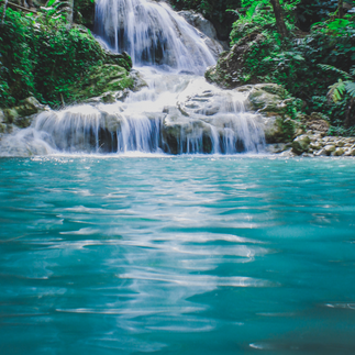
I wanted to show birds flying, and a moment of sunset which defines how beautiful life is and how grateful we are supposed to be in each and every moment as life is short.
I started looking into all the resources of images we have through OCA. some resources didn't work and some I really couldn't find images as 'oldschool' as I want on my moodboards.
I started exploring with the images I have found on Pinterest as I really liked them and wanted to work with them, still not sure if I can use them as they are not from a royalty free source.
I took these images from these sources:

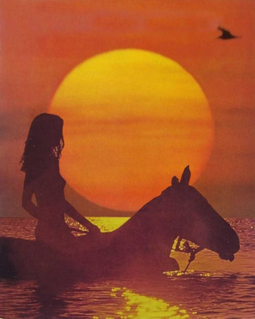
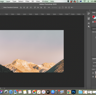
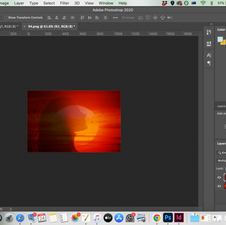
I took these 2 images into photoshop to see how can I layer them and mix them together.
I made layers and used the lasso tool to layer the woman and the horse above the birds, gave the birds opacity, so the background merges. I liked the same font I used before, this time just the classic Caslon as I know I would be able to use the different variations of it as I go with other images and create a cohesive mood. I wanted it to be very tame and very relaxed and minimal so I placed the font in the centre of the sun and kept it kind of small. I have created a smart object from the text and gave it a grain filter, as well as created a clipping mask with the sun to give it a bit of glow with 10% opacity.


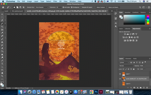

I really liked my design, but I was not sure if I can use Pinterest images so it was a good experience to just explore what I want to create as a theme for the other designs.
I think I will have no other option to just use images from Canva, even though they are very modern looking, and edit and tweak them to look old.
I also have my own library of images so I am hoping to use them, I'm just not sure I have images of all the objects I would like to have, and not sure I will be able to shoot exactly everything, so I will mix it with what I can find on Canva.
I started again.
Poem: Tango With Cows
1. Life is shorter than the squeal of a sparrow.
2. Like a dog, regardless, sailing
on an ice floe down the river in spring?
3. With tinned mirth
we look at our destiny.
4. We - the discoverers of countries
5. conquerors of the air
6. kings of orange groves
and cattle.
7. Perhaps we will drink
8. a glass of wine to the health of the comets,
9. expiring diamond blood.
10. Or better still – we’ll get a record player
11. Well, to hell with you!
12. hornless and ironed!
13. I want one - to dance one
14. tango with cows
15. and to build bridges
from the tears
of bovine jealousy
16. to the tears
of crimson girls.
I have decided to use Canva for my stock images, as they had what I needed, and I could make them all look 'old-school' as I wanted with using Grain filter over the whole design.
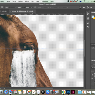
I have decided to use my creativity to create the meaning and expression of the designs, while creating photomontages. I have undergone similar processes for all designs, so I thought it would be better and easier to explain the process together.
I have searched for images which define my connotation of the words and expressions for each quote I have chosen.
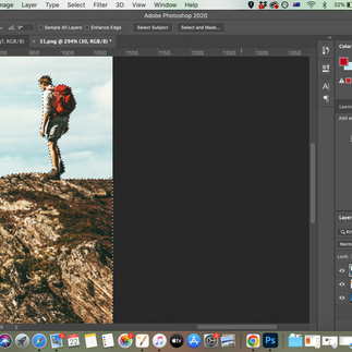
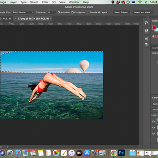
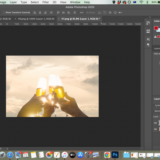
Then I have downloaded the images and started to explore on Photoshop.
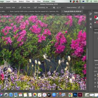
I used one main image for the background and used others to either be elements or complimentary backgrounds.
I used 'quick selection tool', 'magic wand tool', and 'object selection tool' to separate elements and objects.
I used free transform and moved elements around.
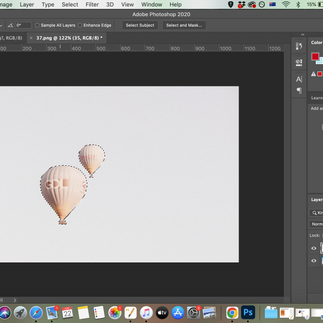
I used the eraser on transparency to create complimentary backgrounds (eg, create flowers on a mountain, or place different water element into a shore etc).
I have used clipping masks when I needed objects to be clipped into other objects in order to blend them, and used blending modes to create harmony between objects/ fonts and background when needed.
Some images needed to be worked on with colours or black and white so I have used photoshop levels, curves, exposures, colour balance etc.
I did play with transparency and opacity too between the layers to make things look more real.
Eventually, I have added the same Caslon text with the same size to all designs, and have used blending modes in some designs to make it look more transparent.
lastly, I have added the same grain filter to all designs with contrast of 50 and intensity between 15-20.
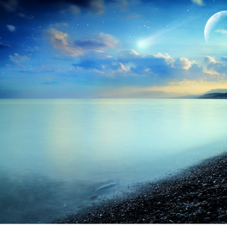
I did use a lot of nature imagery so things do feel cohesive, such as mountains, water sources, sunsets, beautiful orange and pink sky, cows, stars and galaxies etc.
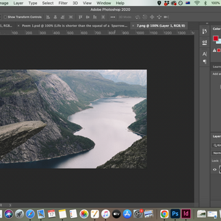
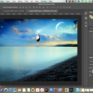
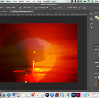
Page 1 Design - Life is shorter than the squeal of a sparrow.
Images for the design


Process


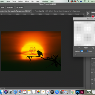


Design

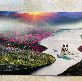
Page 2 Design - Like a dog, regardless, sailing on an ice floe down the river in spring?
Images for the design


Process


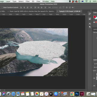


Design

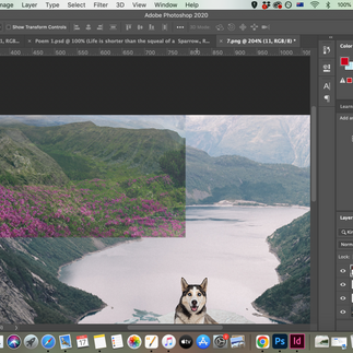
Page 3 Design - With tinned mirth we look at our destiny.
Images for the design


Process


Design

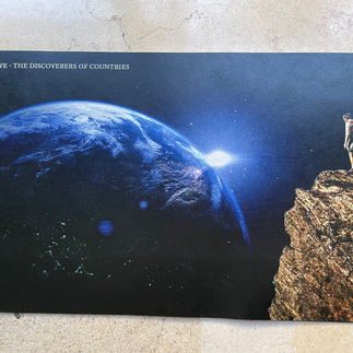
Page 4 Design - We - the discoverers of countries
Images for the design


Process


Design

Page 5 Design - conquerors of the air
Images for the design


Process


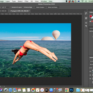


Design

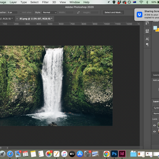
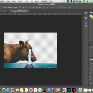
Page 6 Design - kings of orange groves and cattle.
Images for the design


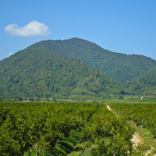


Process


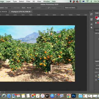


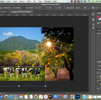


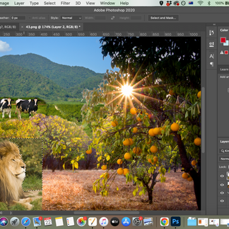


Design

Page 7 Design - Perhaps we will drink
Images for the design


Process


Design

Page 8 Design - a glass of wine to the health of the comets,
Images for the design


Process


Design

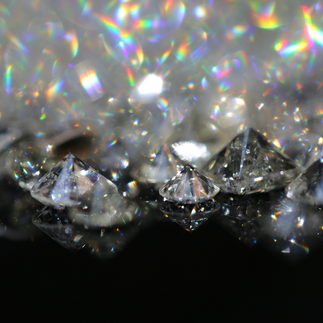
Page 9 Design - expiring diamond blood.
Images for the design


Process


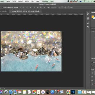


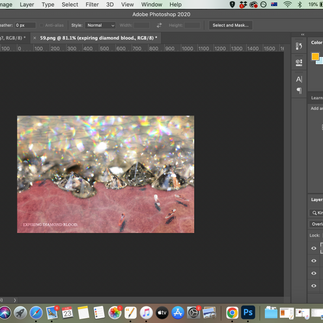


Design

Page 10 Design - Or better still – we’ll get a record player
Images for the design


Process


Design

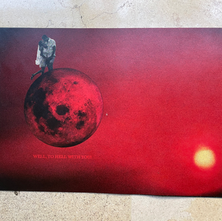
Page 11 Design - Well, to hell with you!
Images for the design


Process


Design

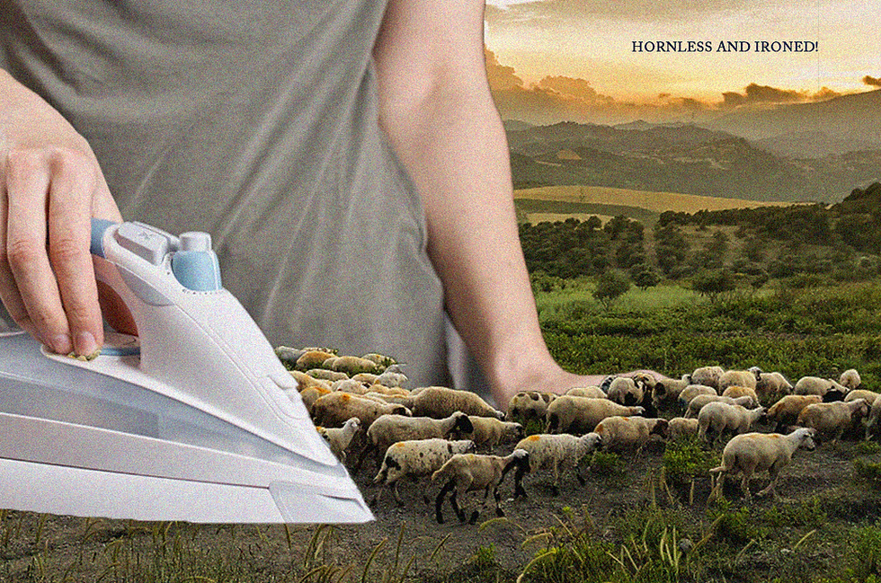
Page 12 Design - hornless and ironed!
Images for the design


Process


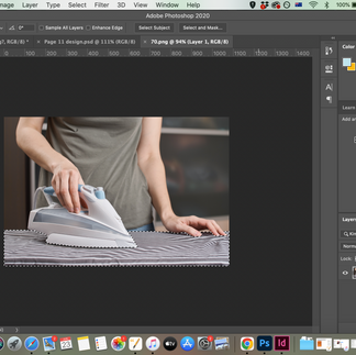


Design
Page 13 Design - I want one - to dance one
Images for the design


Process


Design

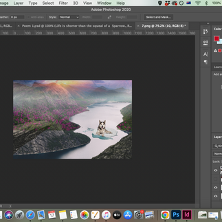
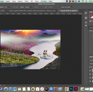
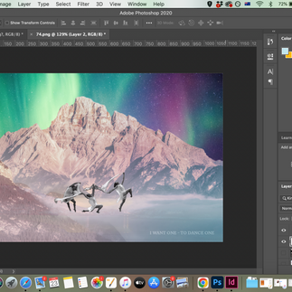
Page 14 Design - tango with cows
Images for the design


Process


Design

Page 15 Design - and to build bridges from the tears of bovine jealousy
Images for the design


Process


Design

Page 16 Design - to the tears of crimson girls.
Images for the design


Process


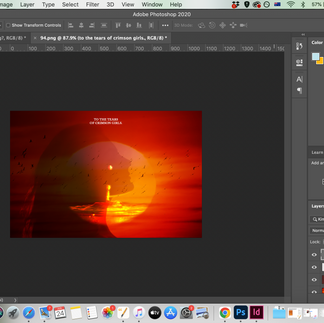


Design

The Paper

Prints together

Each Print


I am so happy with my designs and how it all came together! I decided to make the little pamphlet I planned to make.


Comments