
CBD | P4 | EX2: Concrete Poetry
- Amber Houbara

- Jun 24, 2022
- 5 min read
Updated: Jul 9, 2022
Critical writing task
Identify an example of concrete poetry and write a short critique of the content, design and the relationship between the content and form.
How has the use of typography, layout, and space been employed to help generate meaning?
Print out a copy of the poem and add notes directly onto the page. Write a brief summary of your thoughts, feelings and reflections on how concrete poetry creates new meanings.
As a starting point you may want to look at the following artists who practiced Concrete Poetry:
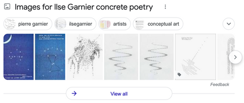
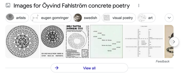
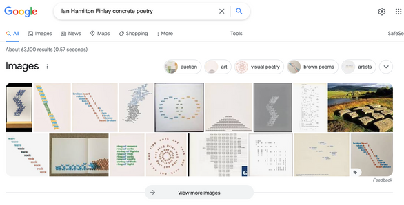
● Dieter Roth ● Max Bense ● Eugen Gomringer ● Ian Hamilton Finlay ● Henri Chopin ● Öyvind Fahlström ● Emmett Williams ● Geraldine Monk ● Mary Ellen Solt ● Ilse Garnier
To explore concrete poetry in more depth you may want to read Mary Ellen Solt’s 1968 Concrete Poetry: A World View, available via UBU: http://www.ubu.com/papers/solt/
Or research the work of individual visual poets at UBU: http://www.ubu.com/vp/
Visual task
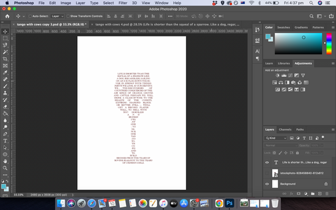
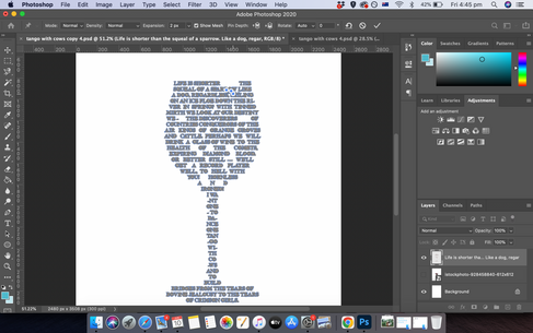
Use one typeface to create a playful design for the Tango with Cows, 1914, by Russian Futurist Vasily Kamensky (poem shown below).
Explore and experiment with the relationship between the meaning of the text and the form you present it.
Think about what kind of typeface you choose as well, does it reflect the content of the text?
How does the paper relate to the design?
Decide on an appropriate scale and format for this page.
Create a series of sketches and ideas, and chose one to develop into your final design.
Print your design on one of the papers you have collected in the previous exercise.
Poem: Tango With Cows
Life is shorter than the squeal of a sparrow.
Like a dog, regardless, sailing
on an ice floe down the river in spring?
With tinned mirth
we look at our destiny.
We - the discoverers of countries
conquerors of the air
kings of orange groves
and cattle.
Perhaps we will drink
a glass of wine to the health of the comets,
expiring diamond blood.
Or better still – we’ll get a record player
Well, to hell with you!
hornless and ironed!
I want one - to dance one
tango with cows
and to build bridges
from the tears
of bovine jealousy
to the tears
of crimson girls.
Write a short paragraph reflecting on the relationship between the form and content of your design in your learning log.
I have researched all the artists above to get some inspiration and understanding of the genre.


I also created a board of concrete poetry I liked on Pinterest.
Identify an example of concrete poetry and write a short critique of the content, design and the relationship between the content and form.
How has the use of typography, layout, and space been employed to help generate meaning?
Print out a copy of the poem and add notes directly onto the page. Write a brief summary of your thoughts, feelings and reflections on how concrete poetry creates new meanings.

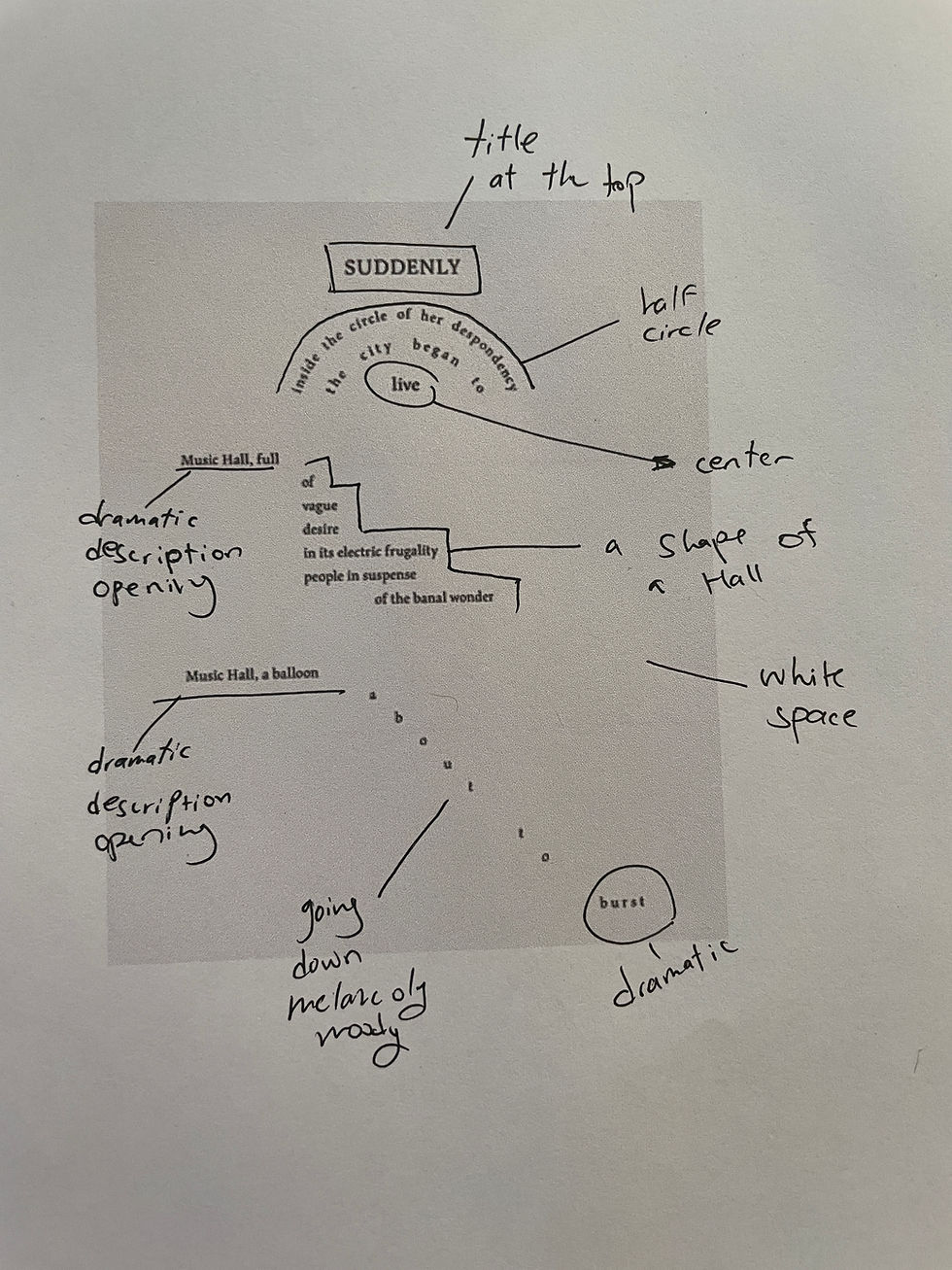
I really like this design, the content is very interesting, feels like it is very melancholic, while I do see a bit of hope there. The design and the content match as the flow of the letters and words is going eventually down, maybe deep into 'her' soul.
I like the fact there is almost a rainbow where it is a half circle, and the word 'live' is described to be 'inside' the circle of her despondency.
Also the music hall is described almost as if the description create a music hall structure.
The balloon is about to burst in a downfall, while burst is very dramatic at the end of it.
It feels as if there is a happening here and again, even though the subject seems sad, there is a living and hope there as well.
I started by researching the poem itself and the writer.


pic extracted From this video
I have found a very interesting website which describe the whole process of creating the book and the translation as well as the history of the poem. I have found it very interesting and very inspiring.
I have started by trying different approaches as I was sketching ideas.

I wanted to experiment with the poem and go without any plan, start giving meanings to each word as I go with my pen on paper.
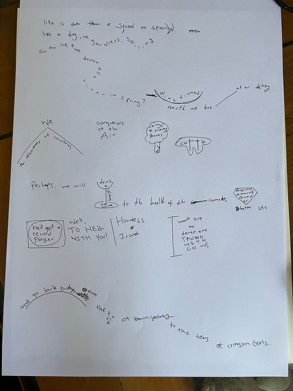
I felt like the poem has very beautiful lines and each feels either aspiring and joyous or very depressing and moody. So I liked the idea of having lines going horizontal and lines going vertical, also to create more space in the page and it looks really ecstatically.
I decided to develop this idea further.
I have chosen the font Caslon as it has so many different variations, I liked the hollow version of it.
I also tried to see how it will look to have a full variation of it for the vertical lines and I really liked the contrast.


I wasn't sure though, if 'one typeface' considered to be variations of it too, and also, I wasn't super happy with my results. I thought it was really cool, but that I could potentially push myself to really use a drawing for the letters.
---------------------------------------
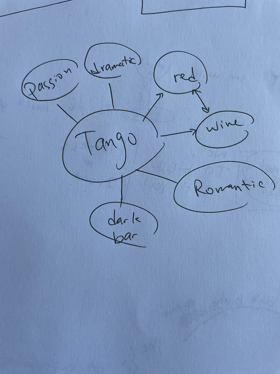
I went back to my research, and had 2 ideas in mind. I really liked the Russian/ Eastern European flowers on the original book and the translation, while also really liked the idea of the glass of wine.
I feel like the Russian tradition, and the red colour of tango and wine association, can be something fun to play with.
I really liked the idea of combining the idea of the wine and a design I have on my mood board. as to symbolise the dramatic tone of this poem.

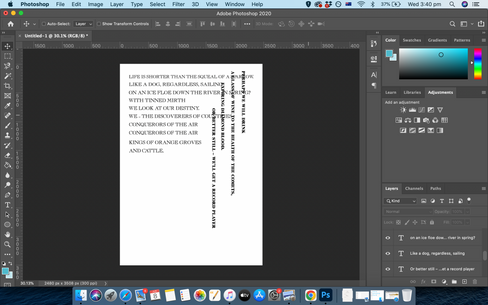
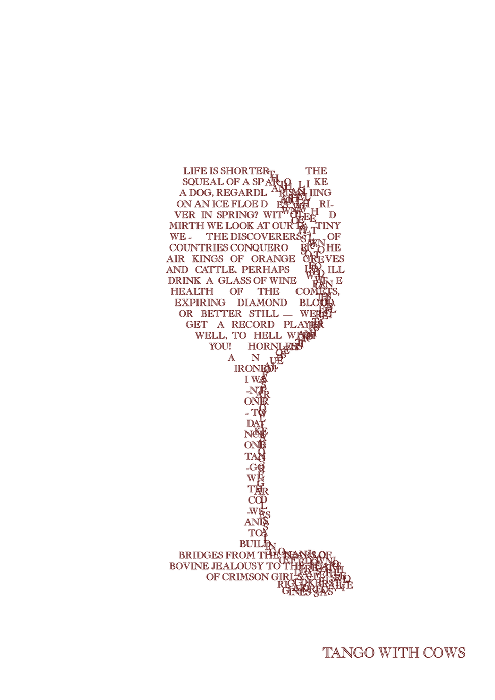
I started playing around on Photoshop and exploring different ideas and angles.
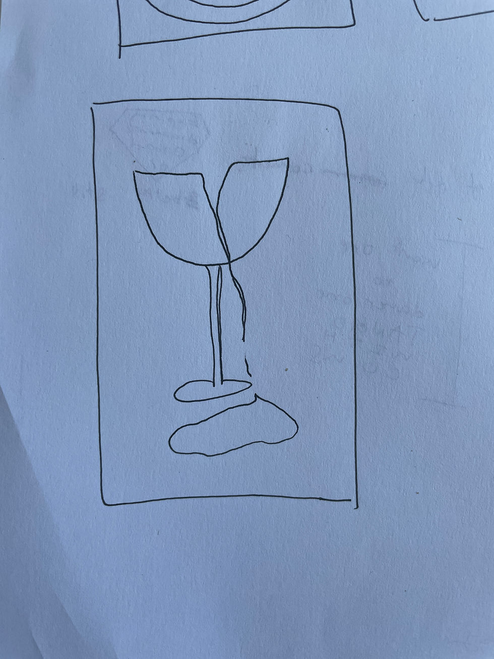
I started by making a glass of wine, I took a random image from google search to use as my wine glass frame for reference.
I really liked the shape I have created by the text!
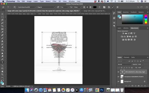


Then, as I was asking my partner's opinion he mentioned my reference of 'melting' letters from Pinterest looks like a glass of martini shape (from the shadows the fallen letters create!) So I decided to see how it can look if I create a glass of wine from the fallen letters.
I used puppet wrap to control each letter and make the drawing.
I also had to start again after one attempt as it wasn't working the way I wanted.


I wasn't so happy with this result either.
I wanted to see how can I take the ideas and process I have undergone so far to the next level and combine the ideas.
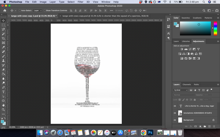
So I took the first design of the full wine glass, and tried to make the letters 'spill'. The main problem was, I didn't have enough text. So I had to copy and paste the text again, only for the spilt letters.
I also decided to color the letters dark red, as from my brainstorm idea.


I am very very happy with my result!!
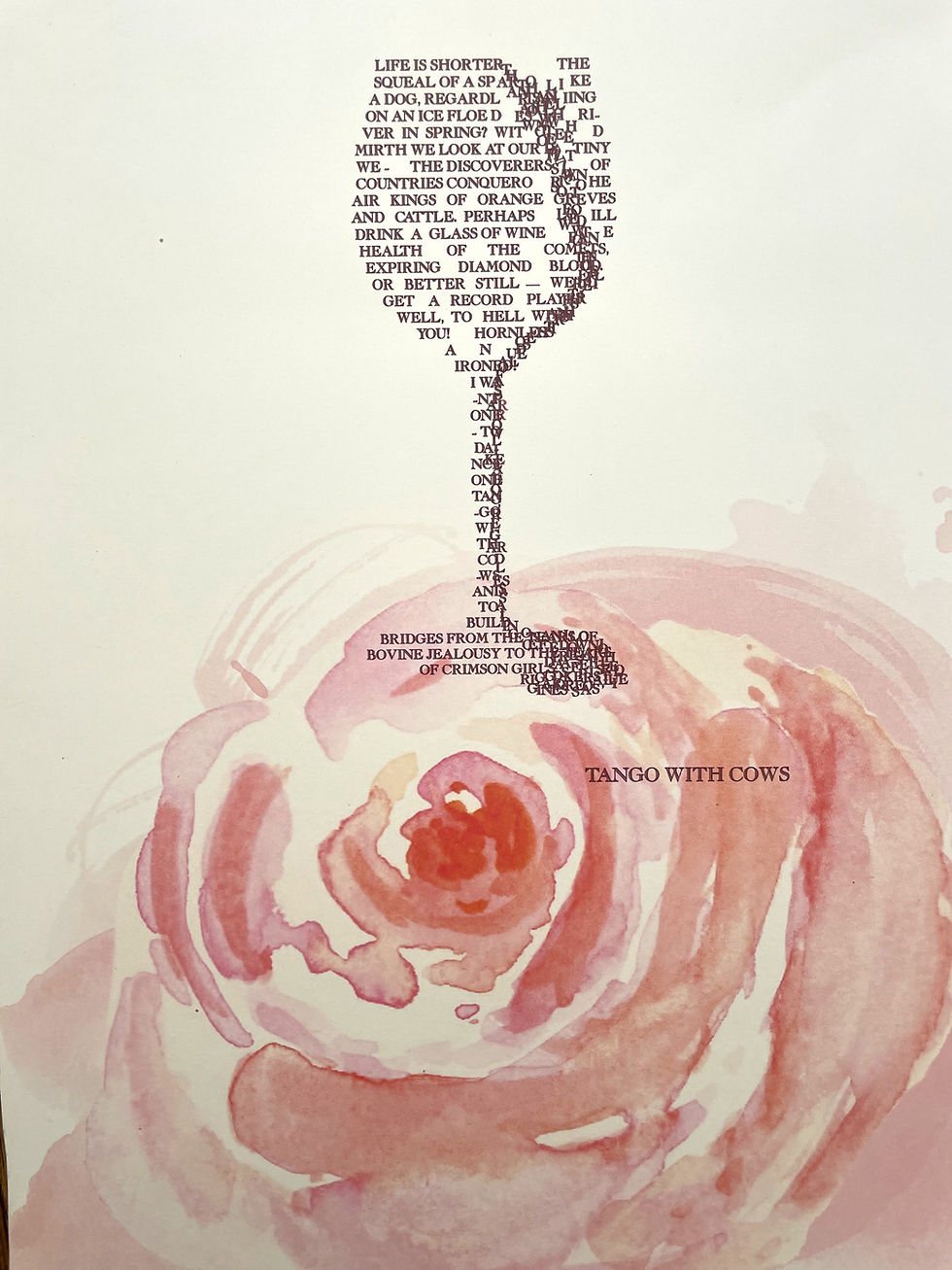
Now I just need to find a matching paper. 2 of the papers I've found and took a picture of on the pervious exercise are from a collection of different papers. I wanted to see if there is a printed paper in this collection which will match better with the mood of this design and poem.
I have found this really nice paper, on the previous exercise I have shown only 2 kinds of it (the big card paper), but my mother has a big pack of these in different patterns.
I really like it and I think it will go really well with my design.
I had to cut it to match my A4 printer.
and print the design onto this paper.
Reflection
I really liked the second part of this task, and really enjoyed again to use puppet wrap and create expressions of text by the shape and form of the appearance of the letters and words together rather than just the meanings..


Comments