CBD | P4 | Research 1: Exploring artists’ books
- Amber Houbara

- Jun 6, 2022
- 2 min read
Find two artists’ books that you feel demonstrate an interesting relationship between their form and content through the materials that the artist has chosen to use. Reflect on these books in your learning log.
If you have physical access to libraries such as The British Library, Tate Library Special Collection, or Leeds University Library, visit them and have a look at examples of artists’ books in their special collections. Libraries have online resources as well with access to their collections, for example the V&A National Art Library. Alternatively, return to the The Smithsonian Library’s online archive of artists’ books: https://library.si.edu/collection/artists-books
You may also want to reread the Artists’ Book section in Part One of this unit.
As I just arrived to my parent's home in Israel, I decided to go into our family library and find some artists' books. My whole family are fans of all sorts of art and therefore we have a wide selection of books at home.
I was drawn to a book I hvae purchased from a second hand shop in Australia years ago, of Hunter S Thompshon. I adore the design of this book and was so into book design before I even knew I wanted to be a book designer.
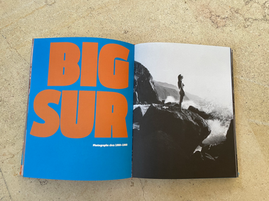
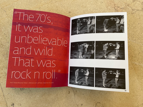
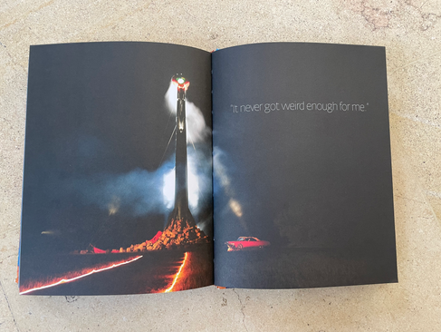
Here are some images of the book.
I love how the book is basically a print screen, based on 3 colours; blue, orange and red.
I love the photography which is all film as it is from back in the day (60-70-80's).
The fonts are really cool, the big almost psychedelic but so 70's titles are so cool and funky in the beginning of each chapter, next to a really impressive photo which sets the vibe of the chapter (location). The thin font for quotes gives the contrast to the thick one, and brings in excitement.
The paper is matte and thick, suited to an impressive printed book with a lot of color (if the paper would have been thin obviously the colors will show from both sides of the pages)
I love how the letters or pieces of writings are scanned from the original documents Hunter have written on the writing machine himself.
The drawings are so much fun, some of them are more like a print screen, very thick and stamp like, and some are in more details and thinner. I feel like there is a contrast going on with thin and thick... making things look really cool
The grids are really fun, making it look like a personal diary; like photos and papers were glued into a diary.
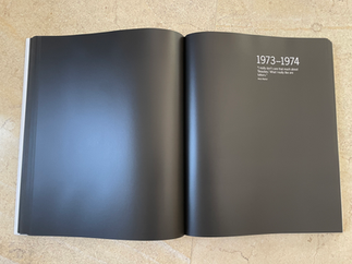
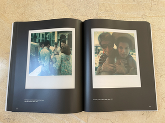
This book is very simple and minimalist, very much like Andy Warhol himself.
The paper is glossy and thick, very well suited to a coffee table style book (which most photographer's books are), also keeps it very chic and expansive looking.
The fonts are very minimal, very modern looking as well, as Andy was all about modernism and minimalism.
Photos are scanned from his own Polaroid collection, with small descriptions in the bottom.
Black background brings the contrasts of the Polaroid frames.
The beginning of every chapter is by years and a very small and minimalist entry as the photo above.
Reflection
I liked doing this exercise as it forced me to look into my family library straight on arrival to my motherland. I am pretty enticed now to see what other hidden gems I can find here for inspiration.











Comments