
5.7.1 - Exercise: The French Hen | Part 1
- Amber Houbara

- Aug 12, 2020
- 3 min read
Newton and Ridley, the brewers best known for their pub, The Rovers Return, are opening
a cafe/wine bar nearer the city centre.
The bar is designed to appeal to younger women and sophisticated young men.
The brewery has identified a gap in the market and wants to provide a ’sophisticated and relaxed’ venue for the ‘discerning’ drinker. (audience)
This bar is to be called the French Hen and will be in direct competition with the cheap ‘binge drinking’ venues on the same street.
The brewery is also trying to enhance its own image as a ‘respectable’ alcohol vendor.
They want you to develop some ideas for a logo, to be used:
• on covers for the food and cocktail menus • in colour on the signage outside, and as a cutout for a window detail • on T-shirts for the staff and paper napkins • for one side of a beermat, the other will carry advice on sensible drinking. There are many conventions that have been developed around the marketing of both bars and products to this age range. You need to be conscious the whole time of avoiding clichés and stereotyping. Draw up at least three ideas to start with.
Be critical of your work.
Check it against the information you have here.
Will it do what the client wants – and how will you know? When you have decided which one you are happiest with,
mock up the menu covers,
the outside sign,
the window detail,
a T-shirt,
paper napkin
and beermat.
Does it all still work?
Research
Articles and interesting interviews
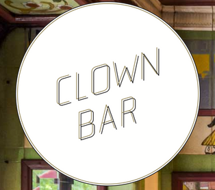
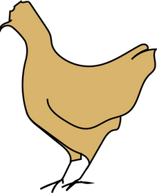
french hen painting


Collecting Ideas


Mood Boards on Pinterest and Behance
(unfortunately I can't make a widget for behance)
Sketches and Brainstorming


Digital Sketching


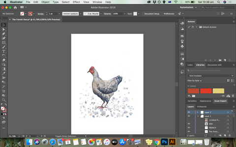


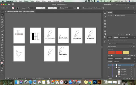
I was using one design by my hand sketch and the other 2 by drawing on illustrator, I have used known French Hen illustration as an inspiration to draw my ideas. I was trying to create one illustration that will only show the minimum amount of elements to describe a french hen - sort of a 'zoom in', and another one of a simple outline stroke of a french hen - sort of a 'zoom out'.
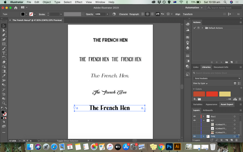
Then I was checking all the fonts I have (because I have so many cool fonts that can work for this task) and it was important to separate fonts that look better for a cocktail bar (different identity and branding) and a cafe & wine bar.
I have ended up with 'Calmius Extra Light Italic' Barret hat version, and 'East liberty sans' along with 'East liberty signature' with the outline stroke illustration.
3 Designs
In my eyes, when we are talking about a wine bar, something very sophisticated, classy and fine - in order to attract the right kind of audience, I think about -
a mysterious image
a font which have a big difference between stems and bars
and colors like black, white, red and gold.
I did really like all my designs, the one I was sketching which has T F and H in the same "shape" is very cleaver in my eyes, and looks great, but I didn't think it was matching my task. I don't see a cool whine bar with this logo at all. Then I had to decide between my 2 illustrated logos, and I did like both of them. I think the french hen with the french hat is very mysterious, especially because you can't see his eyes. and only the mouth and the hat are the 2 elements which are revealed. on another hand, I really thought the illustration of the french han as an outline stroke was a winner, especially with this font. It is simple, it is mysterious enough, and it is an identity. The illustration by itself can be the logo and could be identified without the text.


Choosing Colors

Developing Chosen Design


I really wanted to emphasis how dynamic the logo is, the colors and the cont along with the illustration, could be identified in many ways (- black and white, text in all colors combinations on white or black background), I think from all I've learnt so far about logos - that this is the biggest text!


Comments