
Jonathan Hoefler: Typeface Design / 'Abstract' Documentary series by Netflix
- Amber Houbara

- Apr 13, 2020
- 6 min read
Netflix came up with an amazing fasicnating documentary series on design.
My sister recommended me to watch the series and I've seen there's an episode about Jonathan Hoefler: "Typeface Design".
Jonathan Hoefler is an American typeface designer. Hoefler founded the Hoefler Type Foundry in 1989, a type foundry in New York.
"With a library of nearly 1,500 typefaces designed for print, web, office and mobile environments, fonts by H&Co are everywhere: you’ll find them on Twitter and at Tiffany & Co., in Wiredand The Wall Street Journal, on every can of Coca-Cola, and on every iPhone ever made. Our fonts help organizations like the Natural Resources Defense Council, the Southern Poverty Law Center, and the Office of Barack and Michelle Obama."
"In my very first meetingwith director Brian Oakes, we agreed that our episode of the Netflix documentary Abstract: The Art of Designshould be more than a profile of a working typeface designer: it should also offer viewers some practical insights into the mechanics of the craft itself. I loved Brian’s idea of periodically cutting away from the narrative to offer little lessons, and we both felt that manipulating physical props on a soundstage, rather than using computer animation, would be the most compelling way of demonstrating typographic principles."
I really liked watching this episode, since it gave me more of an idea about the research, work and ... sweat Typeface artists go through when they create a font.
And.. as Hoefler described it - a good lesson!
I took some notes and here they are -


No.1 - Overshoot - Rounds: "Even the alphabet’s simplest goals begin with some unexpected accommodations. Making all the letters appear the same height means drawing round characters to be measurably taller than flat ones, to counter our physiological tendency to see circles as smaller than squares of the same height. In a typeface, letters that are round at the top or bottom (such as this C) will need project beyond the height of the flat letters (such as T), by an amount that type designers call “overshoot.” Overshoot will apply throughout the character set, to the lowercase, numbers, symbols, and punctuation — and devilishly, it won’t always have the same measurement. It’s not uncommon for the overshoot of anSand an O to differ, dictated only by how things appear to the eye."
No.2 - Overshoot - Diagonals: "Our misperception about circles and squares extends to triangles, too: letters whose strokes converge into a point are prone to appear smaller than they actually are. So type designers customarily apply some degree of overshoot to diagonal letters like A, V, and W, and often, if the design calls for especially sharp corners, the acute points of the letters N and M as well."


No.3 - Natural Balance: "Another thing we consistently misjudge is balance. This may be a vestige of how humans have evolved toprocess the physical environment, intuitively recognizing that remote objects appear smaller than those nearby. Applied to typography, it means that making a letterform appear equally balanced requires drawing it to be measurably smaller on top. These expectations about “natural balance” are at work in letters like B, E, and S, which are visibly smaller above and larger below — and even in the letter H, which in order to appear symmetrical, needs a crossbar that’s just above center."
No.4 - Contextual Balance: "Curiously, a letterform’s construction can also influence how we perceive its equilibrium. Take the letter A, whose most basic recipe is “a delta with a horizontal bar in the center.” By rotating this letter about the center of the crossbar, we can see just how far below center this waistline really is. This is because perception is subject to context, and for the bar of the A, what we perceive as itsrelevant contextisn’t the entire letter, it’s the much smaller region that’s inside the delta."
No.5 - Balance (Cpmbined): "Both kinds of typographic balance combine unexpectedly in the letters E and F, whose center arms appear identical, but in fact almost never align. Following what we know about natural balance, the arm of the E will be positioned just above center, in order to appear equidistant from the two other strokes. But owing to itsrelevant context,the arm of the F will be centered not on the height of the character, but in the void between the underside of the top stroke, and the empty bottom of the letter — making it lower than the arm of the E, its fraternal twin. Often, the arrangement of theFis a compromise between what its own construction suggests, and its need for compatibility with the frequently adjacent letter E."


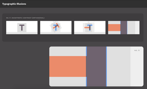
No.6 - Anisotropic Contrast: "The simple letter T conceals one of typography’s great paradoxes: that lines appear thicker when oriented horizontally than vertically. Type designers call this property “contrast,” and because it behaves differently in different directions, it’s said to be “anisotropic.” To create letterforms that appear to have a consistent weight throughout, a type designer will make sure that vertical strokes are measurably thicker than horizontal ones; diagonal strokes, therefore, will fall somewhere in between."
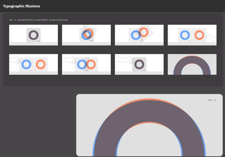
No.7 - Anisotropic Contrast: "Anisotropic contrast affects not only weight, but also dimension: just as we perceive horizontal strokes to be thicker than they really are, we perceive horizontal distances to be longer than they actually are. To create what appears to be a perfect circle or a perfect square, a type designer will create a shape that’s measurably narrower than it is tall. Looking at the letter O, we can see two effects of anisotropic contrast at once: in its normal orientation, the stroke weight becomes steadily thinner as it reaches the top and bottom of the letter, and the letterform itself is taller than it is wide."
No.8 - Calligraphic Bias: "Complicating the way we perceive weight is the “calligraphic bias” that’s implicit in the Latin alphabet itself. The very shapes of our letters are the product of the broad-edged pen, held at an oblique angle in the right hand, which, as it moves rightward, produces thin upstrokes and thick downstrokes. This pattern of thins and thicks is apparent in many of the typefaces we read every day, but it’s also imperceptibly fossilized in even the most evenly-weighted design. Looking at a mirror image of the letter A reveals that its left leg is subtly lighter than its right, a necessary maneuver to satisfy our subliminal expectations about weight — all the consequence of ancient right-handed scribes."


No.9 - Compound Effects: "To see all of these phenomena at work, look no further than the letter S: it only takes viewing the letter from a different angle to reveal all the sleight-of-hand that goes into making it appear balanced. Turning the S clockwise reveals the different proportions of its top and bottom halves, a necessity to maintain natural balance. In this orientation, the ends of the strokes appear to flare outward, a consequence of the anisotropic contrast that causes weights to thicken as they approach verticality."
No.10 - Compound Effects: "Looking at its mirror image reveals an additional illusion: that the S is considerably thicker in the middle than above or below, a consequence of the calligraphic bias that expects downward strokes to be the heaviest. Nowhere is this more dramatic than in its lower left quarter, where the letter’s heavy spine rapidly thins out as it approaches the baseline, the combined effects of anisotropic contrast and calligraphic bias that are both undetectable in its normal orientation."


INSPIRATION AND RESEARCH
I also loved the way he does his research and gain his inspiration.
Inspired by old watches typeface, then getting into a dead-end not being happy with the result and matching it with ancient maps typefaces.
Also to complete fonts and get more inspiration he visits graveyards.


MORE INFORMATION
Jonathan Hoefler was talking about family fonts he designed for leading magazines and how to match different fonts together, He was talking about spaces in fonts too.
"The Jastrow illusion is an optical illusion attributed to the Polish-American psychologist Joseph Jastrow. This optical illusion is known under different names: Ring-Segment illusion, Jastrow illusion, Wundt area illusion or Wundt-Jastrow illusion. The illusion also occurs in the real world."


Comments