
Research point - Typeface
- Amber Houbara

- Apr 10, 2020
- 2 min read
Updated: Apr 16, 2020
Research point The alphabet is only part of a typeface that contains lots of different characters such as numbers, punctuation, mathematical and monetary symbols and ligatures. Ligatures are where two letters are combined together to make printing easier. Explore you computer keyboard to find some of the other characters. You will need to use your shift, alt and cntrl keys.
Choose a magazine, for example the Big Issue or Heat, and look at the main typefaces they use for the body text and headlines. Go to www.identifont.com and use the programme to identify the fonts. Look at the ranges of typefaces all around you and try to identify their distinguishing characteristics.
Make notes in your learning log.
Part one, exploring my keyboard -
1234567890-=
[]\;',./
pressing shift
`~!@#$%^&*()_+
{}|:"<>?
pressing option (alt)
“‘«…æ≤≥÷`¡™£¢∞§¶•ªº–≠
œ∑´®†¥¨ˆøπåß∂ƒ©˙∆˚¬Ω≈ç√∫˜µ
Part two - choosing a magazine and exploring fonts
I took the famous group of Conde' Nast, Vouge etc is matching which kind of magazines.
I took the famous group of Conde' nast, Vouge etc
("Condé Nast is home to some of the world’s most iconic brands, including Vogue, The New Yorker, GQ, Vanity Fair, Wired, Architectural Digest (AD), Condé Nast Traveler and La Cucina Italiana.")
I like the fact they have a magazine in each field that I'm interested in.
Travel - Condé Nast Traveler
Fashion - Vogue, GQ, Vanity Fair...
Food - La Cucina Italiana
and they also have The New Yorker for news.
I have decided to explore 3 of thier magazines.
Travel, Fashion and cusine.
Condé Nast Traveler


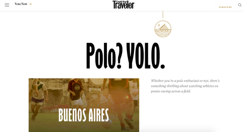


I was checking on identifont the header font first.
It came up as "Gill Sans Nova Extra Condensed Bold" - it does feel very close (slightly different on the A capital, but still very close, I'm guessing it is the same family of fonts)
Then I checked the body font, again, it seems very similar to what I have found on identifont
"Caslon No. 540"
I like the fact that it is a neat and modern pair. On one hand, the headline is very modern and cool, giving it a young attractive Travel headline. While the text font is very easy to read and have a more educational feel. Also, when with a slant, it gives it another dimension which is even more stylish, educational and neat.


Vogue


The font of body text is "Dante" according to identifont and the headline is "Adobe Garamond".
The font of the text is "fusing, since they are very similar. I could see on the capital W they are not the same though, when I found the text font "Dante".
I did like that fact they are similar, since it gives it a very informational and minimalistic style.
As Vogue is one of the leading magazines for fashion in the world, they know how to give you the most stylish presentation. From production, and images to the text and graphics.


La Cucina Italiana


The font of the headline is "Metromedium #2"
The font of text is "EF Century Schoolbook"
I like this pair too, the headline is very playful, very not formal, which is more "kitchen like" feel. The text font is great for reading long instuctions or reviews.


In conclusion, I really like to see how fonts match, and it even made me change the fonts on my own blog here.
I notice now better what is easier to read, what a typeface can give as a mood etc.
I will keep exploring on my surroundings and share on this blog post..


Comments