4.4.2 Exercise: If the face fits
- Amber Houbara

- Apr 14, 2020
- 7 min read
Updated: Jan 6, 2021
Part 2
Now identify which fonts you might use in each of the following commissions:
• A short story in a woman’s magazine entitled “I thought I loved him; now I’m not so sure”.
The story is 1300 words long so you will need to identify a text font and a headline font.
• An advertisement in a parish magazine asking for more helpers on the flower rota.
The finished size is A6 landscape and the text reads:
“Can you add that important artistic flourish to our church? We desperately need more volunteers to join the flower rota. If you can help or would like more information please contact Jennie jennie@vicarage.co.uk.”
• A poster to advertise an after-school club for boys aged 13 – 14.
The poster will be A3 size and the copy reads:
“Bored? Feeling got at? Nowhere to go? Then why not come and join us on Tuesdays and Wednesdays after school in the Old Gym. We’ve got football, ping pong, table soccer, computers, Karate, cooking and lots more. All free just come along.”
• Your friends’ engagement party.
They want a flyer A5 size to send to their friends as if advertising a club night. The copy reads: “Mandy and Josh are finally going to do it...well almost!!!!! Come and join them on Friday 24 March from 8pm at the Golden Calf to celebrate their long awaited engagement... and yes lots of presents would be gratefully received particularly if we can drink them!!!!!"
Then have a go at mocking up each of these.
Try different fonts to see how each changes the feel of the text
and make notes in your learning log about which works best and why.
Women Magazine
My first leading research words will be-
- Women magazine
- Love

Started by Pinterest board to collect ideas
I did notice that whenever a "Love" article made it to the front page, the colors are redder.
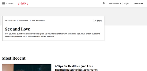
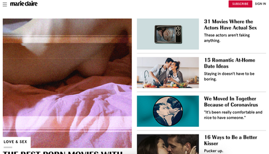
Then I started looking at leading women magazine's Love (and sex.. since all Love and relationship columns are always including sex as well) columns
Then looking deeper into font pairings on those magazines.
to be quick, I have run a search on the fonts through this website
And the fronts are -
Headline - Radiant EF Text Black by Elsner+Flake (Sans Serif)
Text - Amariya Regular by Monotype (Serif)
Colors popping - Purple/ pink, Beige, light blue
Design - The home page has a big box for the main story and other stories on the side in smaller boxes. The article has a main headline with subheading, text, and images throughout.
Headline font - This specific font was hard to find, I could find similar ones but not exactly, I like the fact it's a serif font but it's quite decorative. It has a stylish twist to it.
(similar to Tabac Big Light by Suit case Type Foundry and Rameau by Linotype)
Text font - Amariya Light by Monotype
Colors popping - Purple/ pink, Beige, faded blue/gray
Design - The home page has a big box for the main story and other stories on the side in smaller boxes. The article has a main headline with text, and images throughout. The text starts with a 'drop cap'.
Headline - again, couldnt find the exact font, but the very interesting thing was, this font and the font from Elle magazine were almost identical! (similar to Denver Serial Bold by Soft Maker and Rameau by Linotype) - (Serif)
Subtitle - All Round Gothic Demi by Dharma Type (Sans Serif- decorative)
Text - Georgia Pro by Ascender (Serif)
Colors popping - Purple/ pink, yellow/ orange, light blue.
Design - The home page has boxes of all stories, main 3 are presented first, then the rest (after ad).
The article has a big image before the Title and then the Title, subtitle and text.
conclusion
I didn't need to go any further in my research since I have realized a pattern in those magazines.
1. The headline is mostly decorative but minimalistic. It can be Serif or Sans Serif but have to be very fine.
2. The text is mainly Serif, since it's usually a long text (as in my brief too - 1300 words) and we already know Serif is better for reading longer text.
3. If using a Serif headline and text, the subheadline will be sans serif.
4. Colors that are pretty systematic in this niche are purple-pink, something that resemble with dreamy/ third eye/ sex/ relationship. matching with beige or light warm colors such as yellow or orange, to balance and completed by light or faded blue/gray.
5. Design-wise, Boxes of information, rather one big one + small ones on the side or all medium size.
Now identify which fonts you might use in each of the following commissions:
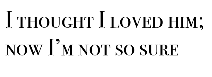
• A short story in a woman’s magazine entitled “I thought I loved him; now I’m not so sure”.
The story is 1300 words long so you will need to identify a text font and a headline font.
Headline -
Fonts that can match
Big Caslon - I really like how stylish it is but at the same time, very minimalistic.
Bodoni 72 - It's definitely a stylish font, but maybe a little bit too stylish for the brief. It gives a little bit of a confused feel since the serifs of it are not straight.
Bodoni 72 Smallcaps - Same as I have mentioned about Bodoni 72 (which is from the same family of fonts), I think this font is very stylish but maybe a little bit too much for this aim. both of them give a different feel for what I am looking for, maybe for an artistic magazine, it can fit better.
I think I like Big Calson the most as a headline for this brief, so I have decided to use it.
Text -
Charter
Athelas
PT Serif
I really like the font Charter for this brief's text.
Checking how the differet fonts look together with the headline I have chosen
PT Serif - For me, it looks very heavy, something about the shape of the font that is not 100% simple for long text reading
Charter - I really like the way Charter font flow on the long text, it is fresh, not too boring, and have a stylish touch to it. Moreover, I really think it pairs nicely with the headline font that I have chosen - Big Caslon.
Athelas - The font both Elle and Marie Claire have used, I thought it can work, but at the same time I wanted to be more sophisticated and use my choice of typeface.
Final Mockup - Women Magazine
images from- first one Elle Magazine second and third from Pinterest.


Parish Magazine advertisement
• An advertisement in a parish magazine asking for more helpers on the flower rota.
The finished size is A6 landscape and the text reads:
“Can you add that important artistic flourish to our church? We desperately need more volunteers to join the flower rota. If you can help or would like more information please contact Jennie jennie@vicarage.co.uk.”
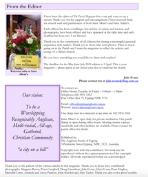
Fist, I have never seen a Parish magazine, so I have started by looking for some examples and inspirations online.
I have found those two websites -
I could see the design of the Parish magazine and also some advertisements, I have found also a website of a church so I have added it as well to my reasearch here
I could see already few interesting things -
1. Most of the typefaces are sans serif. It is so interesting to see how in almost all of them there was a use of sans serif. - Most of them are looking modern and fresh.
2. Colours that are popping into my eyes are - Green, Purple, Yellow and blue
Yellow - hope, Blue - calmness/ spirituality, Purple - royalty/ wealth, Green - optimistic and refreshed
3. The design is very very basic, almost ugly in my eyes, very effortless.
4. images are mainly big
I was looking further for some information about Flower Rota -

And here again, all the typefaces are sans serif.
It was interesting for me since, when I was watching the "Abstract" episode about Typeface and Jonathan Hoefler (see my review here) He was talking about Gothic typeface and the relation for the church and religion. I'm guessing the Church nowadays are trying to be a bit more modern and invite mire fresh young people or at least show they are not backwards.
So I knew already I will have to look into sans serif fonts - especially more modern looking.
Fonts that can match in my eyes (by order) -
Headline -
Gill Sans - Very nuetral and pleasent to the eyes
Skia - It's a really stylish font but might be a little bit bold for the church I think He was talking about the Gothic typeface and the relation for the church and religion. I'm guessing the Church nowadays are trying to be a bit more modern and invite mire fresh young people or at least show they are not backwards.
Seravek - Feels like it's just between the two fonts above, medium stroke, classy but stylish, I did notice that a lot of the fonts from my research had a little round
Text -
Avenir Next - I like this text because it's simple and readable but still classy.
Avenir Next Condensed - It's a very nice font but it's a bit too condense for a big chunk of text.
Assistant - this font is very basic and nice to read.
Skia - I wanted to check this font in headline and in text, but in text the mood looks a bit "hippie-like"
Helvetica - A well known font, but for me it is a bit too boring, and I want to make an ad that will drag attention.

So I think my favorite mix Pair is -
Headline - Seravek
Text - Avenir Next
I started working and put the font Seravek as a headline and gave it a bold stroke
I was playing with the colours and deviding the text so I had 3 chunks of text-
1 - Can you add that important artistic flourish to our church?
- Seravek font all caps letters 22pt colour violet (giving a royalty feel)
2 - We desperately need more volunteers to join the flower rota.
- AvenirNext font bold 18 pt dark green (giving it a fresh and optimistic feel)
3 - If you can help or would like more information please contact Jennie jennie@vicarage.co.uk.”
- AvenirNext font bold 10 pt light stroke dark blue color (giving it a spiritual feel)
Yellow backgroung to give a feel of hope and all together being really colourful as flowers are.
I have added few vectors of flowers and plants I have from "Creative Market" online (They give weekly free graphics and I have an archive of them).
Final Mockup - Parish Magazine


Comments