
4.6.1 Assignment 4 - Show me... | Context / Research type foundries
- Amber Houbara

- Jun 24, 2020
- 5 min read
Context
Typographers and type foundries (the companies that commission and produce typefaces) have always had to promote their latest designs to printers and designers to show off a particular typeface, its different fonts in a variety of sizes and contexts, and the unique features of it. Once Specimen Sheets were the main way of doing this. Nowadays most of that marketing takes place online – research type foundries on the internet.
Brief
Design the font for use on the cover of a magazine called type and write a short article for the magazine using a range of typefaces, with typographic illustrations, drawing on all that you have learned in this section. The article should include sections on: • what makes a typeface interesting
• how a typeface is constructed • question marks.
Requirements
Do a mock up of the magazine cover to show where and how your title font will appear along with other cover elements. Produce a magazine article that is attractive and interesting enough for someone to want to pick it up to read, and which shows off what that you have learnt so far about typography. Add illustrations, photographs and colours as you want.
PART 1 - CONTEXT
Typographers and type foundries (the companies that commission and produce typefaces) have always had to promote their latest designs to printers and designers to show off a particular typeface, its different fonts in a variety of sizes and contexts, and the unique features of it.
Once Specimen Sheets were the main way of doing this.
Nowadays most of that marketing takes place online
– research type foundries on the internet.
I have created a board on Pinterest for Type Specimen Sheets
1. Typofonderie
I have started my research by firstly searching about Specimen Sheets. I think that in order to observe a culture or a mechanism it's important to see where it came from.
I have found this very interesting article at Typofonderie's website which is explaining about Specimen Sheets and presenting a great collection of 20 years of Sheets by this foundry.
"Since 1994, for each typeface published by Typofonderie, a printed specimen is designed. The explanation is very simple: before the web, this was in fact the only way to present correctly a typeface. The web has changed that, a lot. As a foundry, it was a natural way to perpetuate this tradition initiated by Erhardt Ratdolt in 1486. What’s the function of a typeface specimen? To present a typeface before using it in situation for real. But there are different kinds of specimens as the testing pages a punchcutter must do, to check the shapes, weights, alignements, style. However, the main function for a specimen is to present the typeface to potential clients. Catalogues and specimens dedicated to a unique typeface are the first link between the type designer and potential users of new typefaces. A real tool for graphic designers, to check the style and functionalities of typefaces they may potentially need as part of any new projects. As graphic designer, before computers, let’s remember that books on any kind of subjects, color palettes, and type specimens then formed the essential elements to practice art everyday."
Some of my favorite Specimen Sheets from this article


While reading this article I was also pressing on some links and have found this other area on this website, which Typofonderie is presenting Specimen Sheets PDF's of a great number of fonts.
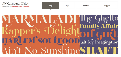
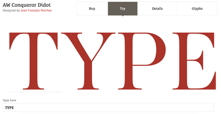
Scrolling through thier website I have looked for types that will be apropriate for magazines and I have found those two - 'AW Conqueror Didot' and 'Mencken Head'. I have used thier 'try' option to check how the word 'Type' would look with this font.
I think that from all reasons why type foundries decided to shieft to online marketing, the 'try' option is the most appealing. It actually gives us the opportunity to see how this font will look like with our text.


Continuing researching I have found those really interesting articles which present the top big and small- boutique Type foundries:
Here are my favorite Type Foundries so far:
An independent type foundry established in 2010 in San Isidro, Portugal.
If we are talking about marketing, they already got me before I even looked at the fonts.
With a cool, bold almost avant-garde interactive website design, they have got my heart.
When checking their actual online font pages, I couldn't believe my eyes, they give an option to change the color, they have proper mocked up items jumping into the screen with the font in use on them and at the end also a gallery with the font in use in public.


The world-famous Monotype is a big name in typography. Monotype is definatly one of the larger names in fonts and typefaces.
Their website is very commercial, keeping minimalistic design, gradients, and great accessibility.
Their presentation of fonts in their online font pages, you can see clearly the fonts in all weights and styles, a showcase of each character, and of course a 'try' option, but what impressed me the most, was the video. If I have mentioned before the 'try' section is the most officiant for web marketing, I take it back. Monotype has perfected the online marketing presentation with their outstanding videos!


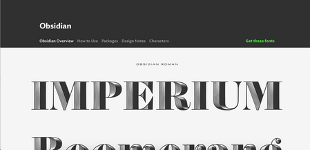
As I have already mentioned on this blog post I did about Jonathan Hoefler, Jonathan Hoefler, and his crew, are a famous type foundry. They have an endless amount of fonts on their website and the design is very sophisticated. On their font page, there is a wide show-case of: font overview, how to use, packages and pricing, design notes, and characters.
The "how to use" section here is a key, it is very educative and very smart. The total language of thier foundry is sophistication and prestige from my point of view, and I like it!


Another cool interactive website, of a Type foundry established in 1991 with offices in London and Brazil. they are presenting with a young yet organized and commercial approach. They have their presentation as a sliding strips showcase, which on some fonts gives you an option to adjust the font by moving the mouse. They even give you a detailed 'case study' which shows their process in creating their fonts. I think it is a very important and interesting marketing tool.


Another great foundry, I really enjoyed their website, it is clean, minimalistic, but still doesn't compromise the interactivity, the dynamic showcase, and the explanations.
It is very easy to use, they have impressive strips to showcase their fonts and a section of fonts in use, as well as a 'goods' section which is a merch shop and an online blog. On each font page, there are big presentations of the styles and weights as well as character section, and wide information about the font.


Comments