
4.6.2 Assignment 4 - Show me... | Font Design + Magazine Cover
- Amber Houbara

- Jun 30, 2020
- 6 min read
Updated: Jan 8, 2021
Context
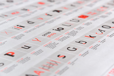
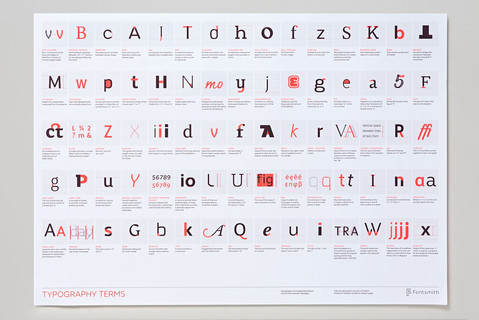
Typographers and type foundries (the companies that commission and produce typefaces) have always had to promote their latest designs to printers and designers to show off a particular typeface, its different fonts in a variety of sizes and contexts, and the unique features of it. Once Specimen Sheets were the main way of doing this. Nowadays most of that marketing takes place online – research type foundries on the internet.
Brief
Design the font for use on the cover of a magazine called type
and write a short article for the magazine using a range of typefaces, with typographic illustrations, drawing on all that you have learned in this section.
The article should include sections on: • what makes a typeface interesting
• how a typeface is constructed • question marks.
Requirements
Do a mock up of the magazine cover to show where and how your title font will appear along with other cover elements. Produce a magazine article that is attractive and interesting enough for someone to want to pick it up to read, and which shows off what that you have learnt so far about typography. Add illustrations, photographs and colours as you want.
Research - Typography magazines and typography in magazines
I have found this interesting article.
it is talking about the idea magazines like to have their own fonts which are different and unique for them.
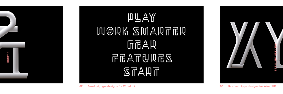
I really like the idea of constructing a font that can work as a normal font but also for dimensional typography, like this one for 'Wired' magazine.


I also liked these quotes by Neville Brody
“When I was at college I really hated it. It’s taught as such a strict rule-based profession—very elitist, monastic almost. So it was by challenging that, and realizing typography was also about image-making: that was the breakthrough for me.”
“When I was at college I really hated it. It’s taught as such a strict rule-based profession—very elitist, monastic almost. So it was by challenging that, and realizing typography was also about image-making: that was the breakthrough for me.”
“Obviously typography carries an emotional thing as well as the words; so how something is said affects our emotional response. The next stage then is to think about what you can do to keep the reader on their toes—how can you create rhythm and balance and surprise and create more of a filmic journey through a magazine?”
I have also found this article and this article reviewing a new typography and design magazine called "TypeNotes", and I really like its esthetics, also I could see elements that are found in those kinds of magazines.


Then I kept searching for interesting magazine covers and made this Pinterest board.
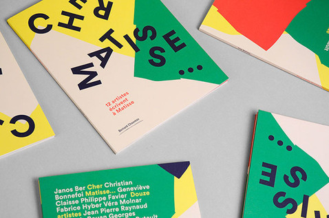
I was looking mostly on the magazine cover's typefaces and fonts, along with some articles design. I was focusing on art and design magazines since 'TYPE' would be a magazine specializing in typography (I assume), but I was openly searching to gain inspiration and see what is out there.
Then I have looked into some more inspiration online specifying in art and design magazines. I have found this article which is presenting "50 Examples Of Stunning Typography In Magazine & Book Designs" I have saved some of my favorite examples including articles from inside these magazines.
I have noticed a big amount of art and design magazines are very minimalistic and I really liked the idea of minimal design, I also see some of them really create a filmic journey through the magazine as I quoted Neville Brody before. I really took it as my main inspiration to create something minimalistic, an image like, tells a story and takes the reader into a journey.


I really liked the way some of those magazines were playing with the lettering in a different direction or smudging the letters. I think I want to create something that looks like someone did something to the font I will create. As vernacular typography is changing with the look of the street and happenings, so is the font I will create. Maybe coffee stains, or something that happens to the font due to water or fingerprints.
I feel like I want to take a risk and maybe have a very very minimalistic cover, something like maybe a white background and only the font on it - so it drawers attention and the reader's curiosity. I have noticed most art and design magazines don't have much text on the front page, differently from fashion, lifestyle, cooking, health (etc) magazines.
SKETCHING
I have done this course on skillshare first to learn how to create my own font
The word TYPE reminds me of a typing machine or printmaking fonts as I have discussed in this research.
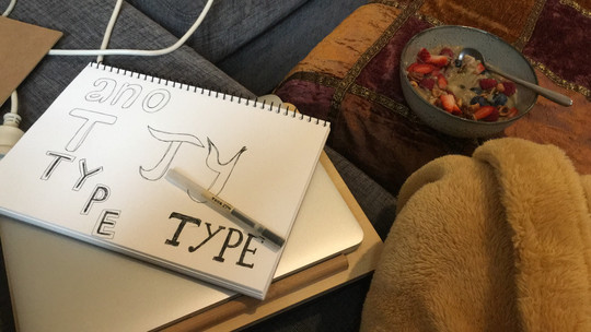
I was checking this course on Skillshare, explaining how to create a font from sketching to the computer. I started sketching but I have found myself getting a bit lost for a whole day, I wanted to create something that would look old but will have a modern tweak.
I was looking at vernacular typography and trying to see what can I get inspired by. I wasn't sure if I want to make a serif of sans serif so I came up with two options that I liked the most.
One is a sans serif, more like a bubbly style, I was thinking to make a sunny side up as the cover image and the bubbly typeface to be the shine on the yolk.
The other option is a serif font, I was playing with a one-side curved square, something that will look like the serif terminals and feet, but will have more volume. A mix between serif and goth lettering. It reminded me a bit of the tuxedo tie. I wanted to make a cover that has this font bold and big on the top of the page, and then make it wet, by water spill, or coffee stains, as I have mentioned before.


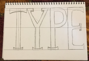
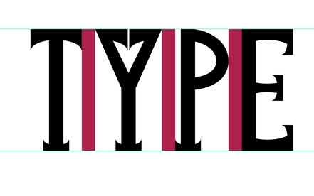
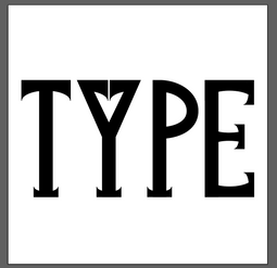
I liked the serif font better so I started going over it with a brush-pen and make some fixes on paper. After that I took my font to the computer, following this tutorial of how to create a typeface on illustrator. I have started by creating the main shape of this font which is a rectangle with one side being curved inwards. Then I could rotate it and change the size in order to construct the rest of the font to be 100% matching. I have also created the stem and could change the size and rotate for the use of the Y. I have created a higher guideline for the P as I already know round shapes seem smaller.


MAGAZINE COVER
I exported my design to PNG and took it to photoshop to start working on my cover. I have used an 8.5 X 11 inch paper, which is appropriate as a standard magazine size.
I still wanted to experiment with the other idea I have had with the sunny side up. So I took a photo from 'Canva' stock and used the liquify tool to make the letters 'TYPE' from the shiny part of the yolk.
I actually really liked it, but kept it as an option for now. If I decide to go for it, I can construct this font I have created from liquifying the shiny part of the yolk on illustrator.
I have added a barcode (from this website) and a description line (using 'Adobe Caslon Pro' 30 pt Bold Italic), since I really like the fact that design magazines don't have too much written on them, they give the main space and attention to the artwork and drawing the reader in to see more.


I was watching a number of tutorials to see how can I make this cover wet. During researching I have decided I want to have this magazine wrapped up in plastic (as many magazines are being sold nowadays) and make water drops on top of the wrapping, as it was sitting outside in the rain.
I have opened again a 8.5 X 11 inch document on photoshop, and placed my new font on the top of the page.
I was looking very hard for a tutorial of how to create my own wrapping plastic vector/ effect. the standard wrapping plastic effect on photoshop didn't look that real in my eyes. I have found online a free high-resolution plastic wrap texture from this website and placed it on a new layer of the document. I have tried first to see how it would look if I only mask the font with the plastic wrap. It was cool in my eyes so I have saved it as an option. Then I decided to go for a quirky look, and chose this peachy color to be my background.
I have added a barcode (again from this website) and added the same line I have added to the cover before. I really liked the font and look of it and wanted to see how it would look on this cover idea.


Final Cover


Comments