
CBD | P5 | Ex 4: Printing
- Amber Houbara

- Jul 13, 2022
- 4 min read
In this exercise you can use any images created elsewhere in the course, to print onto the paper samples you collected earlier
Active experimentation
You are encouraged to be experimental in these exercises; it doesn’t matter if you make a mess or get things wrong in the images you make. It is important to reinforce this message at this point in the creative process, as often people tighten up when they think they are embarking on the final piece, and lose some of the fluidity and spontaneity of their original ideas. We want to keep the visual outcome of this exercise fresh and not stultified by perceived conventions of what is ‘right’.
When you’re exploring visual ideas and processes, the outcomes may not always be what you thought they would be at the outset. You won’t always get it right the first time, and this is how it should be. By repeatedly trying out and experimenting with the materials and ideas at hand, you’ll discover new ways of working. Occasionally ‘mistakes’ turn into happy accidents and prompt a way of working, or technique, that you might choose to deliberately recreate and integrate into your next project. For example, one colour may bleed into another, or your coffee cup might leave a stain on your working paper. Instead of throwing these elements away, you could integrate them into your design process.
Organising images
When you’ve created a set of images, scan or photograph these to create digital files – JPEGS or TIFFs on your computer. Make sure the resolution is set at 300dpi. Having gathered all the images together in one folder, consider how you’re going to print them. What order will the images appear in? At what size? How will the image appear on the page? Which paper will you use for which image? Do you have a particular image in mind for a particular piece of paper? Will you try printing the same image on different sheets of paper?
Draw a simple flatplan as a guide to working out how and where the image will be placed on the page, whether you will include any text, and to explore how the idea of ‘narrative’ might work. You might set up your page layout in DTP software, and work with your images digitally in this way, or you may simply print direct from your photo editing software onto the paper samples.
Printing
You may choose to use a desktop printer to output your images, or you may research other print methods such as screen-printing or etching. Print at least 16 pages using the images you’ve created on the paper samples you have collected.
For this task, I decided to take on my feedback from part 4, and to experiment more as my tutor was encouraging me.
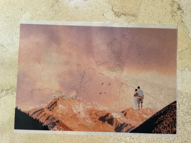
I looked back at Creative Book Design Course and saw I don't really have enough imagery from this course to create a 16 photos narrative, so as I asked my tutor, she said I can use the photomontages from part 4 again.
I have gathered some paper from my previous exercise on part 4, and wanted to print it on some of the papers I've found. There was a Chinese paper, which was very delicate, so I realised I couldn't print so much colour on it or it will tear. I called the print shop before coming and realised all my paper wasn't A3+ (which is how they print). So I decided to change things a bit, and instead of using my own paper collection, use theirs.
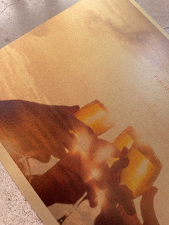
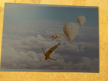
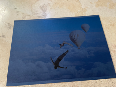
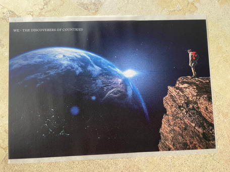
The print house I'm using is very popular among designers so they have a very beautiful and large selection of paper, all very very very interesting and beautiful. I was so intrigued to see how different prints will look on different paper, and I knew some will come out not good (such as colourful photomontages on black paper).
I was very excited!
as my designs are A4 and they have A3+ sheets, we printed 2 designs on each paper, so I had 8 kinds of paper to experiment on.
I wanted to go very randomly with the paper choosing to take changes and make it the most random and experimental.
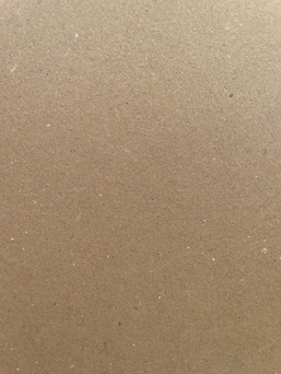
I took also zoom in pictures of each paper.


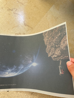


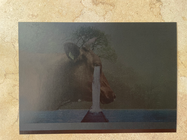


I actually was very impressed with the results, and how randomly things matched!
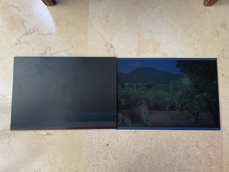
I was even more impressed with the black and darker papers and how it came out!
I was very interested to see how some papers (the darker ones in particular), looked different in different angles and lights.
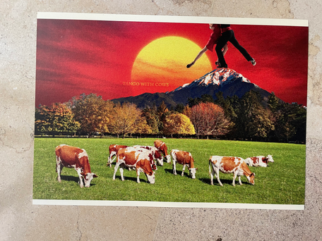
I love how the gold works so well with the golden design of the wine glasses and sunset, and how the silver works so beautifully with the diamonds! It was totally random!
I am very excited to use different paper and see how the prints come out on them.
Unfortunately paper as such is very expensive and only seen in very special books made by more expensive and luxurious publishing houses.
I would love to make more use of special paper in books!
Creating a narrative
This time I wanted to experiment with a less linear narrative (as my tutor suggested).
I looked at my designs and wanted to see by eye what will go nicely with what, as this time I wanted the designs to face each other.
I was looking at the colours, the papers, the prints on the papers and also the written word (I wanted to see how I can pair differently the words not like the poem).
This is how I organised my designs.
I liked how the transparent pages when backed by silver or gold looked really cool!.


Comments