
CBD | P5 | AS5 : Your choice | Part I Research, Design & Print
- Amber Houbara

- Jul 14, 2022
- 15 min read
Your final assignment asks you to draw on all the skills, insight and experience you have gained so far, by designing and producing a book of your choice.
Use the following options to as a starting point or alternatively identify your own project.
● Influential book designers
Identify one or more book designers to present through your book. Find ways to develop your own creative responses to their ideas and visual approaches. Delve into their work, find suitable quotations, investigate their influences, and find ways of communicating this material, and your interpretation of it, to an audience through effective use of layout, narrative, and choices of material.
● Typography
Extend your exploration of typography by continuing to develop creative approaches to how typography, layout and your material choices can help generate meaning. Develop a book that explores one aspect of typography in more detail, or combines a variety of approaches. Just because your project explores typography it doesn’t mean you can’t also include images, colour and narrative.
● Found and altered books
Use an existing book as a creative starting point. This could be an extension of exploring altering books in some way, or as a research project into a specific book that will generate content and creative ideas for a new book. Find a physical book to work with or pick one of your influential books from Part One
Research the subject in depth and think about the editorial structure (described in Part Three) of your book.
What is the flow of the content, would you write articles or create imagery or both?
What do you want to tell about the subject and how would you communicate this?
And who is your audience?
Make a flatplan before you start designing your book, and have a look at other books on the subject to see a different design approach on the subject.
You may want to look at the work of designers you inspired by, in order to develop your own design approaches.
You may have identified an alternative area you wish to pursue. This is fine as long as you check this out with your tutor first and document the reason(s) for your choice.
Follow the creative design process in developing your creative thinking and how you will approach the workflow, in terms of content and timescale.
Decide on your subject and start;
researching,
creating content,
editing content,
making decisions about the materials you want to use,
and designing your book.
Frame this process within an overview of your workflow to help plan the production of your book. Planning the process of generating content, and how this can then be developed, is key to successfully finishing a designed physical book.
Keep notes to accompany the process of making of the book in your learning log, and reflect on your design process.
You can use any medium or materials you want to in the production of your book.
You may want to research and explore hand-binding, or work digitally with print on demand for production.
You may want to combine these approaches and you may want to consider whether you want to produce a one-off copy or a small edition.
If you would like to use a particular paper for your book, make print proofs before printing the whole final book. Test the paper, the colours and how your design works on the paper.
Explore the materiality of books in more depth by considering the paper, printing and bookbinding of books, both as content and form.
Think about how books are held, interacted with, and the associations of the materials you might use. Explore how these choices can start to create meaning within your book.
Reflection
Give yourself a final self assessment check against your assessment criteria to see how well you think you’ve done. Use this process to help reflect on your work and your achievements on the course as a while. It will also help to identify to you and your tutor any areas you may need to work on prior to submitting for assessment
Sharing your work
Digital companies such as blurb.com have an online ‘sharing’ facility – this would be a useful way for your tutor to see the whole work without the need for expensive mail costs. If you decide to send your physical book to your tutor for feedback or to OCA for assessment, for safety, you are strongly advised to send it by special delivery.
Assignment 5
For this final assignment I wanted to do something special, so I can really use everything I've learnt so far in this course.
I was appealed to the idea of Typography, but I feel like I have done a lot of typography so far on Graphic Design Core Concepts and on this course.
I have already decided I will be binding my own book, and I know i will be learning so much about book design from this alone. I have made a soft cover on this course, so I really want to make a hard cover by hand and see how all these elements and parts of the book actually go in together into a hard cover book. I also am obsessed with fabric wrapped hard cover books (as i mentioned few times on this course and in my researched, exercises, and assignments) so I wanted to create it myself, and manifest my favourite kind of book with my bare hands.
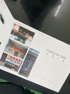
I thought the best idea for a hard cover fabric book is a photography book, and it will be such a great opportunity to finally publish something with my own film photography, which I've started on 2018.
I thought it will be so special!
That way I could also use my own photography and have the freedom to be copyright free.
I have asked my tutor if it will be possible to create my own photography art book as my final assignment, and she agreed.
I am very intrigued by this assignment!
Research
MoodBoard on Pinterest
I always start my process with a visual research, I don't always look at references in close, I just collect as many ideas and look at as many ideas I like, and my brain gather them and document them in a more broad way, gathering ideas inspired by a specific mood.
Book Binding
From my previous exercise of Tango with Cows, I came across this youtube channel called 'Photo Book Guru', and I saw this video of his photo book, it was a very similar idea to what I had in my head.
So this is the technique I want to use:
* I was also watching this video where he explains more about the book he created and gives extra tips
I have asked my tutor how many pages roughly I need to produce, and she said to make it manageable maybe maximum 26. The print house said to me to make sure the number of pages divide by 4 so that makes it to be around 24 pages. I was very concerned 24 won't hold a hard cover, and I really wanted to have a hard cover to create a very neat and impressive look.
So I was trying to see if this kind of binding will hold only about 2 signatures?
or if I sew it in pamphlet stitch would it be able to hold a hard cover?
It was hard to get an answer and I have found myself going around the net for a while trying to find an answer. Watching tons of DIY videos and reading articles.
Articles:
Tutorials:
I was considering changing to these methods, but I wasn't sure it is what I want to achieve.
Eventually, I came across this answer on reddit
"Hey, I was curious as to how many pages is a minimum for hardcover binding.I was considering printing 36 pages (9 A4 Pages) at 160 gsm. Can I place these in signatures of three?
edit: Thanks for the advice, I spoke to a binder/technician at Uni aswell and he mentioned it shouldn't really be a problem. I'll do a test book first to make sure."
Paper and Page Count
So I decided to have 36 pages, 3 signatures of 3 pages. 9 A3 sheets folded in half (A4).
From an early conversation with the print house, I have already asked them about recommended sizes for photography books (one of the workers there is a photographer as well), and they recommended A4 book. I also asked them about the paper recommended for photography books and they showed me few options. As I explained on exercise 3 of this part, they told me some paper kinds won't work for me if I fold the A3+ sheet into A4, as the fibre of the paper can be damaged. They recommended wood free paper, chromo paper. There were few more options which were really beautiful but would only work if I made an A5 book (again, because of the fibre direction and the folding).
I decided on Wood Free paper, as the texture was really nice, and I wanted the most texuturized paper possible, and 170gsm to make it nice and thick.
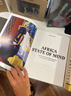
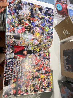
Books & Artists Inspiration:
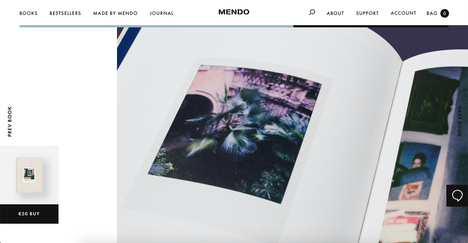
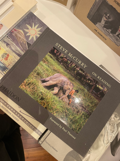
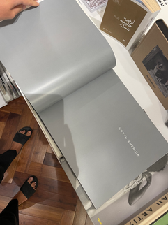
Artist Raymond Meeks
On my research I came across the work of a photographer Raymond Meeks, and his bookWhere Objects Fall
I fell in love with his work and his books and the way he presents them all together. The video in this link was so inspiring how he said the composition of images together in photography books is really a story telling and creates the narrative.
It reminded me how important is the combination of photos and I wanted to make sure I put a lot of attention to it.
Form of consumption
I am not sure if it is a real magazine, as I couldn't find anything about it online other than these images on flicker and Pinterest, but I really love the visual language of this series

Pierrot is a photographer I am following on instagram for a while, he is in charge of this beautiful account I've mentioned few times called Equatore Journal. I really like his aesthetics and the way he is presenting the world and his photography. I love linen wrapped books and I love the fact the name is embossed into the cover.


I kept exploring more photography books on this website.


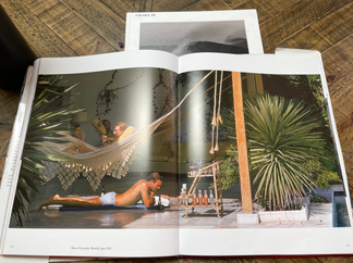
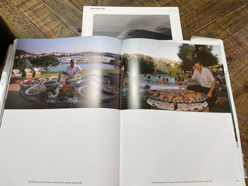
The biggest inspiration for me is Peter Lindbergh and his books. I am totally in love with his aesthetics.


And just like that I have found one of the most beautiful books I came across. I am in awe.
This is so beautiful, such a great inspiration for my book


Book stores visit:


Answering Questions + Brain storming

After such a long research above, I have more of an idea of the editorial structure of the book.
I want this book to be timeless, to take the audience on a journey, as I do, with my camera. I want this book to have minimal writings, just where every place of a photo is, and maybe a short description (a word or two). Like when someone is going into a gallery or museum, and get the experience of getting lost into an exhibition, but at the comfort of a home.
I imagine in my head someone come over to my place for a coffee, have a sit at my living room, and while i make them a coffee they pick up this book from my coffee table and dive in. Or perhaps someone sits at a coffee shop and it's on the table, as they dive in and go on a little journey beyond space and time.
I want the book to be held in someone's hand on a sofa, or on a table in a cafe, flipping through the pages and taking a moment to imagine oneself in this place, to feel the temperature of the place, the smells, the vibrant or muted colours.
Materials; I want the cover to be hard, so the experience is feeling solid on someone's lap or open flat enough to see the pictures properly on a table or in hands.
Thick paper, thick cover wrapped with linen. I want to use and play with transparent paper and print an image of the place on one side and the name of the place on an overlapping transparent paper (as A3 folded into 2 A4)
I want the visuals to tell the story, the narrative.
I had this feeling when I needed some grounding time by myself one day and went to a coffee shop to have breakfast by myself. I run into a book of Slim Aarons (which is a photographer I love!) and just ended up going through a whole massive book in one breath, as I was eating my frozen Acai Bowl and imagining I am back at the 90's or 70's somewhere very faraway.


The audience are probably everyone who's interested in traveling or photography. I think this book can talk to many people, as we all have this very nature of escapism, we want to escape reality, into a better, more beautiful, calmer place. Where we have no problems, where we can relax, where we can be strangers and no body knows us or expect us to be anything. Where there are no tasks, or work to do, just be.
We want paradise.
We want to be free.
It reminded me of a really beautiful text from a book I love called, Eastern Wisdom. Here is just a quote from this text:
"Imagine a special moment in your life when everything was alright. There was no tension in your shoulders, you were smiling, there was nothing to worry about, and everything was perfect just as it was.
Maybe you were in a hammock suspended between two palm trees on a tropical beach, cocktails served with tiny umbrellas and Bob Marley singing in the background. You lay back, closed your eyes, and experienced a pleasurable all-encompassing, profound sense of Everything is alright.
Millions of people plan their annual vacations in anticipation of moments, hours, or hopefully days like this. This feeling of Everything is alright, which nourishes body and soul, is possible for all of us. It will make us peaceful and patient, and when we are in such a state of inner calm, every moment will be an absolute delight.
Everything is alright is a personal state of consciousness and it has nothing to do with the world around us. It is a moment of grace, like we had in the hammock, under the palm trees. Each of us can attain a feeling of Everything is alright, and maybe this is the very happiness everyone is talking about.
To examine one’s state of happiness we divide the great Everything is alright into five parts, each corresponding to a different dimension in time. Our goal is to attain this state of being in as many of the following five as possible...."
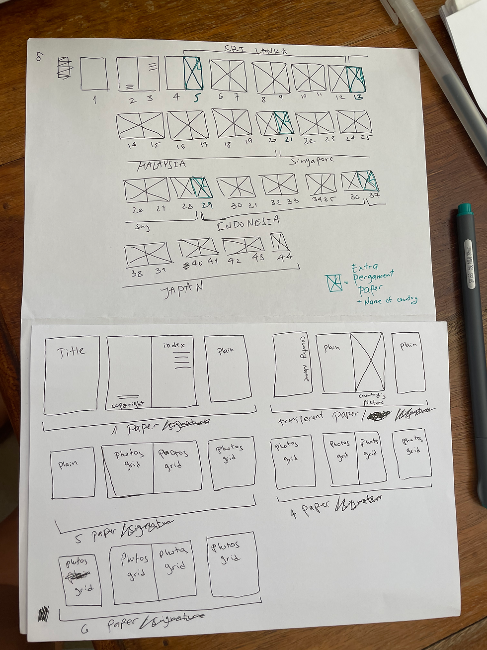
Flatpan of the book + Developing the story
I want to have my idea I mentioned above with the transparent paper. now in order to make it happen, I have to fold A3 of transparent paper into 2, one A4 will have the name of the country, behind it the photo of the place, and behind both, a plain paper to give it the contrast.
It was a very complicated idea, so instead of drawing the flatpan, I decided to make it myself with paper and pergament (transparent) paper.
In order to make this idea into practical, I needed to have my signatures all one sheet (so 9 signatures made of one sheet of folded paper each), I didn't know if it is possible to I have watched a massive amount of tutorials to see if anyone does it. I have found this tutorial where it seems as she's using thick paper as signatures (so each folded paper is a signature). So I knew I can make it.

A little Problem
When I went back to the print to consult with them about the pergament paper and the binding of the book, they told me if I fold the pergament paper, and even worst, sew it, it can brake or damage and it will be really bad. Even though the tutorial I'm using to bind the book suggesting to sew it, I think I will trust the printers as they have such a good experience with paper and book binding.
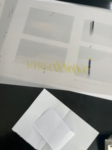
They suggested me to not print the image on the pergament paper, rather only the name of the country on the pergament, the photo of the country on the normal paper, and use a double sided glue to blue the pergament (which will be only A4 in size) into the side of the image, so it is not sewn in and only comes as an extra.
Even though I was devestated as I really wanted to print an image on the pergament paper (I liked the results of it on exercise 4 of this part, as I was testing paper), I decided to go with this idea, as I have no options to keep the book really well bound and also print the image on the pergament.
The good news were, now things are less complicated, and I can actually use signatures.
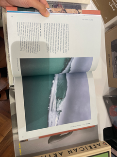
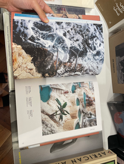
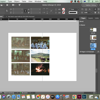
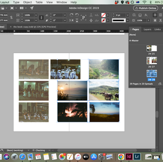
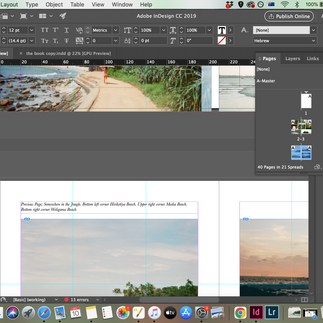
I looked at the amount of photography I have, and amount of countries I've shot, and I was trying to think about an idea of a story telling. From looking at all images, and living/ traveling in the far east for several years I decided to focus on Asia, and chose 5 countries; Sri Lanka, Malaysia, Singapore, Indonesia and Japan.
When I left traveling at the end of 2013, I did a 'Round the World' Ticket, and started in India and went East, all the way around the world. I felt how every country I went to, I could see the similarities and then a slight change and the differences, in the shape of faces, the features of the body, the culture, the food, etc. I wanted to bring this experience into the book, so I started from East to west (obviously Japan is a bit more north) I visited Japan only later on, and in the snow, so I felt it was a good way to finish the book. Also, Japan is a very powerful and beautiful and special place so I thought the powerful images can also be a great finish to the book.
So I re-planned my book and here is the flatpan.
I also decided to make the book slightly longer than planned, again, as I really wanted to make this book something special.
Giving each country 1 page to open the section + 7 pages of images organised by grids.
*Luckily the print told me they can arrange the signatures for me, which was nice to think I don't have to get my head around it.
Workflow & Planning
Keeping my eye on my plan at all times, I had to have a very solid plan, and really keep in my time schdule, as my end date was close.
I had this plan as mentioned on EX2 of this part;
Friday & Saturday - Research, online, visit book stores, get the idea, understand what I can manifest with the time and resources I have. Brain storm, solve problems.
Saturday & Sunday - Select and gather images, create layouts and grids.
Monday - make sure the design is finished and be at the print shop at 9am when they open (that way I know they are not busy and I can consult with them about everything before printing). Get all materials I need for the book cover etc, sew the pages. Design the cover.
Tuesday - Get all materials left, print the cover design, make the cover.
Wednesday & Thursday - write and show my process + extra time if something goes wrong.
Obviously things could go wrong, and I have extra time to allow that to happen.
Creating & Editing content
I started with gathering all my images, and organising them into folders.
choosing which photos I like or think can be good for the book, and filtering the ones which are either not good enough or don't really suit the book.


Then I started going through my research and ideas, and drawing as many layouts and grids as I can, intuitively. It is an exercise I like to do when I plan a book, I think about the mood and the ideas behind and just draw without over thinking it too much.

Designing the book
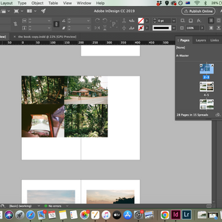
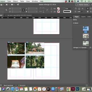
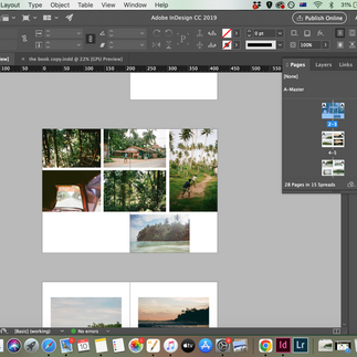
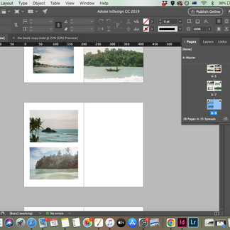
Then I went into my inDesign, and opened a file, A4, with 3 mm bleed as the print asked.
I started working intuitively, having a look at my layouts every now and again, but coming up with different ideas as I go. I really like getting into this creative mode and letting everything come up.
I prefer sometimes to work with the images directly rather than creating layouts with a tinted frame, so I can give my attention to the images themselves and see how I can tell the story.
Fonts
I was also looking for the right fonts, I wanted something vert classic, or vintage. I was looking in my computer and my collection and on creative market which I use to buy fonts when I need.
I have found this really nice font I liked called 'Amaline' and used it for my titles. For my text I chose 'Baskerville' i think it is a timeless font with a wide family so I could modify on the text when explaining images (top bottom right left etc.) and give descriptions.
Feedback
I have asked my family for their thoughts and what do they think I need to change. My sister gave me some ideas and a great feedback, very minor changes but they made a big difference in my eeys.
Layouts and alignment
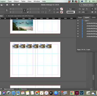
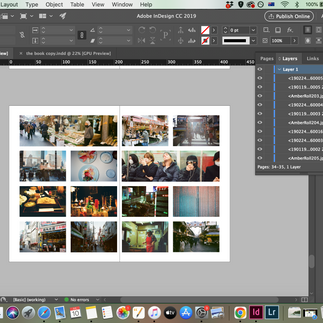
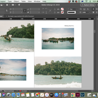
I made sure my book is divided to 3rds of the page, so my A master was having a grid of 3 lines horizontal and vertical. I like using the fibonacci elements and placements as a guide, but work intuitively.
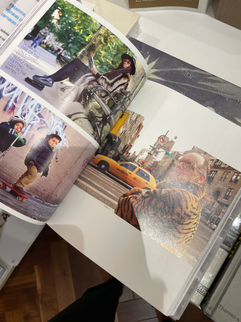
I used photos which are not the same image or even not from the same place, and i like to put them side by side and make them look as if they are continuing of each other, even if they are not. You can see it along the images and grids of the book.
Every distance between photos, are either 7mm or 3.5. to make it look neat and cohesive.


Editing
I was editing and reviewing my writing, checking spelling, where I put bold and italic, and making sure everything is cohesive. I zoomed in a lot to see I stretched everything perfectly to the bleed, checked my margines, and checked every distance from one image to another to make sure my measurements are 100% correct.
Printing + Paper testing /proofing
So far, I was on top of my schedule. It was Monday morning, the book design is ready, and I was going to the print, so I can be there first thing when they open.
I came there and we discussed again for about 90 minutes about the best way to do things, rethinking the paper, the signatures, etc.
we printed a proof to see how the design, images and quality look, and it is so beautiful! I was so excited to see my work coming together!
Then we printed the pergament paper (there were only 5 of them so we printed all of them as a proof to check all images) - they were too bright! we had to make the colour darker so it wil work better, and it did.


Comments